
We always use presentation charts to analyze the huge data and show their relationships to our readers for reporting. Usually when we create a chart, the default chart on the presentation slides may not contain some excellent tools such as trendline and data tables etc. In this article, we will show clearly how to create a presentation chart with trendline and data labels in C#.
This article contains the two parts, which are given below.
- Trendline types and its usage.
- Create a presentation chart with trendline and data labels in C#, using Spire.presentation.
There are six kinds of different types of trendlines and each of them has its own usage.
- Exponential
An Exponential trendline is a curved line, which is used mostly to show the data rise or fall at increasingly higher rates. - Linear
A Linear trendline is usually used to show something, which is increasing or decreasing at a steady rate. When the data is simple, we always use Linear. - Logarithmic
A logarithmic trendline is appropriate to show the rate of change in the data increases or decreases quickly and then levels out for both positive values and negative values. - Polynomial
A polynomial trendline is a curved line to show the fluctuations of data. We should choose a different order of polynomial trendlines, based on how many bends (hills and valleys) the curve has. - Power
A power trendline is the best-fit curved line to show whether the data increases at a specific rate. It can only be used for positive data. - Moving Average
A moving average trendline consists of average data points with the lines. Its data points are decided by the period option we set.
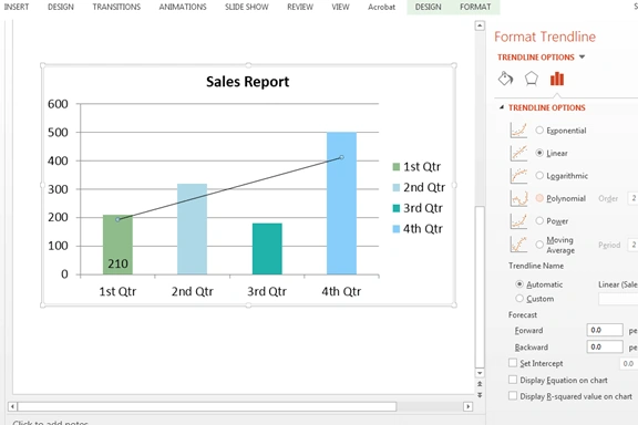
Trendline options on Microsoft PowerPoint files are given below.

First, get the Spire.Presentation.dll from NuGet and add it as a reference for our projects.
Tools, which we require are given below.
- Spire.Presentation.dll
- Visual Studio
Namespaces to be used are given below.
- using Spire.Presentation;
- using Spire.Presentation.Charts;
- using Spire.Presentation.Drawing;
- using Spire.Presentation.Collections;
- using System.Drawing;
Code snippets of how to create a presentation chart. Add trendlines and data labels to the chart in C#.
- Presentation ppt = new Presentation();
- //Insert a chart and set the chart type.
- RectangleF rect1 = new RectangleF(40, 100, 550, 320);
- IChart chart = ppt.Slides[0].Shapes.AppendChart(ChartType.ColumnStacked, rect1, false);
- //Add a title for the chart and format it.
- chart.ChartTitle.TextProperties.Text = "Sales Report";
- chart.ChartTitle.TextProperties.IsCentered = true;
- chart.ChartTitle.Height = 30;
- chart.HasTitle = true;
- // Define some data.
- string[] quarters = new string[] { "1st Qtr", "2nd Qtr", "3rd Qtr", "4th Qtr" };
- int[] sales = new int[] { 210, 320, 180, 500 };
- //Append data to ChartData which represents a data table where the chart data is stored.
- chart.ChartData[0, 0].Text = "Quarters";
- chart.ChartData[0, 1].Text = "Sales";
- for (int i = 0; i < quarters.Length; ++i)
- {
- chart.ChartData[i + 1, 0].Value = quarters[i];
- chart.ChartData[i + 1, 1].Value = sales[i];
- }
- // Set series label, category labels and series data.
- chart.Series.SeriesLabel = chart.ChartData["B1", "B1"];
- chart.Categories.CategoryLabels = chart.ChartData["A2", "A5"];
- chart.Series[0].Values = chart.ChartData["B2", "B5"];
- //Add data points to series and fill each data point with different color.
- for (int i = 0; i < chart.Series[0].Values.Count; i++)
- {
- ChartDataPoint cdp = new ChartDataPoint(chart.Series[0]);
- cdp.Index = i;
- chart.Series[0].DataPoints.Add(cdp);
- }
- chart.Series[0].DataPoints[0].Fill.FillType = FillFormatType.Solid;
- chart.Series[0].DataPoints[0].Fill.SolidColor.Color = Color.DarkSeaGreen;
- chart.Series[0].DataPoints[1].Fill.FillType = FillFormatType.Solid;
- chart.Series[0].DataPoints[1].Fill.SolidColor.Color = Color.LightBlue;
- chart.Series[0].DataPoints[2].Fill.FillType = FillFormatType.Solid;
- chart.Series[0].DataPoints[2].Fill.SolidColor.Color = Color.LightSeaGreen;
- chart.Series[0].DataPoints[3].Fill.FillType = FillFormatType.Solid;
- chart.Series[0].DataPoints[3].Fill.SolidColor.Color = Color.LightSkyBlue;
- //Add the trendline to the chart and set TrendlinesType as Linear.
- ITrendlines it = chart.Series[0].AddTrendLine(TrendlinesType.Linear);
- //Set the trend line properties to determine what should be displayed.
- it.displayEquation = false;
- it.displayRSquaredValue = false;
- // Get the chart series
- ChartSeriesFormatCollection sers = chart.Series;
- //Format data labels
- ChartDataLabel cd1 = sers[0].DataLabels.Add();
- cd1.LabelValueVisible = true;
- cd1.Position = ChartDataLabelPosition.InsideBase;
- //Save the document to file.
- ppt.SaveToFile("Chart.pptx", FileFormat.Pptx2010);
Effective screenshot of the presentation chart with trendlines and data labels.
Conclusion
Thanks to Spire.Presentation. I am able to show you how to add trendlines, data label and format the data points for presentation charts programmatically in C#. I hope you have a deeper understanding of chart tools on the presentation slides after reading my article. Thank you for reading.
Join the conversation! Your thoughts help the community grow.