

Dialog components are one of the most useful UI elements in modern web applications. You can use them for confirmation messages, sign-in forms, newsletters, feedback forms, terms and conditions, and many other interactions without navigating users to a new page.
In this guide, you’ll learn ho to nstall and use the Shadcn Dialog component in your React and Next.js projects using Tailwind CSS. We’ll first install the base Dialog component, then build a reusable Subscribe Dialog that you can easily customize for your own applications.
Shadcn Dialog Modal
This reusable Dialog component includes everything you need to build modern modal windows, including the trigger, overlay, content, header, footer, title, description, and close button.
Install the Shadcn Dialog Component
The easiest way to add the Dialog component is with the Shadcn CLI.
Step 1: Install the Dialog component
Run the following command:
npx shadcn@latest add dialogStep 2: Install the requiredi dependency
The Dialog component uses Base UI. Install it with:
npm install @base-ui/reactStep 3: Add the Dialog component
Copy the following code into your project to create a reusable Dialog component.
"use client"

import * as React from "react"
import { Dialog as DialogPrimitive } from "@base-ui/react/dialog"
import { XIcon } from "lucide-react"

import { cn } from "@/lib/utils"
import { Button } from "@/components/ui/button"

function Dialog({ ...props }: DialogPrimitive.Root.Props) {
  return <DialogPrimitive.Root data-slot="dialog" {...props} />
}

function DialogTrigger({ ...props }: DialogPrimitive.Trigger.Props) {
  return <DialogPrimitive.Trigger data-slot="dialog-trigger" {...props} />
}

function DialogPortal({ ...props }: DialogPrimitive.Portal.Props) {
  return <DialogPrimitive.Portal data-slot="dialog-portal" {...props} />
}

function DialogClose({ ...props }: DialogPrimitive.Close.Props) {
  return <DialogPrimitive.Close data-slot="dialog-close" {...props} />
}

function DialogOverlay({
  className,
  ...props
}: DialogPrimitive.Backdrop.Props) {
  return (
    <DialogPrimitive.Backdrop
      data-slot="dialog-overlay"
      className={cn(
        "fixed inset-0 isolate z-50 bg-black/10 duration-100 supports-backdrop-filter:backdrop-blur-xs data-open:animate-in data-open:fade-in-0 data-closed:animate-out data-closed:fade-out-0",
        className
      )}
      {...props}
    />
  )
}

function DialogContent({
  className,
  children,
  showCloseButton = true,
  ...props
}: DialogPrimitive.Popup.Props & {
  showCloseButton?: boolean
}) {
  return (
    <DialogPortal>
      <DialogOverlay />
      <DialogPrimitive.Popup
        data-slot="dialog-content"
        className={cn(
          "fixed top-1/2 left-1/2 z-50 grid w-full max-w-[calc(100%-2rem)] -translate-x-1/2 -translate-y-1/2 gap-4 rounded-xl bg-popover p-4 text-sm text-popover-foreground ring-1 ring-foreground/10 duration-100 outline-none sm:max-w-sm data-open:animate-in data-open:fade-in-0 data-open:zoom-in-95 data-closed:animate-out data-closed:fade-out-0 data-closed:zoom-out-95",
          className
        )}
        {...props}
      >
        {children}
        {showCloseButton && (
          <DialogPrimitive.Close data-slot="dialog-close" render={<Button variant="ghost" className="absolute top-2 right-2" size="icon-sm"><XIcon /><span className="sr-only">Close</span></Button>} />
        )}
      </DialogPrimitive.Popup>
    </DialogPortal>
  )
}

function DialogHeader({ className, ...props }: React.ComponentProps<"div">) {
  return (
    <div
      data-slot="dialog-header"
      className={cn("flex flex-col gap-2", className)}
      {...props}
    />
  )
}

function DialogFooter({
  className,
  showCloseButton = false,
  children,
  ...props
}: React.ComponentProps<"div"> & {
  showCloseButton?: boolean
}) {
  return (
    <div
      data-slot="dialog-footer"
      className={cn(
        "-mx-4 -mb-4 flex flex-col-reverse gap-2 rounded-b-xl border-t bg-muted/50 p-4 sm:flex-row sm:justify-end",
        className
      )}
      {...props}
    >
      {children}
      {showCloseButton && (
        <DialogPrimitive.Close render={<Button variant="outline">Close</Button>} />
      )}
    </div>
  )
}

function DialogTitle({ className, ...props }: DialogPrimitive.Title.Props) {
  return (
    <DialogPrimitive.Title
      data-slot="dialog-title"
      className={cn(
        "cn-font-heading text-base leading-none font-medium",
        className
      )}
      {...props}
    />
  )
}

function DialogDescription({
  className,
  ...props
}: DialogPrimitive.Description.Props) {
  return (
    <DialogPrimitive.Description
      data-slot="dialog-description"
      className={cn(
        "text-sm text-muted-foreground *:[a]:underline *:[a]:underline-offset-3 *:[a]:hover:text-foreground",
        className
      )}
      {...props}
    />
  )
}

export {
  Dialog,
  DialogClose,
  DialogContent,
  DialogDescription,
  DialogFooter,
  DialogHeader,
  DialogOverlay,
  DialogPortal,
  DialogTitle,
  DialogTrigger,
}
Once the component is ready, an reuse it anywhere in your application.

The component includes:
Dialog – The root component that controls the dialog state.
DialogTrigger – Opens the dialog.
DialogContent – Displays the dialog content.
DialogOverlay – Creates the background overlay.
DialogHeader – Wraps the title and description.
DialogTitle – Displays the dialog heading.
DialogDescription – Adds supporting text.
DialogFooter – Holds action buttons.
DialogClose – Closes the dialog.
Build a Subscribe Dialog
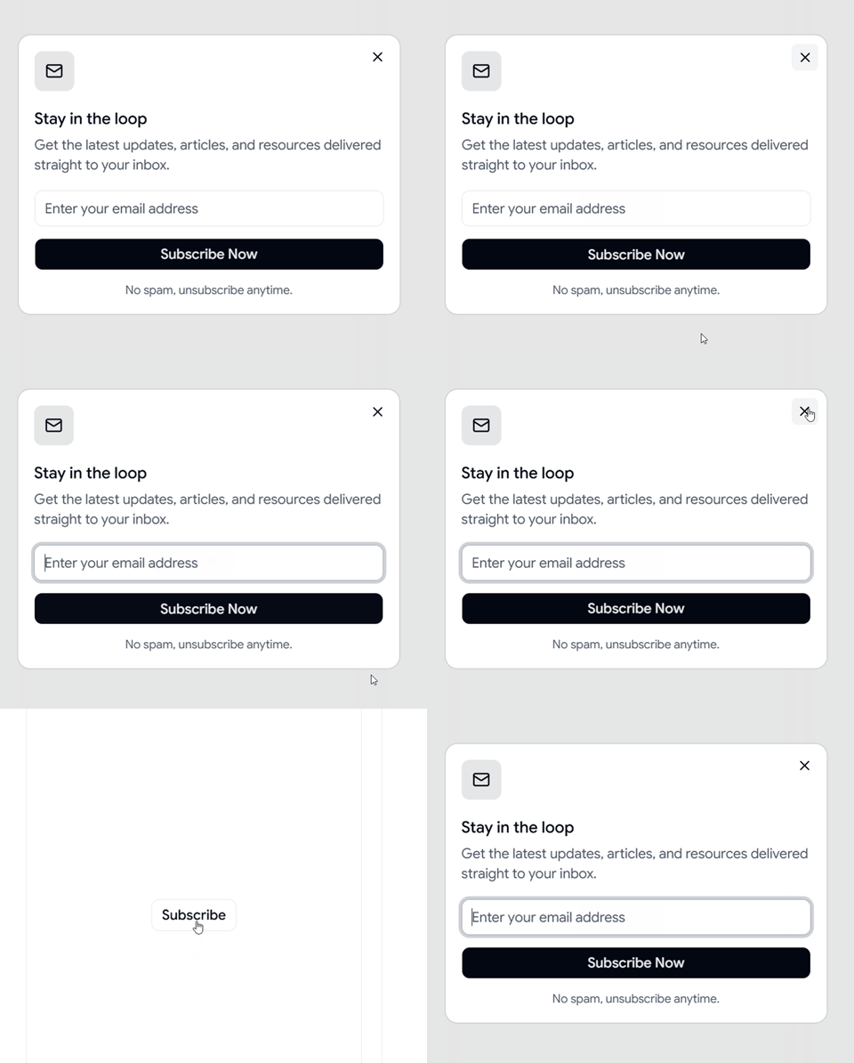
Subscribe Dialog is a reusable modal component for capturing newsletter subscriptions in React and Next.js applications. It features an email input field, a call-to-action button, and a clean layout that works well for blogs, product websites, SaaS applications, and landing pages. You can customize the content, styling, animations, and form logic to fit your project’s requirements.
Now let’s build a simple newsletter subscription dialog that users can open from a button.
This example includes:
Email input field
Subscribe button
Close functionality
Smooth open and close animations
Install the component
You can instantly install the Subscribe Dialog using the Shadcn Space CLI.
npx shadcn@latest add @shadcn-space/dialog-03Add the component
npm install @base-ui/reactUse below code to add Subscribe Dialog into your react projects
        "use client";

import { MailIcon } from "lucide-react";
    import {
      Dialog,
      DialogTrigger,
      DialogContent,
      DialogHeader,
      DialogTitle,
      DialogDescription,
      DialogClose,
    } from "@/components/ui/dialog";
    import { Button } from "@/components/ui/button";
    import { Input } from "@/components/ui/input";


export default function Dialog03() {
      return (
        <Dialog>
          <DialogTrigger render={<Button variant="outline" className="cursor-pointer" />}>
            Subscribe
          </DialogTrigger>
          <DialogContent className="data-open:slide-in-from-left-8 data-closed:slide-out-to-left-8 data-open:zoom-in-100 data-closed:zoom-out-100 duration-300 [[data-slot=dialog-overlay]:has(~_&)]:duration-300">
            <div className="flex items-center justify-center size-10 rounded-lg bg-primary/10 text-primary mb-1">
              <MailIcon size={18} />
            </div>
            <DialogHeader>
              <DialogTitle>Stay in the loop</DialogTitle>
              <DialogDescription>
                Get the latest updates, articles, and resources delivered straight
                to your inbox.
              </DialogDescription>
            </DialogHeader>
            <div className="flex flex-col gap-3">
              <Input
                type="email"
                placeholder="Enter your email address"
                className="h-9"
              />
              <DialogClose render={<Button className="w-full cursor-pointer hover:bg-primary/80" />}>
                Subscribe Now
              </DialogClose>
              <p className="text-xs text-muted-foreground text-center">
                No spam, unsubscribe anytime.
              </p>
            </div>
          </DialogContent>
        </Dialog>
      );
    }
After adding the component, you’ll have a fully functional newsletter popup that you can customize with your own branding, colors, and form logic.
Customize Your Dialog
Once the component is working, you can easily customize it by:
Changing the animation direction.
Updating the title and description.
Replacing the email input with any form.
Adding confirmation or success messages.
Using different button variants.
Adjusting the dialog width and spacing.
Because the component is built with React and Tailwind CSS, it’s easy to extend for almost any use case.
Conclusion
You now know how to install and use Shadcn Dialog components in your React and Next.js projects. Starting with the base Dialog component makes it easy to build reusable modals, and you can customize them for newsletters, authentication, confirmations, forms, and many other use cases.
Feel free to copy the code examples, customize them to match your design system, and use them in your own applications.
Want to build checkbox inside your dialogs?
Check out this guide on How to Use Shadcn Checkbox in React & Next.js Projects to learn how to add accessible checkboxes to your dialogs.
In the next guide, we’ll explore how to build reusable Shadcn Select Components with practical examples and ready-to-use code.
Join the conversation! Your thoughts help the community grow.