

This chapter is taken from book "Programming Windows Phone 7" by Charles Petzold published by Microsoft press. http://www.charlespetzold.com/phone/index.html
One of the most important classes in all of Silverlight is Panel-the class that plays a starring role in the Silverlight layout system. You might expect such a crucial class to define many properties and events, but Panel defines only three properties on its own:
- Background of type Brush
- Children of type UIElementCollection
- IsItemsHost of type bool
The three standard types of panels provided by Silverlight for Windows Phone are StackPanel (probably the simplest kind of panel), Grid (which is the first choice for most routine layout), and Canvas, which should be ignored for most routine layout jobs, but has some special characteristics that make it handy sometimes.
The Single-Cell Grid
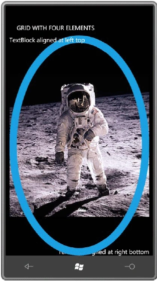
A Grid is generally arranged in rows and columns, you can put multiple children in a single-cell Grid. Here's a simple example for reference purposes:
<Grid
x:Name="ContentPanel"
Grid.Row="1"
Margin="12,0,12,0">
<TextBlock
Text="TextBlock
aligned at right bottom"
HorizontalAlignment="Right"
VerticalAlignment="Bottom"
/>
<Image
Source="Images/BuzzAldrinOnTheMoon.png"
/>
<Ellipse
Stroke="{StaticResource
PhoneAccentBrush}"
StrokeThickness="24"
/>
<TextBlock
Text="TextBlock
aligned at left top"
HorizontalAlignment="Left"
VerticalAlignment="Top"
/>
</Grid>
All four elements are given the entire content area in which to reside:
The StackPanel Stack
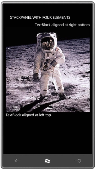
Here are the same four elements in a StackPanel, which is nested in the content grid:
<Grid
x:Name="ContentPanel"
Grid.Row="1"
Margin="12,0,12,0">
<StackPanel
Name="stackPanel"
Orientation="Vertical">
<TextBlock
Text="TextBlock aligned
at right bottom"
HorizontalAlignment="Right"
VerticalAlignment="Bottom"
/>
<Image
Source="Images/BuzzAldrinOnTheMoon.png"
/>
<Ellipse
Stroke="{StaticResource
PhoneAccentBrush}"
StrokeThickness="12" />
<TextBlock
Text="TextBlock aligned
at left top"
HorizontalAlignment="Left"
VerticalAlignment="Top"
/>
</StackPanel>
</Grid>
By default, the StackPanel arranges its children in a stack from top to bottom. The children do not overlap:
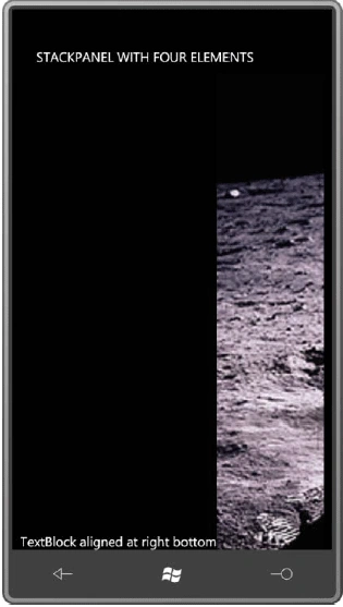
The Orientation property of StackPanel is set to a member of the Orientation enumeration, either Horizontal or Vertical. The default is Vertical, but the StackPanelWithFourElements program toggles the StackPanel orientation when you tap the screen. Here's the code to do it:
protected
override void
OnManipulationStarted(ManipulationStartedEventArgs
args)
{
stackPanel.Orientation =
stackPanel.Orientation == System.Windows.Controls.Orientation.Vertical
? System.Windows.Controls.Orientation.Horizontal
: System.Windows.Controls.Orientation.Vertical;
args.Complete();
args.Handled = true;
base.OnManipulationStarted(args);
}
One tap and the elements are arranged from left to right:
Text Concatenation with StackPanel
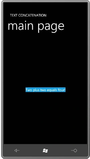
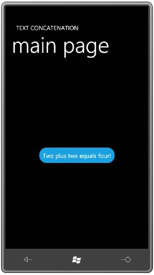
A StackPanel with a horizontal orientation can concatenate text. This is demonstrated in the TextConcatenation project:
<Grid
x:Name="ContentPanel"
Grid.Row="1"
Margin="12,0,12,0">
<StackPanel
Orientation="Horizontal"
HorizontalAlignment="Center"
VerticalAlignment="Center"
Background="{StaticResource
PhoneAccentBrush}">
<TextBlock
Text="Two
" />
<TextBlock
Text="plus
" />
<TextBlock
Text="two
" />
<TextBlock
Text="equals
" />
<TextBlock
Text="four!"
/>
</StackPanel>
</Grid>
Here it is:
An easier solution is to put the
StackPanel in a
Border element, and move all the alignment and
Background settings to
that Border:
<Grid
x:Name="ContentPanel"
Grid.Row="1"
Margin="12,0,12,0">
<Border
Background="{StaticResource
PhoneAccentBrush}"
Padding="12"
CornerRadius="24"
HorizontalAlignment="Center"
VerticalAlignment="Center">
<StackPanel
Orientation="Horizontal">
<TextBlock
Text="Two
" />
<TextBlock
Text="plus
" />
<TextBlock
Text="two
" />
<TextBlock
Text="equals
" />
<TextBlock
Text="four!"
/>
</StackPanel>
</Border>
</Grid>
Now you get a nice comfortable background with rounded corners:
Nested Panels
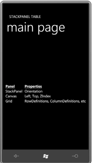
It's possible to nest one StackPanel in another, which makes most sense if they're of different orientations. Here's a program with two verticals in one horizontal:
<StackPanel
Orientation="Horizontal"
HorizontalAlignment="Center"
VerticalAlignment="Center">
<StackPanel>
<TextBlock
Text="Panel"
FontWeight="Bold"
TextDecorations="Underline"
/>
<TextBlock
Text="StackPanel"
/>
<TextBlock
Text="Canvas"
/>
<TextBlock
Text="Grid"
/>
</StackPanel>
<StackPanel
Margin="12
0 0 0">
<TextBlock
Text="Properties"
FontWeight="Bold"
TextDecorations="Underline"
/>
<TextBlock
Text="Orientation"
/>
<TextBlock
Text="Left,
Top, ZIndex" />
<TextBlock
Text="RowDefinitions,
ColumnDefinitions, etc" />
</StackPanel>
</StackPanel>
Join the conversation! Your thoughts help the community grow.