

Introduction
Many apps that require security have a lock screen. Some applications have it by default, and others allow you to choose it. Pin, pattern, and password security are all options. In this article, we will discuss the pin-type lock screen with biometrics. If biometrics or face locks are available in the device.
You can also discover libraries available on GitHub that offer pre-built lock screen functionality. However, it's often more advantageous to develop it with your own code and integrate it seamlessly into your application without relying on external modules or libraries.
Therefore, without any delay, let's start the implementation of our custom lock screen.
1. Add Dependency
Create a new project or open any project then the following dependencies to your module build.gradle(App) file.
    implementation("androidx.compose.material3:material3")
    implementation("androidx.biometric:biometric-ktx:1.2.0-alpha05")
    implementation("androidx.navigation:navigation-compose:2.5.3")
Then apply it by clicking on Sync Now.
2. Creating Screen

The lock screen can be designed in a variety of ways. So, we'll design the screen as seen below.
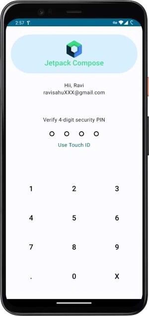
This is a sample screen based on a well-known app (you can guess the app's name in the comments). I can do many things to be here, but in order to appear clear and professional, I designed the bare minimum of functionality. We can utilize 4-digit passwords or the device's biometrics to authenticate the app. The biometric will only function if it is present on the device; otherwise, you can unlock it with the four-digit key. For this comparison, we're using a static key of 1234, but in practice, you may save it in the datastore preference and use Android key chain encryption to make it more secure to extract. To keep things simple, let's use 1234 as our pin to unlock the app.
Someone once said Talk is cheap. Show me the code, and now, present the code.
@Composable
fun LockScreen(
    tonavigate: () -> Unit
) {
    val pin = remember {
        mutableStateListOf<Int>(
        )
    }
    val useBio = remember {
        mutableStateOf(false)
    }

    Surface {
        Column(
            modifier = Modifier.fillMaxSize(),
            horizontalAlignment = Alignment.CenterHorizontally,
            verticalArrangement = Arrangement.Center
        ) {

            Spacer(modifier = Modifier.height(10.dp))
            Image(
                painter = painterResource(id = R.drawable.img),
                contentDescription = "User",
                contentScale = ContentScale.Crop,
                modifier = Modifier
                    .fillMaxWidth()
                    .padding(15.dp)
                    .clip(CircleShape)
            )

            Spacer(modifier = Modifier.height(10.dp))
            Text(text = "Hii, Ravi")
            Text(text = "[email protected]")

            Spacer(modifier = Modifier.weight(0.1f))
            Text(text = "Verify 4-digit security PIN")

            Spacer(modifier = Modifier.height(10.dp))


            InputDots(
            			//to define here
            )

            Text(text = "Use Touch ID", color = Color(0xFF00695C), modifier = Modifier.clickable {
                useBio.value = true
            })
            Spacer(modifier = Modifier.weight(0.1f))

            NumberBoard(
                		 //to define
            )

            Spacer(modifier = Modifier.height(10.dp))

            if (pin.size == 4) {
                //check auth here
            }

            if (useBio.value) {
                //use bio auth here
                useBio.value = false
            }

        }
    }
}
The above code is here, which we are going to expand further. Lastly, we are going to make it fully functional by adding the required composable functionality.
3. Define Dots
It's a basic concept to describe dots, but the implementation logic can differ depending on your level of expertise. Beginners might accomplish the same thing using several lines of code, whereas someone experienced could achieve it in just two lines. Let's explore how we can define these dots.
@Preview
@Composable
fun InputDots(
    numbers: List<Int> = listOf(1, 2),
) {
    //1st way
    Row(
        horizontalArrangement = Arrangement.Center,
        verticalAlignment = Alignment.CenterVertically,
        modifier = Modifier.fillMaxWidth()
    ) {
        for (i in 0..3) {
            PinIndicator(
                filled = when (i) {
                    0 -> numbers.isNotEmpty()
                    else -> numbers.size > i
                }
            )
        }

    }
    //2nd way
    Row(
        horizontalArrangement = Arrangement.Center,
        verticalAlignment = Alignment.CenterVertically,
        modifier = Modifier.fillMaxWidth()
    ) {
        PinIndicator(filled = numbers.isNotEmpty())
        PinIndicator(filled = numbers.size > 1)
        PinIndicator(filled = numbers.size > 2)
        PinIndicator(filled = numbers.size > 3)
    }
}

@Composable
private fun PinIndicator(
    filled: Boolean,
) {
    Box(
        modifier = Modifier
            .padding(15.dp)
            .size(15.dp)
            .clip(CircleShape)
            .background(if (filled) Color.Black else Color.Transparent)
            .border(2.dp, Color.Black, CircleShape)
    )
}
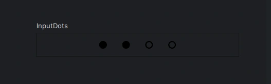
The preview will look like this-
4. Define Button
It's a good idea to go with the bottom-up method, where we make small parts first. To describe the 'NumberBoard' thing, let's start by creating its button.
//option 1 Square Button

@Preview(showBackground = true)
@Composable
private fun NumberButton(
    modifier: Modifier = Modifier,
    number: String = "1",
    onClick: (number: String) -> Unit = {},
) {
    Button(
        onClick = {
            onClick(number)
        },
        colors = ButtonDefaults.buttonColors(containerColor = Color.Transparent),
        modifier = modifier
            .size(90.dp)
            .padding(0.dp),
        shape = RectangleShape,
    ) {
        Text(
            text = number, color = Color.Black, fontSize = 22.sp
        )
    }
}

//option 2 Rounded Corner Button

private val NumberButtonBackground = Color.Black.copy(alpha = 0.1F)

@Preview(showBackground = false)
@Composable
private fun NumberButton2(
    modifier: Modifier = Modifier,
    number: String = "1",
    onClick: (number: String) -> Unit = {},
) {
    Button(
        onClick = {
            onClick(number)
        },
        colors = ButtonDefaults.buttonColors(containerColor = NumberButtonBackground),
        modifier = modifier
            .size(90.dp)
            .padding(10.dp),
        shape = RoundedCornerShape(200.dp),
    ) {
        Text(
            text = number, color = Color.Black, fontSize = 22.sp
        )
    }
}
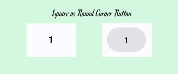
The preview will look like this.
5. Define NumberBoard
Now, we're putting together the button and making the NumberBord. You can create the dots in different ways, just like you can make the whole NumberBoard in various ways. Let's check out a few of these ways and pick the one that works best and is easy to do.
// method 1
@Composable
fun NumberBoard(onNumberClick: (String) -> Unit) {

    NumberBoardRow(
        listOf("1", "2", "3", "4", "5", "6", "7", "8", "9", ".", "0", "X"),
        onNumberClick
    )

}

// method 2
@Composable
fun NumberBoard2(
    onNumberClick: (num: String) -> Unit,
) {
    val buttons = (1..9).toList()

    Column(
        modifier = Modifier.fillMaxWidth(), verticalArrangement = Arrangement.SpaceEvenly
    ) {
        buttons.chunked(3).forEach { buttonRow ->
            Row(
            ) {
                buttonRow.forEach { buttonNumber ->

                    NumberButton(
                        number = buttonNumber.toString(),
                        onClick = onNumberClick,
                        modifier = Modifier
                            .weight(1f)
                    )

                }
            }
        }
        NumberBoardRow2(listOf(".", "0", "X"), onNumberClick = onNumberClick)
    }
}

//method 1 function
@Composable
fun NumberBoardRow(num: List<String>, onNumberClick: (num: String) -> Unit) {
    val list = (1..9).map { it.toString() }.toMutableList()
    list.addAll(mutableListOf(".", "0", "X"))

    LazyVerticalGrid(
        columns = GridCells.Fixed(3),
        contentPadding = PaddingValues(
            start = 12.dp,
            top = 16.dp,
            end = 12.dp,
            bottom = 16.dp
        ),
        content = {
            itemsIndexed(items = list) { index, item ->
                NumberButton(
                    modifier = Modifier,
                    number = item,
                    onClick = { onNumberClick(it) })

            }
        }
    )
}

//method 2 function
@Composable
fun NumberBoardRow2(
    num: List<String>,
    onNumberClick: (num: String) -> Unit
) {
    Row(
        modifier = Modifier.fillMaxWidth(),
        verticalAlignment = Alignment.CenterVertically,
        horizontalArrangement = Arrangement.Center
    ) {
        for (i in num) {
            NumberButton(
                modifier = Modifier.weight(1f),
                number = i,
                onClick = { onNumberClick(it) })
        }
    }
}
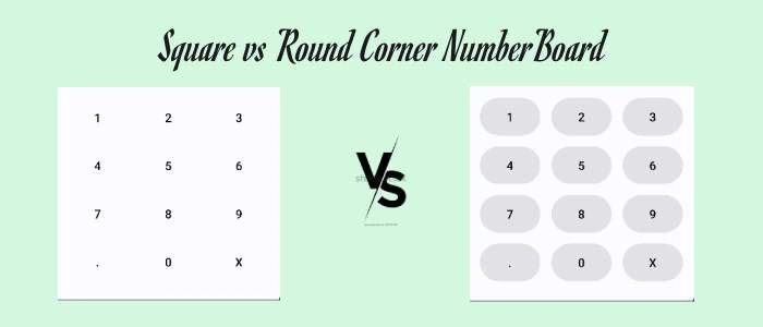
The preview will look like this-
6. Sum up the code
To Sum up all the code, we would define all the required functions and validation that were left in part one so let's start by defining the input dots, NumberBoard, check pin auth, and use Biometrics.
// code  1

InputDots(pin)

// code  2
 NumberBoard(
                onNumberClick = { mynumber ->
                    when (mynumber) {
                        "." -> {}
                        "X" -> {
                            if (pin.isNotEmpty()) pin.removeLast()
                        }

                        else -> {
                            if (pin.size < 4)
                                pin.add(mynumber.toInt())
                        }
                    }
                }
            )

// code  3
            Spacer(modifier = Modifier.height(10.dp))
            if (pin.size == 4) {
                checkUserAuth(pin.toList(), tonavigate)
            }
            if (useBio.value) {
                UseBioMetric()
                useBio.value = false
            }


//code 4 to define checkUserAuth function

@Composable
fun checkUserAuth(pin: List<Int>, onLoginSuccess: () -> Unit) {
    val isPinCorrect = pin == listOf(1, 2, 3, 4)
    if (isPinCorrect) {
        LaunchedEffect(Unit) {
            onLoginSuccess()
        }
    } else {
        Toast.makeText(LocalContext.current, "Login Failed", Toast.LENGTH_SHORT).show()
    }
}

//code 5  to define UseBioMetric
@Composable
fun UseBioMetric() {

    val activity = LocalContext.current
    LaunchedEffect(key1 = true) {
        Biometric.authenticate(
            activity as FragmentActivity,
            title = "Sharp Wallet",
            subtitle = "Please Authenticate in order to use Sharp Wallet",
            description = "Authentication is must",
            negativeText = "Cancel",
            onSuccess = {
                runBlocking {
                    Toast.makeText(
                        activity,
                        "Authenticated successfully",
                        Toast.LENGTH_SHORT
                    )
                        .show()

                }
            },
            onError = { errorCode, errorString ->
                runBlocking {
                    Toast.makeText(
                        activity,
                        "Authentication error: $errorCode, $errorString",
                        Toast.LENGTH_SHORT
                    )
                        .show()
                }
            },
            onFailed = {
                runBlocking {
                    Toast.makeText(
                        activity,
                        "Authentication failed",
                        Toast.LENGTH_SHORT
                    )
                        .show()
                }
            }
        )

    }
}
7. Navigate the User After Login
When we want to authenticate that the user is verified, we move them from the "lock" screen to the "Home" screen. We can also display a small pop-up message to share the status, or we can keep a record of it using a logger. I initially did the logging part and showed simple toast, thinking it was a good approach, but in the real world, you usually go with the navigation method. So, you can follow the code below to guide the user. Here's a piece of the code for your reference:
class MainActivity : FragmentActivity() {
    override fun onCreate(savedInstanceState: Bundle?) {
        super.onCreate(savedInstanceState)
        setContent {
            LockScreenTheme {
                // A surface container using the 'background' color from the theme
                Surface(
                    modifier = Modifier.fillMaxSize(),
                    color = MaterialTheme.colorScheme.background
                ) {
                    LockApp()
                }
            }
        }
    }
}

@Composable
fun LockApp(navController: NavHostController = rememberNavController()) {
    NavHost(
        navController = navController,
        startDestination = "LockScreen",
    ) {
        composable(route = "LockScreen") {
            LockScreen(
                tonavigate = {
                    navController.navigate("Home") {
                        popUpTo("LockScreen") {
                            inclusive = true
                        }
                    }
                }
            )
        }
        composable(route = "Home") {
            HomeScreen()
        }
    }
}

@Composable
fun HomeScreen() {
    Surface {
        Column(
            modifier = Modifier.fillMaxSize(),
            horizontalAlignment = Alignment.CenterHorizontally,
            verticalArrangement = Arrangement.Center
        ) {
            Text(text = "Welcome Ravi!")
        }
    }
}
Output
Conclusion
This article discussed creating a basic lock screen for Android. The provided code can be applied in various scenarios. There are plenty of options to customize it according to your unique design preferences and creativity. I'd love to hear your thoughts and whether you've used this sample to create any screens. Feel free to share your feedback. Thanks!
RinatPosted Nov 27, 2023, 11:57 AM
Great tutorial, many thanks!
Uday DodiyaPosted Aug 25, 2023, 6:20 AM
Nice Article