

If you've ever opened the Power BI service for the first time and felt like everyone around you was speaking a slightly different language — workspaces, semantic models, capacities, apps — you're not alone. Power BI's vocabulary can feel like a wall standing between you and actually getting useful work done. The good news is that once a handful of terms click into place, the rest of the platform starts to make a lot more sense.
Two Kinds of People Use Power BI
Before diving into terminology, it helps to know that almost everyone in Power BI falls into one of two camps.
The first group builds things. These are the people pulling data together, shaping it into models, and turning it into charts and dashboards other people can actually use. You'll often hear them called designers or creators. Their day-to-day involves connecting to data sources, building out reports, organizing everything into shared spaces, and deciding who gets to see what.
The second group uses what the first group builds. These are the business users — the people who open a report to check last quarter's numbers, glance at a dashboard before a meeting, or click through an app someone shared with them. They're not usually building models or writing queries; they're consuming insights and making decisions based on them.
Most people who spend real time in Power BI eventually do a bit of both, but keeping this split in mind makes the rest of the terminology far easier to place.
The Building Blocks Worth Knowing
Semantic models (you might still hear the older term "datasets" floating around) are essentially the data engine behind everything else. A semantic model pulls together data — sometimes from several different sources — and packages it in a way that reports and dashboards can draw from. Think of it as the foundation everything else gets built on top of.
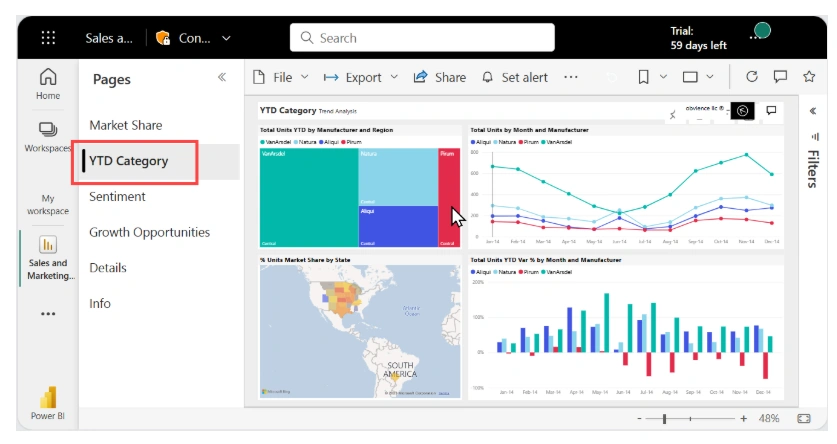
Reports sit on top of a semantic model. A report is usually a handful of pages filled with charts, tables, and other visuals, all built to answer a particular business question or explore a particular slice of the data. If a colleague asks "how did regional sales perform last quarter," a report is probably where that answer lives.
Dashboards are a different animal. Rather than multiple pages, a dashboard is a single screen made up of tiles — bits of visuals, text, or images pulled from one or more reports. Dashboards are built for at-a-glance monitoring: the kind of thing you'd want open on a second monitor to keep an eye on key numbers throughout the day.
Visualizations are the individual charts and graphs themselves — the bar charts, maps, and tables that make up reports and dashboards. They're interactive by design, so a business user can filter, slice, or drill into them without needing to touch the underlying model.
Workspaces are where the actual collaboration happens. A workspace is a shared area where a team stores and manages its reports, dashboards, and semantic models together. People get assigned roles inside a workspace — Admin, Member, Contributor, or Viewer — which controls exactly what they're allowed to see or change. If your organization has adopted Microsoft Fabric, a workspace can hold more than Power BI content too, including things like lakehouses and notebooks.
Apps take a curated bundle of dashboards, reports, and models and package it up for distribution to a wider audience — a whole department, say, rather than just the handful of people working inside a shared workspace. If you've ever been handed a single link that opens up a polished little bundle of reports, that was almost certainly an app.
The Less Glamorous (But Still Important) Terms
Not everything in Power BI is about charts and visuals. A few terms matter more for access and infrastructure than for storytelling with data.
Licenses and subscriptions determine what a given user is actually allowed to do — whether they're on a free tier, a Pro license, or something more premium, each tier unlocks a different set of capabilities.
Capacity refers to the dedicated computing resources behind the scenes that keep everything running smoothly at scale. Premium and Fabric capacities (the ones you'll see labelled with P or F SKUs) are what let organizations serve content to users who only have a free license, and they're also a requirement if you want to use Copilot.
Speaking of which Copilot is Power BI's built-in AI assistant. It can help draft reports, summarize what's happening in your data in plain language, and generally speed up the parts of the job that used to involve a lot of manual clicking. It's switched on by default, but it only actually works if your organization has the right paid capacity behind it.
Rounding things out are two terms tied to how data gets into Power BI in the first place. A workbook is simply an Excel file that's been uploaded into the service. You can view it as-is or use it as a source for building reports. A dataflow (now considered a legacy approach, with newer tools taking over its role) is a set of reusable data transformation steps stored centrally, so multiple reports can draw on the same cleaned-up data without everyone reinventing the wheel.
Why Any of This Matters
None of these terms exist in isolation. Rather, they build on each other. Data becomes a semantic model. A semantic model feeds one or more reports. Reports get pinned into dashboards for quick monitoring. Workspaces hold it all together for a team. Apps repackage the finished product for a broader audience. And licensing and capacity quietly determine who can do what along the way.
Once that chain clicks into place, navigating Power BI stops feeling like decoding a foreign language and starts feeling like using a tool that actually makes sense. From here, the natural next step is just to get hands-on — open the service, poke around a workspace, and see how a report actually behaves when you start clicking on it.
Join the conversation! Your thoughts help the community grow.