

Introduction
I have written this article to demonstrate creating charts in R. In this article, I aim to explain how we can easily create our charts to display data graphically. A chart helps to visualize data that is otherwise difficult or tedious to understand. Charts can also be used to identify trends in the behavior of data, which is extremely difficult to understand by simply looking at the figures. I will show the readers how to create Pie Charts, Bar Charts, Horizontal Bar Charts, and Stacked Bar Charts using R programming.
Pie Chart
Pie charts are circular charts used to indicate the proportion of subsets of data as a percentage of the overall data. In R, pie charts can be created using the pie() function.
Following is the syntax of the pie() function,
pie(x,labels,col,main)
The x parameter specifies the values to be plotted.
The labels parameter specifies the labels to be used for the slices of the pie chart.
The col parameter specifies the colors to be used to fill the slices.
The main parameter specifes the main title for the chart
The following code illustrates the creation of a pie chart using data stored in lists,
# Plotting a Pie chart of student marks

marks <- c(75,82,65,40,87)
names <- c("AAA","BBB","CCC","DDD","EEE")
percentages <- round(100 * marks / sum(marks),1)
png(file="pie.png")
pie(marks,labels=paste(names," - ",marks," - ",percentages,"%"),
      col=rainbow(length(names)),main="Student Marks Data")
legend("bottomleft",names,fill=rainbow(length(names)))
print("Chart saved as pie.png")
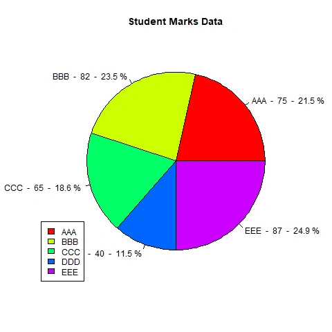
The above code computes the percentages using marks and plots the marks with labels as names, marks, and percentages.
The paste() function is used to concatenate the names, marks, and percentages to be used as labels.
The rainbow color palette is specified using the col parameter.
The legend() function displays the legend at the bottom left corner.
The resulting pie.png file contains the pie chart as follows,
Bar Chart
Bar charts show data as rectangular bars with the length of the bars indicating the value of the data being plotted. In R, bar charts can be created using the barplot() function.
Following is the syntax of the barplot() function:
x <- barplot(H,xlab,ylab,main,col,xlim,ylim)
The H parameter specifies the values to be plotted.
The xlab parameter specifies the labels to be displayed on the X-Axis.
The ylab parameter specifies the labels to be displayed on the Y-Axis.
The col parameter specifies the colors to be used to fill the slices.
The main parameter specifies the main title for the chart
The xlim parameter specifies the limit for the X-Axis.
The ylim parameter specifies the limit for the Y-Axis.
The following code illustrates the creation of a bar chart using data stored in lists,
# Plotting a Bar chart of student marks

marks <- c(75,82,65,40,87)
names <- c("AAA","BBB","CCC","DDD","EEE")

png(file="bar.png")
x <- barplot(marks~names,xlab="Names",ylab="Marks",main="Student Mark Data",col=rainbow(length(names)),ylim=c(0,100))
y <- as.matrix(marks)
text(x,y+2,labels=as.character(y))
print("Chart saved as bar.png")
print(x)
print(y)
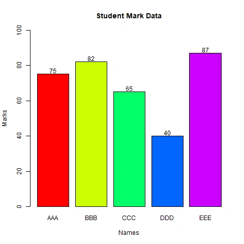
The above code plots names on the X and marks on the Y-Axis. The barplot() function returns a vector containing the X Co-ordinates of the center of each bar, which is used as the first parameter in the text() function indicating the X Co-ordinate of the data label to be displayed. The second parameter of the text() function is the Y Co-ordinate which is obtained using the matrix() function with the data plotted on the Y-Axis. The third parameter of the text() function is the value to be displayed converted to character type using the as.character() function. The ylim parameter is used to specify the Y-Axis limit.
The resulting bar.png file contains the bar chart as follows,
Stacked Bar Chart
Stack Bar charts can be plotted by combining all the values to be displayed on the Y-Axis using the matrix() function and specifying the number of rows and columns using the nrow and ncol parameters.
The following code illustrates the creation of a stacked bar chart using data stored in lists,
# Plotting a Stacked Bar chart of student marks

mark1 <- c(75,82,65,40,87)
mark2 <- c(60,85,60,50,70)
values <- matrix(c(mark1,mark2),nrow=5,ncol=2)
names <- c("AAA","BBB","CCC","DDD","EEE")
png(file="stackedbar.png")
x <- barplot(values~names,xlab="Names",ylab="Marks",main="Student Mark Data",col=rainbow(length(names)),ylim=c(0,200))
y1 <- as.matrix(mark1)
y2 <- as.matrix(mark2)
text(x,y1/2,labels=as.character(y1))
text(x,y1+y2/2,labels=as.character(y2))
print("Chart saved as stackedbar.png")
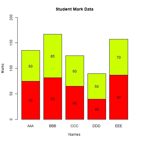
The above code plots names on the X and mark1 and mark2 stacked one above another on the Y-Axis. The text() function has to be used twice to display data values on the bars. The y parameter is divided by 2 to display the data label in the center of the bar vertically. In the second text() function call, the y parameter has to be incremented by the first y value.
The resulting stackedbar.png file contains the bar chart as follows,
Horizontal Bar Chart
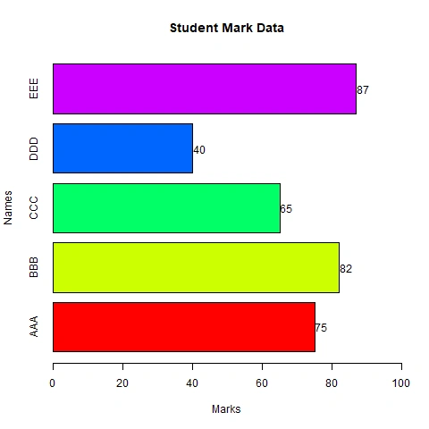
The horiz=TRUE parameter of the barplot() function can be used to plot horizontal bars on a bar plot. The values returned from the barplot() function can be stored in the y vector and the x vector can be created from the values (marks), to be used in the text() function to display the data values.
The following code illustrates the creation of a stacked bar chart using data stored in lists,
# Plotting a Horizontal Bar chart of student marks
marks <- c(75,82,65,40,87)
names <- c("AAA","BBB","CCC","DDD","EEE")
png(file="horizbar.png")
y <- barplot(marks~names,xlab="Marks",ylab="Names",main="Student Mark Data",col=rainbow(length(names)),
                    horiz=TRUE,xlim=c(0,100))
x <- as.matrix(marks)
text(x+2,y,labels=as.character(x))
print("Chart saved as horizbar.png")
The resulting horizbar.png file contains the horizontal bar chart as follows,
Line Chart
The plot() function can be used to plot a line chart. The plot() function draws points at specified locations. These points can be connected with lines to create a line plot.
Following is the code to draw a line chart,
# Plotting a Line chart of student marks

marks <- c(75,82,65,40,87)
names <- c("AAA","BBB","CCC","DDD","EEE")
png(file="line.png")
a <- barplot(marks~names,xlab="Names",ylab="Marks",main="Student Mark Data",col=rainbow(length(names)),ylim=c(0,100))
x <- plot(marks,type="o",xlab="Names",ylab="Marks",main="Student Mark Data",
               col=rainbow(length(names)),cex=2,pch=16,xlim=c(0,6),ylim=c(0,100))
y <- as.matrix(marks)
text(a,y+2,labels=paste(names,"-",as.character(y)))
print("Chart saved as line.png")
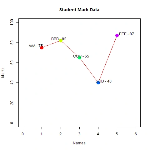
In the above code, I am first using the barplot() function to get the x positions in the variable a to be used to display labels in the text() function. Then a line plot is created using the plot() function. The type="o" parameter indicates that we have to display points as well as lines. The cex parameter specifies the scaling factor for the data points. The pch parameter specifies the shape of the plotting character as 16 which indicates a filled circle.
The resulting line.png file contains the line chart as follows,
Conclusion
I hope this article will help readers to understand the ease with which we can create different types of charts in R and make the readers more interested in exploring new concepts in R programming.
Join the conversation! Your thoughts help the community grow.