

Introduction
Today we will discuss the Popup control of XAML files in Metro Style Applications. the popup control has a property IsOpen; this property takes a boolean value as input. In this application we will take a popup control that is associated with a Click event of a button control; on the click event we will swap the value of the IsOpen property to open and close the popup control. We will use any XAML control as a child control of the popup control such as image, canvas, StackPanel etc. Here we will use a StackPanel control.
In the following we are including the entire code of the XAML file and code behind file to create this mini application.
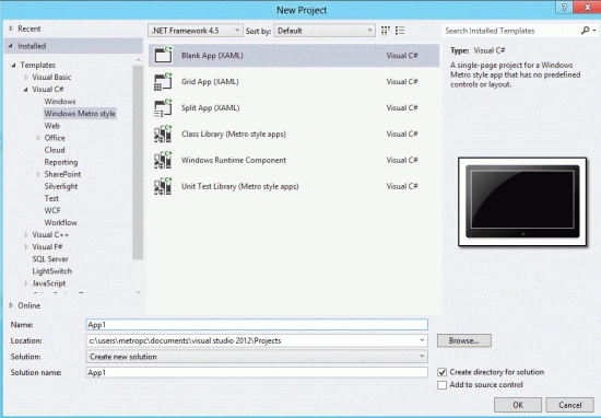
Step 1 : First, you will create a new Metro Style Application. Let us see the description with images of how you will create it.
- Open Visual Studio 2012
- File -> New -> Project
- Choose Template -> Visual C# -> Metro Style Application
- Rename the application
Step 2 : In the Solution Explorer there are two files that we will primarily work with; the MainPage.xaml and MainPage.xaml.cs files.
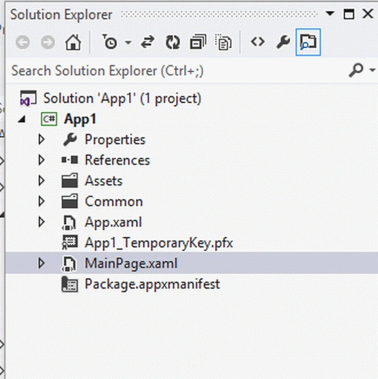
Step 3 : The MainPage.xaml file is as in the following code:
Code :
<Page
x:Class="App1.MainPage"
IsTabStop="false"
xmlns="http://schemas.microsoft.com/winfx/2006/xaml/presentation"
xmlns:x="http://schemas.microsoft.com/winfx/2006/xaml"
xmlns:local="using:App2"
xmlns:d="http://schemas.microsoft.com/expression/blend/2008"
xmlns:mc="http://schemas.openxmlformats.org/markup-compatibility/2006"
mc:Ignorable="d">
<Grid Background="Red">
<Grid.ColumnDefinitions>
<ColumnDefinition Width=".333*"></ColumnDefinition>
<ColumnDefinition Width=".333*"></ColumnDefinition>
<ColumnDefinition Width=".333*"></ColumnDefinition>
</Grid.ColumnDefinitions>
<Grid.RowDefinitions>
<RowDefinition Height=".333*"></RowDefinition>
<RowDefinition Height=".133*"></RowDefinition>
<RowDefinition Height=".033*"></RowDefinition>
</Grid.RowDefinitions>
<TextBlock Text="Popup Control in Metro Apps" FontSize="30" Grid.Column="1"
FontWeight="Bold" VerticalAlignment="Bottom" Margin="0,0,0,50">
</TextBlock>
<Popup x:Name="ppup" IsOpen="False" Grid.Column="1" Grid.Row="1" >
<StackPanel Background="Blue" Height="100" Width="400">
<TextBlock Text="This is Pop up control of Xaml" FontSize="20" FontWeight="Bold">
</TextBlock>
</StackPanel>
</Popup>
<TextBlock x:Name="txt1" Text="Click button to On Popup control" FontSize="20"
FontWeight="Bold" Grid.Column="1" Grid.Row="1"
VerticalAlignment="Bottom" Margin="0,0,0,100">
</TextBlock>
<Button Click="Button_Click_1" Grid.Column="1" Grid.Row="2"
Content="Open Popup" Background="Green">
</Button>
</Grid>
</Page>
Step 4 : The MainPage.xaml.cs file is as in the following code:
Code :
using System;
using System.Collections.Generic;
using System.IO;
using System.Linq;
using Windows.Foundation;
using Windows.Foundation.Collections;
using Windows.UI.Xaml;
using Windows.UI.Xaml.Controls;
using Windows.UI.Xaml.Controls.Primitives;
using Windows.UI.Xaml.Data;
using Windows.UI.Xaml.Input;
using Windows.UI.Xaml.Media;
using Windows.UI.Xaml.Navigation;
namespace App2
{
public sealed partial class MainPage : Page
{
public MainPage()
{
this.InitializeComponent();
}
protected override void OnNavigatedTo(NavigationEventArgs e)
{
}
private void Button_Click_1(object sender, RoutedEventArgs e)
{
if (ppup.IsOpen == false)
{
ppup.IsOpen = true;
txt1.Text = "Click button to Off Popup Control";
}
else
{
ppup.IsOpen = false;
txt1.Text = "Click button to On Popup control";
}
}
}
}
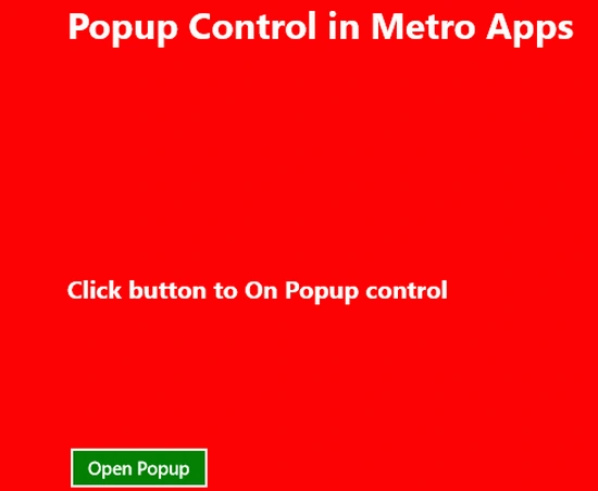
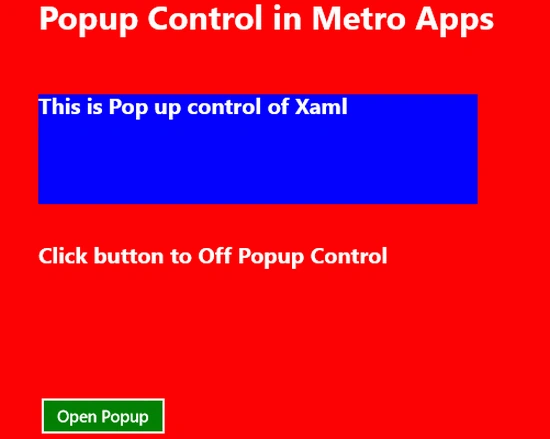
Step 5 : After running this code the output looks like this:
Join the conversation! Your thoughts help the community grow.