

Introduction
Reactstrap is a component library for Reactjs. It provides built-in Bootstrap components that provide flexibility and inbuilt validations, making it easy to create a UI. Reactstrap is similar to Bootstrap but has self-contained components.
You can check my previous articles where we discussed how we add Reactstrap and basic Reactstrap components in Reactjs applications from the below links:
In this article, we will discuss the following Reactstrap components:
- Dropdowns
- Fade
- Jumbotron
Prerequisites
- We should have a basic knowledge of HTML and JavaScript.
- Visual Studio Code should be installed
- Node and NPM installed
- npx create-react-app reactstrapcomponent
- npm install --save reactstrap react react-dom
- npm install --save bootstrap
Now, open the index.js file and add import Bootstrap.
- import 'bootstrap/dist/css/bootstrap.min.css';
Now, in Visual Studio code, go to the src folder, create a new folder and inside this folder, add 3 new components,
- DropdownsDemo.js
- FadeDemo.js
- JumbotronDemo.js
Now open the DropdownsDemo.js file and add the following code:
- import React, { Component } from 'react'
- import { UncontrolledDropdown, DropdownToggle, DropdownMenu, DropdownItem } from 'reactstrap';
- import { Navbar, Nav, NavItem, NavLink } from 'reactstrap';
- export class DropdownsDemo extends Component {
- render() {
- return (
- <div>
- <Navbar className="btn btn-warning" light expand="md">
- <Nav color="info" navbar>
- <NavItem className="hdr">
- <NavLink style={{ "color": "white" }} >Reactstrap Dropdowns Components</NavLink>
- </NavItem>
- </Nav>
- </Navbar>
- <UncontrolledDropdown>
- <DropdownToggle caret>
- Dropdown
- </DropdownToggle>
- <DropdownMenu>
- <DropdownItem header>Header</DropdownItem>
- <DropdownItem disabled>Action</DropdownItem>
- <DropdownItem>Another Action</DropdownItem>
- <DropdownItem divider />
- <DropdownItem>Another Action</DropdownItem>
- </DropdownMenu>
- </UncontrolledDropdown>
- </div>
- )
- }
- }
- export default DropdownsDemo
- import React from 'react';
- import logo from './logo.svg';
- import './App.css';
- import DropdownsDemo from './DropdownsDemo'
- function App() {
- return (
- <div className="App">
- <DropdownsDemo></DropdownsDemo>
- </div>
- );
- }
- export default App;
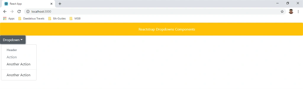
Now open the FadeDemo.js file and add the following code in this component:
- import React, { useState } from 'react';
- import { Button, Fade } from 'reactstrap';
- import { Navbar, Nav, NavItem, NavLink } from 'reactstrap';
- const FadeDemo = (props) => {
- const [fadeIn, setFadeIn] = useState(true);
- const toggle = () => setFadeIn(!fadeIn);
- return (
- <div>
- <Navbar className="btn btn-warning" light expand="md">
- <Nav color="info" navbar>
- <NavItem className="hdr">
- <NavLink style={{ "color": "white" }} >Reactstrap Fade Components</NavLink>
- </NavItem>
- </Nav>
- </Navbar>
- <Button color="primary" onClick={toggle}>Toggle Fade</Button>
- <Fade in={fadeIn} tag="h5" className="mt-3">
- Demo content
- </Fade>
- </div>
- );
- }
- export default FadeDemo
Now open the App.js file and add the following code:
- import React from 'react';
- import logo from './logo.svg';
- import './App.css';
- import FadeDemo from './FadeDemo'
- function App() {
- return (
- <div className="App">
- <FadeDemo></FadeDemo>
- </div>
- );
- }
- export default App;
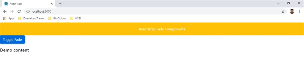
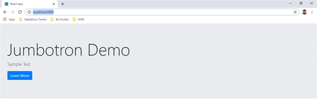
Now open JumbotronDemo.js file and add the following code in this component:
- import React, { Component } from 'react'
- import { Jumbotron, Button } from 'reactstrap';
- export class Jumbotrondemo extends Component {
- render() {
- return (
- <div>
- <Jumbotron>
- <h1 className="display-3">Jumbotron Demo</h1>
- <p className="lead">Sample Text</p>
- <p className="lead">
- <Button color="primary">Learn More</Button>
- </p>
- </Jumbotron>
- </div>
- )
- }
- }
- export default Jumbotrondemo
Now open App.js file and add the following code:
- import React from 'react';
- import logo from './logo.svg';
- import './App.css';
- import Jumbotrondemo from './Jumbotrondemo'
- function App() {
- return (
- <div className="App">
- <Jumbotrondemo></Jumbotrondemo>
- </div>
- );
- }
- export default App;
Run the project by using 'npm start' and check the result.
Summary
In this article, we learned how to use Dropdowns, Fade, and Jumbotron in Reactstrap components. Reactstrap is a component library for ReactJS.
Join the conversation! Your thoughts help the community grow.