

Introduction
react-draft-wysiwyg is a 3rd party plugin to Create RichTextEditor in React.
Properties
Styling the editor
The editor by default will use DraftJS editor, as it is without any styling and will occupy 100% width of the container. Some styling to add border to editor and set width would be nice.
- wrapperClassName: class applied around both the editor and the toolbar
- editorClassName: class applied around the editor
- toolbarClassName: class applied around the toolbar
- wrapperStyle: style object applied around both the editor and the toolbar
- editorStyle: style object applied around the editor
- toolbarStyle: style object applied around the toolbar
Editor state
The editor can be implemented as a controlled component using EditorState or un-controlled component using EditorState or RawDraftContentState.
- defaultEditorState: Property to initialize editor state once when its created.
- editorState: Property to update editor state in a controlled way.
- onEditorStateChange: Function is called each time there is a change in the state of the editor. A function argument passed is an object of EditorState.
- defaultContentState: Property to initialize editor state once when its created.
- contentState: Property to update editor state in a controlled way.
- onChange: Function is called each time there is a change in state of the editor. The function argument passed is an object of type RawDraftContentState.
- onContentStateChange: Function is called each time there is a change in state of the editor, function argument passed is object of type RawDraftContentState.
toolbar
The toolbar property provides a lot of parameters to customize the pre-built option in the toolbar. The default value of toolbar property is as shown below:
- {
- options: ['inline', 'blockType', 'fontSize', 'fontFamily', 'list', 'textAlign', 'colorPicker', 'link', 'embedded', 'emoji', 'image', 'remove', 'history'],
- inline: {
- inDropdown: false,
- className: undefined,
- component: undefined,
- dropdownClassName: undefined,
- options: ['bold', 'italic', 'underline', 'strikethrough', 'monospace', 'superscript', 'subscript'],
- bold: { icon: bold, className: undefined },
- italic: { icon: italic, className: undefined },
- underline: { icon: underline, className: undefined },
- strikethrough: { icon: strikethrough, className: undefined },
- monospace: { icon: monospace, className: undefined },
- superscript: { icon: superscript, className: undefined },
- subscript: { icon: subscript, className: undefined },
- },
- blockType: {
- inDropdown: true,
- options: ['Normal', 'H1', 'H2', 'H3', 'H4', 'H5', 'H6', 'Blockquote', 'Code'],
- className: undefined,
- component: undefined,
- dropdownClassName: undefined,
- },
- fontSize: {
- icon: fontSize,
- options: [8, 9, 10, 11, 12, 14, 16, 18, 24, 30, 36, 48, 60, 72, 96],
- className: undefined,
- component: undefined,
- dropdownClassName: undefined,
- },
- fontFamily: {
- options: ['Arial', 'Georgia', 'Impact', 'Tahoma', 'Times New Roman', 'Verdana'],
- className: undefined,
- component: undefined,
- dropdownClassName: undefined,
- },
- list: {
- inDropdown: false,
- className: undefined,
- component: undefined,
- dropdownClassName: undefined,
- options: ['unordered', 'ordered', 'indent', 'outdent'],
- unordered: { icon: unordered, className: undefined },
- ordered: { icon: ordered, className: undefined },
- indent: { icon: indent, className: undefined },
- outdent: { icon: outdent, className: undefined },
- },
- textAlign: {
- inDropdown: false,
- className: undefined,
- component: undefined,
- dropdownClassName: undefined,
- options: ['left', 'center', 'right', 'justify'],
- left: { icon: left, className: undefined },
- center: { icon: center, className: undefined },
- right: { icon: right, className: undefined },
- justify: { icon: justify, className: undefined },
- },
- colorPicker: {
- icon: color,
- className: undefined,
- component: undefined,
- popupClassName: undefined,
- colors: ['#61bd6d', '#1abc9c', '#54acd2', '#2c82c9',
- '#9365b8', '#475577', '#cccccc', '#41a85f', '#00a885',
- '#3d8eb9', '#2969b0', '#553982', '#28324e', '#000000',
- '#f7da64', '#fba026', '#eb6b56', '#e25041', '#a38f84',
- '#efefef', '#ffffff', '#fac51c', '#f37934', '#d14841',
- '#b8312f', '#7c706b', '#d1d5d8'],
- },
- link: {
- inDropdown: false,
- className: undefined,
- component: undefined,
- popupClassName: undefined,
- dropdownClassName: undefined,
- showOpenOptionOnHover: true,
- defaultTargetOption: '_self',
- options: ['link', 'unlink'],
- link: { icon: link, className: undefined },
- unlink: { icon: unlink, className: undefined },
- linkCallback: undefined
- },
- emoji: {
- icon: emoji,
- className: undefined,
- component: undefined,
- popupClassName: undefined,
- emojis: [
- '😀', '😁', '😂', '😃', '😉', '😋', '😎', '😍', '😗', '🤗', '🤔', '😣', '😫', '😴', '😌', '🤓',
- '😛', '😜', '😠', '😇', '😷', '😈', '👻', '😺', '😸', '😹', '😻', '😼', '😽', '🙀', '🙈',
- '🙉', '🙊', '👼', '👮', '🕵', '💂', '👳', '🎅', '👸', '👰', '👲', '🙍', '🙇', '🚶', '🏃', '💃',
- '⛷', '🏂', '🏌', '🏄', '🚣', '🏊', '⛹', '🏋', '🚴', '👫', '💪', '👈', '👉', '👉', '👆', '🖕',
- '👇', '🖖', '🤘', '🖐', '👌', '👍', '👎', '✊', '👊', '👏', '🙌', '🙏', '🐵', '🐶', '🐇', '🐥',
- '🐸', '🐌', '🐛', '🐜', '🐝', '🍉', '🍄', '🍔', '🍤', '🍨', '🍪', '🎂', '🍰', '🍾', '🍷', '🍸',
- '🍺', '🌍', '🚑', '⏰', '🌙', '🌝', '🌞', '⭐', '🌟', '🌠', '🌨', '🌩', '⛄', '🔥', '🎄', '🎈',
- '🎉', '🎊', '🎁', '🎗', '🏀', '🏈', '🎲', '🔇', '🔈', '📣', '🔔', '🎵', '🎷', '💰', '🖊', '📅',
- '✅', '❎', '💯',
- ],
- },
- embedded: {
- icon: embedded,
- className: undefined,
- component: undefined,
- popupClassName: undefined,
- embedCallback: undefined,
- defaultSize: {
- height: 'auto',
- width: 'auto',
- },
- },
- image: {
- icon: image,
- className: undefined,
- component: undefined,
- popupClassName: undefined,
- urlEnabled: true,
- uploadEnabled: true,
- alignmentEnabled: true,
- uploadCallback: undefined,
- previewImage: false,
- inputAccept: 'image/gif,image/jpeg,image/jpg,image/png,image/svg',
- alt: { present: false, mandatory: false },
- defaultSize: {
- height: 'auto',
- width: 'auto',
- },
- },
- remove: { icon: eraser, className: undefined, component: undefined },
- history: {
- inDropdown: false,
- className: undefined,
- component: undefined,
- dropdownClassName: undefined,
- options: ['undo', 'redo'],
- undo: { icon: undo, className: undefined },
- redo: { icon: redo, className: undefined },
- },
- }
Various parameters and their uses are:
- options: An array of available options in the toolbar and in each menu option. Only those options specified in this property are added to the toolbar and in the order in which they are specified. By default, all options are present. In the case of fontSize, options can be used to add more font-sizes.
- classname: This property can be used to add a classname to buttons, dropdowns, and popups in the toolbar.
- inDropdown: This property can be used to group the options in dropdown.
- component: This property can be used to configure a custom react component to be used for toolbar options, instead of the pre-built ones.
- icon: This can be used to specify an icon for toolbar buttons.
- colorPicker: colors: This is an array of colors to be shown in color-picker. The value should be of RGB value.
- link: showOpenOptionOnHover: If this is true, a small arrow icon is shown over links on hover. Clicking this icon will open the link in a new tab. Value is true by default.
- link: defaultTargetOption: This property sets the target of link in the editor. Default value is '_self'.
- link: linkCallback: This is a callback to process the link added by the user. By default, the library linkify-it is used for the purpose.
- The callback is passed an object with following details{title: <text>,target: <link>,targetOption: <_blank|_self|_parent|_top>}. It is expected to return a similar object with new details that will be saved in the link.
- emoji: emojis: The property is an array of emoji characters (unicodes). Which are shown in the emoji option.
- embedded: defaultSize: This property can be used to pass default size (height and width) of embedded links in the editor. The default values are 'auto'.
- embedded: embedCallBack: This callback is called after the user add a URL to be embedded, it can be used to do any required modifications to the URL. The callback is passed to a URL and should return the URL only.
- image: urlEnabled: The property can be used to configure if the option to specify an image source URL should be enabled. The default value is true.
- image: uploadEnabled: The property can be used to configure if the option to upload an image is enabled. The default value is true.
- image: uploadCallback: This is image upload callBack. It should return a promise that resolves to give image src. The default value is true.
- Both the above options of uploadEnabled and uploadCallback should be present for upload to be enabled.
- Promise should resolve to return an object { data: { link: <THE_URL>}}.
- image: previewImage: The property can be used to configure image preview after upload in image popup, false by default.
- image: alignmentEnabled: The property can be used to configure if image alignment should be enabled. Alignment options are LEFT, RIGHT and CENTER. The default value is true.
- image: inputAccept: The property can be used to configure which file types should be allowed to upload by file input for image upload.
- image: alt: The property can be used to enable the alt field for images and optionally make it mandatory.
- image: defaultSize: This property can be used to pass default size (height and width) of an image in the editor. The default values are 'auto'.
Enabling mentions
- Mentions can be enabled in the editor as shown in the example below. The separator is a character that separates a mention from word preceding it. The default value is space ' '. A trigger is a character that causes mention suggestions to appear, default value is '@'. Each suggestion has 3 properties:
- text: this is a value that is displayed in the editor.
- value: the filtering of suggestions is done using this value.
- URL: mention is added as link to editor using this 'URL' in href. This is optional and if not present 'value' is used instead of this.
Enabling hashtag
Hashtag can be enabled in the editor as showed in the example below. Separator is a character that separates a mention from word preceding it, default value is space ' '. A trigger is a character that causes mention suggestions to appear, default value is '#'.
Open a command prompt. Create a directory for the SPFx solution.
md spfx-RichTextEditor
Navigate to the above-created directory.
cd spfx-RichTextEditor
Run the Yeoman SharePoint Generator to create the solution.
yo @microsoft/sharepoint
Solution Name
Hit Enter to have the default name (spfx-RichTextEditor in this case) or type in any other name for your solution.
Selected choice - Hit Enter
Target for the component
Here, we can select the target environment where we are planning to deploy the client web part, i.e., SharePoint Online or SharePoint OnPremise (SharePoint 2016 onwards).
Selected choice - SharePoint Online only (latest)
Place of files
We may choose to use the same folder or create a subfolder for our solution.
Selected choice - Same folder
Deployment option
Selecting Y will allow the app to be deployed instantly to all sites and be accessible everywhere.
Selected choice - N (install on each site explicitly)
Permissions to access web APIs
Choose if the components in the solution require permission to access web APIs that are unique and not shared with other components in the tenant.
Selected choice - N (solution contains unique permissions)
Type of client-side component to create
We can choose to create a client-side web part or an extension. Choose the web part option.
Selected choice - WebPart
Web part name
Hit Enter to select the default name or type in any other name.
Selected choice - SpfxRichTextEditor
Web part description
Hit Enter to select the default description or type in any other value.
Framework to use
Select any JavaScript framework to develop the component. Available choices are - No JavaScript Framework, React, and Knockout.
Selected choice - React
The Yeoman generator will perform a scaffolding process to generate the solution. The scaffolding process will take a significant amount of time.
Once the scaffolding process is completed, lock down the version of project dependencies by running the below command,
npm shrinkwrap
In the command prompt, type below command to open the solution in the code editor of your choice.
code .
NPM Packages Used,
On the command prompt, run the below command:
- npm install react-draft-wysiwyg (For Editor)
- npm i setimmediate (for Resolve Error in React-dom whil intializing Editor)
- npm i draftjs-to-html (for Converting Text editor content to html format)
- npm i prop-types (Runtime type checking for React props and similar objects.)
- <Editor
- toolbarHidden
- wrapperClassName="wrapper-class"
- editorClassName="editor-class"
- toolbarClassName="toolbar-class"
- />
- import * as React from 'react';
- import styles from './SpfxRichTextEditor.module.scss';
- import { ISpfxRichTextEditorProps } from './ISpfxRichTextEditorProps';
- import 'setimmediate';
- import * as PropTypes from 'prop-types';
- import { EditorState, convertToRaw,Modifier, ContentState, convertFromHTML } from 'draft-js';
- import { Editor } from 'react-draft-wysiwyg';
- import draftToHtml from 'draftjs-to-html';
- /*import htmlToDraft from 'html-to-draftjs';*/
- require('./main.css');
- import { RichUtils } from 'draft-js';
- export default class SpfxRichTextEditor extends React.Component<ISpfxRichTextEditorProps, EditorState> {
- constructor(props) {
- super(props);
- this.state = {
- editorState: EditorState.createEmpty(),
- };
- /*this.state = {
- editorState: EditorState.createWithContent(
- ContentState.createFromBlockArray(
- convertFromHTML('<p>Helo⭐<ins>as</ins><strong><ins>asdsadsfsd </ins></strong><sup><strong><ins>scfsds</ins></strong></sup></p>')
- )
- ),
- };*/
- }
- private onEditorStateChange: Function = (editorState) => {
- this.setState({
- editorState,
- });
- }
- public render(): React.ReactElement<ISpfxRichTextEditorProps> {
- const { editorState } = this.state;
- let hashConfig = {
- trigger: '#',
- separator: ' ',
- };
- return (
- <div className={ styles.spfxRichTextEditor }>
- <div className={ styles.container }>
- <Editor
- editorState={editorState}
- wrapperClassName="demo-wrapper"
- editorClassName="demo-editor"
- onEditorStateChange={this.onEditorStateChange}
- mention={{
- separator: ' ',
- trigger: '@',
- suggestions: [
- { text: 'APPLE', value: 'apple', url: 'apple' },
- { text: 'BANANA', value: 'banana', url: 'banana' },
- { text: 'CHERRY', value: 'cherry', url: 'cherry' },
- { text: 'DURIAN', value: 'durian', url: 'durian' },
- { text: 'EGGFRUIT', value: 'eggfruit', url: 'eggfruit' },
- { text: 'FIG', value: 'fig', url: 'fig' },
- { text: 'GRAPEFRUIT', value: 'grapefruit', url: 'grapefruit' },
- { text: 'HONEYDEW', value: 'honeydew', url: 'honeydew' },
- ],
- }}
- hashtag={{}}
- toolbarCustomButtons={[<CustomOption />]}
- />
- <textarea
- disabled
- value={draftToHtml(convertToRaw(editorState.getCurrentContent()), hashConfig)}
- />
- </div>
- </div>
- );
- }
- }
- class CustomOption extends React.Component<EditorState> {
- constructor(props) {
- super(props);
- }
- static propTypes = {
- onChange: PropTypes.func,
- editorState: PropTypes.object,
- };
- private addStar: Function = (): void => {
- const { editorState, onChange } = this.props;
- const contentState = Modifier.replaceText(
- editorState.getCurrentContent(),
- editorState.getSelection(),
- '⭐',
- editorState.getCurrentInlineStyle(),
- );
- onChange(EditorState.push(editorState, contentState, 'insert-characters'));
- }
- public render(): React.ReactElement {
- return (
- <div onClick={() => this.addStar()} >⭐</div>
- );
- }
- }
- /*
- class CustomOption extends Component {
- static propTypes = {
- onChange: PropTypes.func,
- editorState: PropTypes.object,
- };
- toggleBold: Function = (): void => {
- const { editorState, onChange } = this.props;
- const newState = RichUtils.toggleInlineStyle(
- editorState,
- 'BOLD',
- );
- if (newState) {
- onChange(newState);
- }
- };
- render() {
- return (
- <div className="rdw-storybook-custom-option" onClick={this.toggleBold}>B</div>
- );
- }
- }
- */
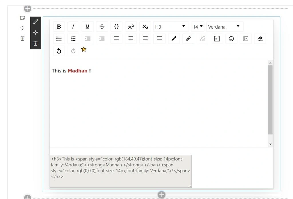
In this example, I am using the concept of hashtag, mentions, custom options, etc... To set the value to texteditor, use the following method for controlled component.
- this.state = {
- editorState: EditorState.createWithContent(
- ContentState.createFromBlockArray(
- convertFromHTML('<p>Helo⭐<ins>as</ins><strong><ins>asdsadsfsd </ins></strong><sup><strong><ins>scfsds</ins></strong></sup></p>')
- )
- ),
- };
- let hashConfig = {
- trigger: '#',
- separator: ' ',
- };
- draftToHtml(convertToRaw(editorState.getCurrentContent()), hashConfig)
- mention={{
- separator: ' ',
- trigger: '@',
- suggestions: [
- { text: 'APPLE', value: 'apple', url: 'apple' },
- { text: 'BANANA', value: 'banana', url: 'banana' },
- { text: 'CHERRY', value: 'cherry', url: 'cherry' },
- { text: 'DURIAN', value: 'durian', url: 'durian' },
- { text: 'EGGFRUIT', value: 'eggfruit', url: 'eggfruit' },
- { text: 'FIG', value: 'fig', url: 'fig' },
- { text: 'GRAPEFRUIT', value: 'grapefruit', url: 'grapefruit' },
- { text: 'HONEYDEW', value: 'honeydew', url: 'honeydew' },
- ],
- }}
- hashtag={{}}
For more examples, please click here.
Hope this helps someone, Happy Coding :)
Michael Feng WanPosted Jul 1, 2024, 8:53 PM
Thanks for sharing, looks great. Do you have updated code can work in [email protected], [email protected]?
Julio MunozPosted Jun 28, 2021, 3:36 PM
Thank you for sharing, Only I have a question, I am testing this control and work fine, but when I set the HTML value in its state using `htmlToDraft`I can assign a html markup as a value because lost the markup, i.e, I assigne `<p class="ms-rteElement-Note-default">Hello I am here</p>` but when I see the value, only I found `<p>Hello I am here</p>` Do you have any ideat how to do that? Thanks in advace to answer me :)
Bharath Radhekrishna ChennuPosted Dec 9, 2019, 1:17 PM
Thanks for nice post