

Introduction:
This article discusses the construction of a custom control used to add a
scrollable Picturebox control to a project. There are different ways to scroll
an image; it can be done using GDI+ for example, but the approach used in this
demo is based upon what I feel is the easiest approach; that being to just
scroll a full sized image contained within a panel control set to auto size. By
building the control as a custom control, you can reuse in any application where
you might need to provide such capability.
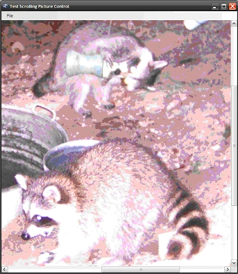
Figure 1: Custom Control Loaded into a Test Application
Since the control is based upon the panel control, you will pick up all of the
properties contained in the panel control which will make this simple control
immediately more useful (for example, you will be able to dock the control into
a form).
Getting Started:
In order to get started, unzip the included project and open the solution in the
Visual Studio 2008 environment. There are two projects contained in the
solution. TestControl is the first project and it is Windows form application
used to test the custom control. The second project (XPicboxVB) is class library
containing a single custom control called XtendPicBox.vb.
In the solution explorer, you should note these items:
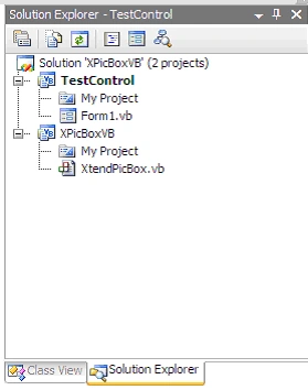
Figure 2: Solution Explorer
The Custom Control (XtendPicBox.vb)
The extended picture box custom control contains everything necessary to display
an image in a scrollable container. The control itself is an extension of the
panel control. Within the extended control, a picture box control is configured
and added to the panel's control collection. When the control is initialized,
the picture box is set to the upper left corner of the control and its size mode
is set to normal. Properties within the control are used to both limit the
consumer's access to the auto scroll property of the panel control (it has to be
set to true in order for the image to scroll) and to allow the consumer to set
the image file displayed in the inner picture box at both design and runtime.
The custom control class begins with the following library imports:
Imports
System.ComponentModel
Imports
System.Drawing
Imports
System.Windows.Forms
Following the imports, the class is defined. A constructor is added as are a
collection of local member variables. The local member variables include the
declaration of the inner Picturebox control, the path to the Picturebox image,
and a Boolean value used to set auto scroll to true (for the extended panel
control). The constructor is used to configure the Picturebox and to add the
Picturebox control to the extended panel control.
''' <summary>
''' Extend the standard panel control
''' to serve as a scrollable picture
''' box control
''' </summary>
''' <remarks></remarks>
Public Class XtendPicBox
Inherits
Panel
#Region "Local Member Variables"
''' <summary>
''' Collection of member variables used to
''' support the display of the picturebox,
''' maintain the path to the image file,
''' and to lock the panel into remaining in
''' auto scroll mode
''' </summary>
''' <remarks></remarks>
Private innerPicture As New PictureBox()
Private mPictureFile As String = String.Empty
Private
mAutoScroll As
Boolean = True
#End
Region
#Region "Constructor"
''' <summary>
''' Constructor - set up the inner
''' picture box so that is plants itself
''' in the top left corner of the panel
''' and so that its size mode is always
''' set to normal. At normal, the picture
''' will appear at full size.
''' </summary>
Public Sub New()
InitializeComponent()
' add the inner picture
innerPicture.Top = 0
innerPicture.Left = 0
innerPicture.SizeMode = PictureBoxSizeMode.Normal
Controls.Add(innerPicture)
End Sub
#End
Region
Next up are the custom control's
properties. The first property is used to set the image file to be displayed
within the inner Picturebox control. Attributes are set to describe the purpose
of the property when that property is used within the IDE; the attributes also
specify that the property will be set using the file name editor; this will
support opening a file browser window within the IDE at design time if the
control consumer chooses to set the image file at design time. If the editor
were not specified here, the control consumer would have to key in the path the
image file.
The second property merely overrides the extended panel control's auto scroll
property. By overriding the property and setting up the Browsable attribute to
false, the control consumer will be denied the ability to set the property using
the property editor at design time. Since we always want the panel's auto scroll
property set to true, we block access to the property and set the value within
the custom control's code.
#Region "Properties"
''' <summary>
''' Maintain the path to the current
''' inner picture box image file
''' </summary>
''' <value></value>
''' <returns></returns>
''' <remarks></remarks>
<Category("Image File")> _
<Browsable(True)> _
<Description("Set path to image file.")> _
<Editor(GetType(System.Windows.Forms.Design.FileNameEditor), _
GetType(System.Drawing.Design.UITypeEditor))> _
Public
Property PictureFile()
As String
Get
Return mPictureFile
End Get
Set(ByVal value As String)
mPictureFile = value
If String.IsNullOrEmpty(mPictureFile) = False Then
' set the image to the image file
innerPicture.Image = Image.FromFile(mPictureFile)
' resize the image to match the image file
innerPicture.Size = innerPicture.Image.Size
End If
End Set
End
Property
''' <summary>
''' Override the auto scroll property
''' and use the browsable attribute
''' to hide it from control consumer
''' The property will always be set
''' to true so that the picturebox will
''' always scroll
''' </summary>
<Browsable(False)> _
Public Overrides Property AutoScroll() As Boolean
Get
Return mAutoScroll
End Get
Set(ByVal value As Boolean)
mAutoScroll = value
End Set
End Property
#End Region
End
Class
That is all there is to building the custom control. Once compiled, you may use
the control in any project where this sort of functionality is needed.
The Test Form (Form1.vb).
Looking at the test project, you will find a single form containing a menu with
File->Open and File->Exit functions defined and you will find a single instance
of the custom control. The custom control is docked full within the form. There
is not a lot of code here to worry about; the file open method does demonstrate
the ability to set the control's image file at runtime so you might want to take
a look at that. The entire body of code for the test form is as follows:
Public
Class Form1
Private Sub openToolStripMenuItem_Click(ByVal _
sender As System.Object, ByVal e As System.EventArgs) _
Handles
openToolStripMenuItem.Click
' create new open file dialog
Dim
openFileDialog1 As
New OpenFileDialog()
' configure the open file dialong
openFileDialog1.Title = "Open Image File"
openFileDialog1.Filter = "Bitmap Files|*.bmp" + _"|Enhanced Windows MetaFile|*.emf" + _"|Exchangeable ImageFile| *.exif" + _"|Gif Files|*.gif|Icons|*.ico|JPEG Files|*.jpg" + _"|PNG Files|*.png|TIFF Files|*.tif|Windows MetaFile|*.wmf"
openFileDialog1.FilterIndex = 6
openFileDialog1.FileName = String.Empty
' show the dialog to the user
openFileDialog1.ShowDialog()
' if the user returns an empty path to an image
' file, return and do nothing
If String.IsNullOrEmpty(openFileDialog1.FileName) = True Then
Return
End If
' set the extended picturebox control's
' image to the open file dialog's filename
xtendPicBox1.PictureFile = openFileDialog1.FileName
End
Sub
''' <summary>
''' Standard application exit call
''' </summary>
''' <param name="sender"></param>
''' <param name="e"></param>
''' <remarks></remarks>
Private Sub exitToolStripMenuItem_Click(ByVal _
sender As System.Object, ByVal e As System.EventArgs) _
Handles exitToolStripMenuItem.Click
' shut it down
Application.Exit()
End Sub
End Class
Summary
This solution provides a custom control which may be used to display
image files in a scrollable container. The methods used within the control are
nothing new or novel; the project does provide a simple example of how to
construct a custom control, how to extend an existing control, and how to add
design time support to a custom control. The same approaches to building this
custom control may be applied to constructing other custom controls.
Join the conversation! Your thoughts help the community grow.