

Microsoft rolled out a new modern look and feel for the Office 365 environment for the first release users. During the roll out, I have received that update to my trial account.
Here, I want to share my experience with everyone and in my previous post, “SharePoint site contents in modern look", I have summarized the different sections in the site contents page. In the same way in this post, we are going to see the different sections available in the document library view page.
The new modern look provides a lot of user friendly options like edit item, new field creation, manage column in views etc. in a single page, instead of navigating between the different pages.
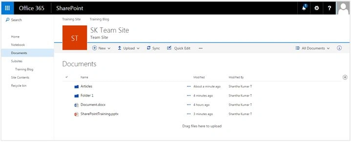
Figure 1 - Modern SharePoint Document Library
In a new look, the document library view is categorized in the sections given below:
Common Sections
- Top Bar
- Search Box
- Quick Launch
- Top Navigation
- Header
Page Specific Sections
- Command Bar
- Breadcrumb Bar
- List Contents
- Detail Pane
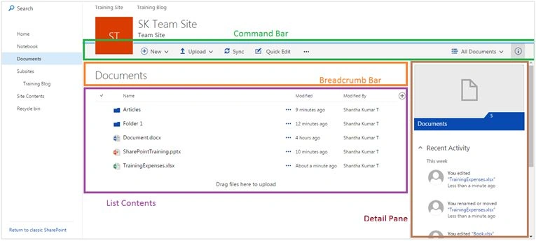
Figure 2 - SharePoint Library sections
The common sections are the same place holders, similar to the previous versions. So, here I’ll only summarize the document library view sections.
Command Bar
Command bar is a new feature in SharePoint. Modern UI experience and this command bar is a replacement for the ribbon interface, used in previous SharePoint versions.
This command bar contains the links/buttons, used to do different options like:
- Creating a new document or afolder
- Copying a file
- Moving a file
- Switch view format b/w tabular & tile etc.
The screenshot, given below, shows the updated commands in the command bar for the folder selection.

Figure 3 - Command bar for folder selection
Commands or the links within this command bar dynamically change, based on the user selection in the list contents section.
Breadcrumb Bar
Breadcrumb bar is updated in new UI. It shows header (Library Name) in top view. In sub folder, it hides the header information and shows the breadcrumb navigation, based on the folder selection.

Figure 4 - Breadcrumb Bar for sub folder
List Contents
The UI for displaying the contents to the library has changed to a great extent. There is no use of XSLT List View webpart or Data Form Webpart. For now, render the contents to the list by using a combination of knockout js and react js frameworks (this may change in the future).

Figure 5 - List Contents section with Contextual Menu
The selection of the items and the contex of the menu structure is updated with new UI and it provides a better user experience.
Details Pane
List contents and info pane sections are available in a single container and are based on the selection of items. The right pane area expands and shows the details of the pane on the right of the list contents section.
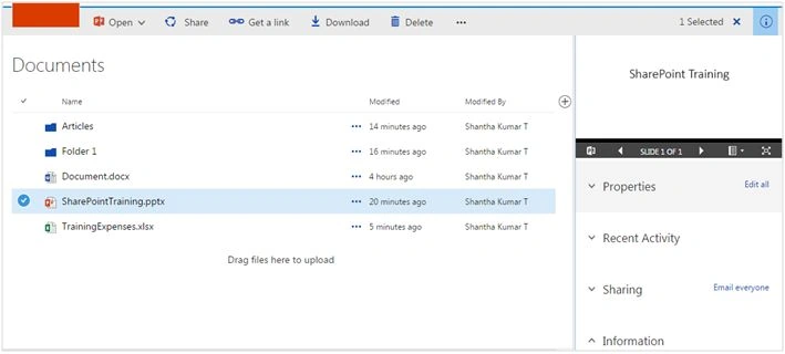
Figure 6 - Details Pane for the selected file
The detail pane shows the five types of information,
- Preview - Preview the image of the selected item.
- Properties - User can view/ update the property for the selected item.
- Recent Activity - It helps to list the recent activities that happened to the selected item.
- Sharing - It helps to manage the permissions for the selected item.
- Information - It gives summary information about the file.
The number of interactions that happened among all the sections is based on any item selection. For example, right-click on the list contents section, that opens a context menu for the list. The total number of selections changes dynamically in the command bar etc.
I’ll cover more information in upcoming posts. Happy learning.
Santhakumar MunuswamyPosted Jun 25, 2016, 2:51 AM
Nice share
Abhay ShankerPosted Jun 19, 2016, 4:52 AM
Nice...
Vignesh ManiPosted Jun 17, 2016, 5:38 AM
Nice
Prasham SabadraPosted Jun 16, 2016, 2:05 AM
Thanks for Sharing!!!
Thiruppathi RPosted Jun 16, 2016, 1:01 AM
Good..
Humayun Kabir MamunPosted Jun 15, 2016, 11:58 PM
Nice...