

XAML is the universal language for Windows Presentation Foundation (WPF), Silverlight, and Windows Store app user interfaces such as Windows, Pages and controls. In this article, we will learn how to create and use styles on UI elements using XAML. Once you know how this is done in XAML, you can use the same approach in your WPF, Silverlight, and Windows Store apps.
This sample is created using a WPF application using Visual Studio 2012.
Styling is a way to group similar properties in a single Style element and apply on multiple XAML elements.
Let's have a look at the XAML code in Listing 1 that generates Figure 1. This code creates a Window with three Button controls, a TextBlock, and a TextBox.
xmlns="http://schemas.microsoft.com/winfx/2006/xaml/presentation"
xmlns:x="http://schemas.microsoft.com/winfx/2006/xaml"
Title="Window1" Height="291" Width="455">
<Grid Height="236" Width="405">
<TextBlock Margin="12,52,26,83" Name="textBlock1"
Background="Gray" Foreground="Orange" FontFamily="Georgia" FontSize="12"
Width="370" Height="100" />
<TextBox Height="30" Margin="11,16,155,0" Name="textBox1" VerticalAlignment="Top" />
<Button HorizontalAlignment="Right" Margin="0,14,26,0"
Name="button1" VerticalAlignment="Top"
Height="30" Width="120"
FontFamily="Verdana" FontSize="14" FontWeight="Normal"
Foreground="White" Background="DarkGreen"
BorderBrush="Black" >
Browse
</Button>
<Button HorizontalAlignment="Right" Margin="0,0,30,39" Name="button2"
VerticalAlignment="Bottom"
Height="30" Width="120"
FontFamily="Verdana" FontSize="14" FontWeight="Normal"
Foreground="White" Background="DarkGreen"
BorderBrush="Black" >
Spell Check
</Button>
<Button Margin="129,0,156,39" Name="button3" VerticalAlignment="Bottom"
Height="30" FontFamily="Verdana" FontSize="14" FontWeight="Normal"
Foreground="White" Background="DarkGreen"
BorderBrush="Black" >
Save File
</Button>
</Grid>
</Window> |
Listing 1
The output of Listing 1 XAML creates a window that looks like Figure 1. As you can see from Figure 1, all three buttons have the same width, height, background, foreground, and fonts.
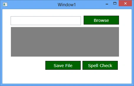
Figure 1
Here is the Button element code that sets Height, Width, Foreground, Background, and Font properties.
Name="button1" VerticalAlignment="Top"
Height="30" Width="120"
FontFamily="Verdana" FontSize="14" FontWeight="Normal"
Foreground="White" Background="DarkGreen"
BorderBrush="Black" >
Browse
</Button> |
All of the three buttons have the same values.
Now, imagine you have a large application with many windows and pages and they have many buttons with the same size and look. That means you will have to repeat the same XAML in every window that you need a Button.
Let's say, your application is finished and now your client wants to change a green background color to a red background color. You will have to go to each page and find and change the background color from green to red.
But there is a better way to do that. You can create a resource style and use that for every Button control. The next time that you need to change a property, all you need to do is change the value in the resource.
The Style element in XAML represents a style. A Style element is usually added to the resources of a FrameworkElement. The x:Key is the unique key identifier of the style. The TargetType is the element type such as a Button.
The code snippet in Listing 2 adds a Style to the Window Resources and within the Style we use a Setter to set the property type and their values. The code snippet sets Width, Height, FontFamily, FontSize, FontWeight, Foreground, Background, and BorderBrush properties.
<!-- Green Button Style -->
<Style x:Key="GreenButtonStyle" TargetType="Button" >
<Setter Property="Width" Value="120"/>
<Setter Property="Height" Value="30"/>
<Setter Property="FontFamily" Value="Verdana"/>
<Setter Property="FontSize" Value="14"/>
<Setter Property="FontWeight" Value="Normal"/>
<Setter Property="Foreground" Value="White"/>
<Setter Property="Background" Value="DarkGreen"/>
<Setter Property="BorderBrush" Value="Black"/>
</Style>
</Window.Resources> |
Listing 2
Note: If you do not specify the TargetType, you can explicitly specify it in the Setter as in the following:
<Setter Property="Button.Width" Value="120"/>
Once a Style is added to the resource dictionary, you can use it by using the Style property of a FrameworkElement. The code snippet in Listing 3 sets the Style of a Button using the StaticResource Markup Extension.
Name="button1" VerticalAlignment="Top"
Style="{StaticResource GreenButtonStyle}" >
Browse
</Button> |
Listing 3
Now we can replace Listing 1 with much cleaner and manageable code listed in Listing 4. If we need to change the background color of Buttons from green to red, all we have to do is, change the Background property in the resources.
xmlns="http://schemas.microsoft.com/winfx/2006/xaml/presentation"
xmlns:x="http://schemas.microsoft.com/winfx/2006/xaml"
Title="Window1" Height="291" Width="455">
<Window.Resources>
<Style x:Key="GreenButtonStyle" TargetType="Button" >
<Setter Property="Width" Value="120"/>
<Setter Property="Height" Value="30"/>
<Setter Property="FontFamily" Value="Verdana"/>
<Setter Property="FontSize" Value="14"/>
<Setter Property="FontWeight" Value="Normal"/>
<Setter Property="Foreground" Value="White"/>
<Setter Property="Background" Value="DarkGreen"/>
<Setter Property="BorderBrush" Value="Black"/>
</Style>
</Window.Resources>
<Grid Height="236" Width="405">
<TextBlock Margin="12,52,26,83" Name="textBlock1"
Background="Gray" Foreground="Orange"
FontFamily="Georgia" FontSize="12"
Width="370" Height="100" />
<TextBox Height="30" Margin="11,16,155,0" Name="textBox1" VerticalAlignment="Top" />
<Button HorizontalAlignment="Right" Margin="0,14,26,0"
Name="button1" VerticalAlignment="Top"
Style="{StaticResource GreenButtonStyle}" >
Browse
</Button>
<Button HorizontalAlignment="Right" Margin="0,0,30,39" Name="button2"
VerticalAlignment="Bottom"
Style="{StaticResource GreenButtonStyle}" >
Spell Check
</Button>
<Button Margin="129,0,156,39" Name="button3" VerticalAlignment="Bottom"
Style="{StaticResource GreenButtonStyle}" >
Save File
</Button>
</Grid>
</Window> |
Join the conversation! Your thoughts help the community grow.