

The Tab control is a common UI element that has been around for some time. It makes a convenient way to organize your window when there is more than could realistically fit and still be comprehensible. Tab Control is easier in Windows Presentation Foundation. Thanks to XAML, you can build a tab control from scratch with markup codes.
Two elements play main roles in building a tab control,
- TabControl and
- TabItem
TabControl is the container of one or more TabItem elements as follows.
- <TabControl>
- <TabItem Header="Tab 1">xyz</TabItem>
- <TabItem Header="Tab 2">abc</TabItem>
- </TabControl>
In WPF, Tabs are very easy to implement. Create a new WPF Window, remove the default Grid tags, and add the following XAML:
- <TabControl>
- <TabItem Header="Tab 1">xyz</TabItem>
- <TabItem Header="Tab 2">abc</TabItem>
- </TabControl>
Window1.xaml
- <Window x:Class="TabControl.Window1" xmlns=http://schemas.microsoft.com/winfx/2006/xaml/presentation xmlns:x=http://schemas.microsoft.com/winfx/2006/xaml Title="Window1" Height="300" Width="500">
- <ScrollViewer HorizontalScrollBarVisibility="Auto" VerticalScrollBarVisibility="Auto">
- <StackPanel>
- <Border Background="#99FFFFFF" BorderBrush="#CCCCFF" BorderThickness="2" HorizontalAlignment="Left" Padding="20" Margin="20,10,0,0" Width="400">
- <TabControl Name="Tabs1" TabStripPlacement="Top" Background="LightGray" BorderBrush="Blue" Margin="10,10,0,5">
- <TabItem Header="Name" IsSelected="True" Background="Gray">
- <TextBlock Height="150" Width="200" Margin="0,10,120,0">
- <Bold>Purushottam Rathore</Bold>
- </TextBlock>
- </TabItem>
- <TabItem Header="Image" Background="Gray">
- <Image Source="ballon.gif" Height="150" Width="200" />
- </TabItem>
- <TabItem Header="Hotels" Background="Gray">
- <Image Source="r.jpg" Height="150" Width="200" />
- </TabItem>
- <TabItem Header="Contact Us" Background="Gray">
- <Grid Height="150" Width="300">
- <Grid.RowDefinitions>
- <RowDefinition></RowDefinition>
- <RowDefinition></RowDefinition>
- <RowDefinition></RowDefinition>
- </Grid.RowDefinitions>
- <Grid.ColumnDefinitions>
- <ColumnDefinition Width="*"></ColumnDefinition>
- <ColumnDefinition Width="2*"></ColumnDefinition>
- </Grid.ColumnDefinitions>
- <Label HorizontalAlignment="Right" Margin="0,12,0,0" Width="42.033"> Name:</Label>
- <Label Grid.Row="1" HorizontalAlignment="Right" Margin="0,14,0,0" Width="40.097"> Email:</Label>
- <TextBox Name="Name" Grid.Column="1" Margin="0,0,0,13" />
- <TextBox Name="Email" Grid.Column="1" Grid.Row="1" Margin="0,14,0,0" />
- <ButtonGrid.Column="1" Grid.Row="2" Width="75" HorizontalAlignment="Left" Name="CoolTabButton" Click="CoolTabButton_Click" Margin="0,15,0,12">OK</Button>
- </Grid>
- </TabItem>
- </TabControl>
- </Border>
- </StackPanel>
- </ScrollViewer>
- </Window>
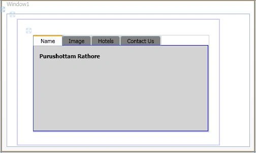
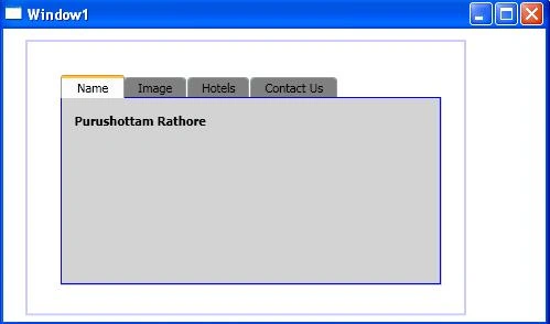
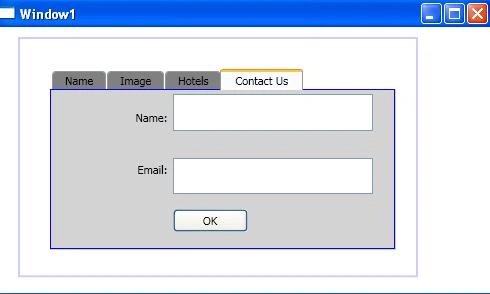
TabItem contain the IsSelected property. if you write IsSelected="True" then that tab will select by default. In this example I have written IsSelected="True" in first tab so the first tab named "Name" is selected by default (in the above figure).
Window1.xaml.cs
- using System;
- using System.Collections.Generic;
- using System.Linq;
- using System.Text;
- using System.Windows;
- using System.Windows.Controls;
- using System.Windows.Data;
- using System.Windows.Documents;
- using System.Windows.Input;
- using System.Windows.Media;
- using System.Windows.Media.Imaging;
- using System.Windows.Navigation;
- using System.Windows.Shapes;
- namespace TabControl {
- publicpartialclassWindow1: Window {
- public Window1() {
- InitializeComponent();
- }
- privatevoid CoolTabButton_Click(object sender, RoutedEventArgs e) {
- TabItem ti = Tabs1.SelectedItem asTabItem;
- MessageBox.Show("This is " + ti.Header + " tab");
- }
- }
- }
TabStripPlacement is an attribute that lets you change the position of tab strip (default is Top). There are four attributes of TabStripPlacement.
- Top
- Left
- Right
- Bottom
If you write TabStripPlacement="Bottom" then you will get the following output:
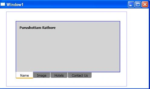
Figure 6: Tabs are at bottom position
How to add a Context Menu to a Tab Control
TabItem.ContextMenu is used to add a ContextMenu to a TabItem. The following code snippet creates a TabControl where the first TabItem has a ContextMenu with three Menu items.
- <TabControl>
- <TabItem Name="ColorTabItem" Header="Color Tab">
- <TabItem.ContextMenu>
- <ContextMenu MenuItem.Click="ContextMenuClickEventHandler">
- <MenuItem Header="Red" Name="RedMenuItem" />
- <MenuItem Header="Blue" Name="BlueMenuItem" />
- <MenuItem Header="Orange" Name="OrangeMenuItem" />
- </ContextMenu>
- </TabItem.ContextMenu>
- <TabItem.Content> Tab Item data here </TabItem.Content>
- </TabItem>
- <TabItem Name="ShapeTabItem" Header="Shape Tab"></TabItem>
- </TabControl>
Write this click event handler to your code behind.
- void ContextMenuClickEventHandler(object sender, RoutedEventArgs e) {
- if (e.Source == RedMenuItem) {
- ColorTabItem.Header = "Red Item";
- ColorTabItem.Foreground = Brushes.Red;
- } else if (e.Source == BlueMenuItem) {
- ColorTabItem.Header = "Blue Item";
- ColorTabItem.Foreground = Brushes.Blue;
- } else if (e.Source == OrangeMenuItem) {
- ColorTabItem.Header = "Orange Item";
- ColorTabItem.Foreground = Brushes.Orange;
- }
- }
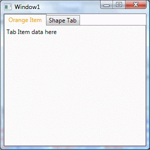
The output looks like this. Download the attached project for more details.
Ali HamzaPosted Jan 12, 2018, 12:15 AM
Thank you. I hope, this will help me in my learning process and my current project was based on this.
David WPosted Sep 18, 2014, 9:53 AM
Thank you. This will help me in my learning process and help me for my current project
Kiran Kumar TalikotiPosted Oct 7, 2013, 7:37 AM
Thanks Sudeep:)
sudeep s kanakagiriPosted Oct 7, 2013, 5:23 AM
Nice work kiran..keep it up