

Today, 3.17 billion people worldwide access the Internet, according to a Statista report. Can you guess how many of these people access the Internet on their mobile phones? More than 60% of population access use smartphones to browse the Internet. That is why, as software developers and website creators, it is very important to develop mobile friendly websites, a responsive website.
From Responsive web design basics:
Responsive web design, originally defined by Ethan Marcotte in A List Apart responds to the needs of the users and the devices they’re using. The layout changes based on the size and capabilities of the device. For example, on a phone, users would see content shown in a single column view; a tablet might show the same content in two columns.
As a web developer, how do you know if a website is responsive or not? Fortunately, there are several free and paid tools available to test responsive web design.
In this article, I will list few of these tools that we often use in our web projects.
TestMySite by thinkwithGoogle
TestMySite is one of the coolest tool Google recently launched that lets you test your website for mobile friendliness, performance, and speed on desktop and mobile devices. The tool is powered Google’s Search Console’s mobile friendly feature and PageSpeed Insights.
URL: https://testmysite.thinkwithgoogle.com/
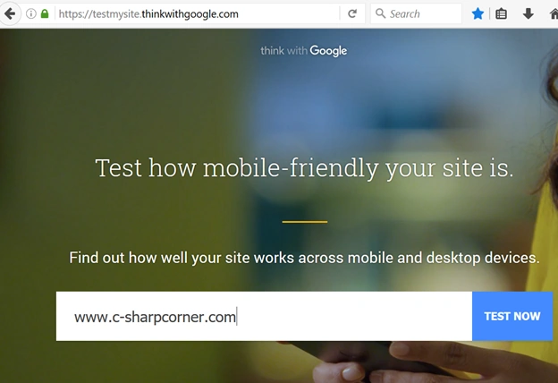
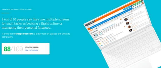
I just checked www.c-sharpcorner.com website with the tool and the results look like the following:
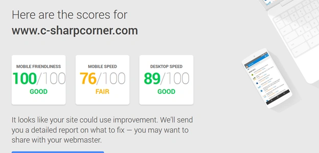
As you can see from the above report, TestMyWebsite not only check the mobile friendliness of a website but also checks for mobile and desktop speed.
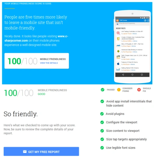
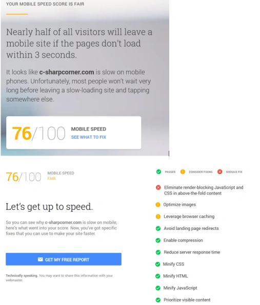
Your mobile friendliness and speed results are self explanatory.
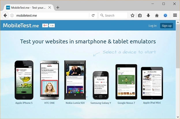
MobileTest.me
The mobiletest.me website lets you browse a URL on different device sizes.
Select your desired device, type a URL and you are good to go.
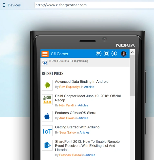
Once a website is loaded an emulator, you can browse the website and its functionality.
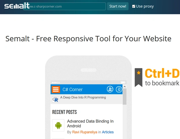
Semalt.design
Semalt.design is a free responsive to test websites.
Once a website is loaded, you will see different device sizes and how your website looks on those sizes. The emulators let you also navigate through website functionality.
Summary
In this article, I talked about three useful and free tools to test responsiveness of your website. Developers and testers should take advantage of these tools to build better web experience.
DeepanPosted Jan 22, 2018, 1:53 AM
Thanks for sharing..
Humayun Kabir MamunPosted Jul 11, 2016, 3:02 AM
Thanks a lot...
Ravi PatelPosted Jul 9, 2016, 7:46 AM
Useful thanks for sharing
veera muthuPosted Jul 8, 2016, 12:38 AM
Thankyou sir.. its very useful....
Kameshwar RoyPosted Jul 3, 2016, 12:30 PM
Thanks a lot Mahesh sir , useful article !
Ehsan SajjadPosted Jul 2, 2016, 8:40 PM
Informative. Thanks for sharing
Shaili DashoraPosted Jul 1, 2016, 4:39 AM
Nice one thanks Mahesh Chand sir
Vignesh ManiPosted Jun 30, 2016, 5:46 PM
Good one sir
kalu singh raoPosted Jun 30, 2016, 1:38 AM
Nice...
Santhakumar MunuswamyPosted Jun 30, 2016, 12:44 AM
Thank you for nice article sir
RajaPosted Jun 30, 2016, 12:28 AM
Good One...
Muhammad Aqib ShehzadPosted Jun 29, 2016, 9:17 AM
I have used the google tool its very nice and smart. we must focus on the betterment of our websites by the use of these tools.
Samir BhogaytaPosted Jun 29, 2016, 6:14 AM
Thank you very much for sharing sir..
Suthish NairPosted Jun 29, 2016, 5:10 AM
Interesting...
Nishan BalasooriyaPosted Jun 29, 2016, 5:04 AM
Very useful article sir.Thanks
Suresh MogudalaPosted Jun 29, 2016, 3:35 AM
Thanks Mahesh Chand sir, I have tested my blogs and I need to improve more on that.
Nikhil SanganiPosted Jun 29, 2016, 2:47 AM
Thanks for sharing such a useful article.
Manoj KulkarniPosted Jun 29, 2016, 2:12 AM
Thank you for sharing sir
Nitesh KejriwalPosted Jun 29, 2016, 12:43 AM
We can also do using https://developers.google.com/speed/pagespeed/insights/