

When we build apps in PowerApps, one common challenge is making sure the app looks good and works properly on every device. Sometimes an app looks perfect on a laptop but feels completely broken on a mobile screen. That’s where responsive design becomes really important.
Responsive design simply means your app adjusts itself based on the screen size. Instead of creating separate apps for mobile, tablet, and desktop, you design one app that automatically fits everywhere.
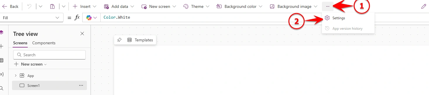
To start using responsive design in PowerApps, you first need to enable it from the app settings. Open your app, click on the three dots, go to Settings, then select Display and set App layout to Responsive.
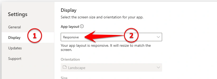
Once you select this, your app will start behaving differently, meaning it will adjust based on screen size instead of sticking to fixed positions.
Now, one important concept you should understand is breakpoints. Breakpoints help PowerApps decide how your app should behave on different screen sizes.
To check SizeBreakpoints, select the App and then choose the SizeBreakpoints property from the top bar as shown in below image.
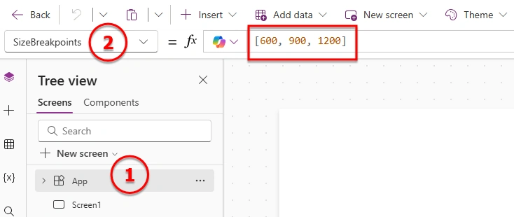
By default, you will see values like [600, 900, 1200]. These numbers represent screen width. If the width is up to 600, it is considered a mobile screen. Between 600 and 900, it behaves like a tablet. From 900 to 1200, it fits smaller laptop screens, and anything above that works for larger desktop screens.
So based on these values, your app can change its layout. For example, on mobile you may want everything in a single column. On a tablet, you can arrange things side by side. On a desktop, you can show more content in a wider layout. This helps users get a better experience on any device.
Another important thing in responsive design is avoiding fixed positioning. Instead of setting exact X and Y values everywhere, it’s better to use flexible properties like Parent.Width and Parent.Height. This allows controls to adjust automatically when the screen size changes.
Using containers also makes your life easier. You can group controls and manage layout in a cleaner way. Along with that, try to keep width and height flexible instead of fixed numbers, so your UI can expand as needed.
Spacing is something you should not ignore. On larger screens, elements need proper spacing so they don’t look crowded. On smaller screens, spacing should be balanced so nothing feels too tight or too far apart.
Finally, always test your app on different screen sizes. Try resizing your browser or using preview mode to see how your app behaves. This helps you catch layout issues early.
In simple words, responsive design in PowerApps is about making your app smart enough to adjust itself. Once you start using responsive layout, breakpoints, and flexible design, your app will feel much better on any device.
Join the conversation! Your thoughts help the community grow.