

This chapter is taken from book "Programming Windows Phone 7" by Charles Petzold published by Microsoft press. http://www.charlespetzold.com/phone/index.html
The template is easily one of the most powerful features in Silverlight, and perhaps one of the most difficult. For that reason, many developers swear by Expression Blend to generate their templates. This article will demonstrate how to write templates by hand so you'll be in a better position to understand Expression Blend output if you later decide to go that route.
ContentControl and DataTemplate
If that object derives from FrameworkElement (such as TextBlock or Image), then the element is displayed inside the ContentControl. But you can also set the Content property to an object that does not derive from FrameworkElement. Here's the Content of a Button set to a RadialGradientBrush:
<Button HorizontalAlignment="Center"
VerticalAlignment="Center">
<RadialGradientBrush>
<GradientStop Offset="0" Color="Blue" />
<GradientStop Offset="1" Color="AliceBlue" />
</RadialGradientBrush>
</Button>
Normally you'd set the Foreground property of a Button to a brush, or the Background property, or perhaps the BorderBrush property. But setting the Content property to a brush? What does that even mean?
If the object set to the Content property of a ControlControl does not derive from FrameworkElement, it is rendered with its ToString method, and if the class has no ToString override, the fully-qualified class name is displayed, so this particular Button looks like this:
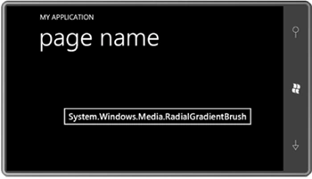
This is not exactly something you want to use to show off your programming skills to your friends.
The existence of the DataTemplate means that you really can set the content of a Button to a RadialGradientBrush just as long as you define a visual tree that makes use of that brush in the DataTemplate:
<Button HorizontalAlignment="Center"
VerticalAlignment="Center">
<RadialGradientBrush>
<GradientStop Offset="0" Color="Blue" />
<GradientStop Offset="1" Color="AliceBlue" />
</RadialGradientBrush>
<Button.ContentTemplate>
<DataTemplate>
<Ellipse Width="100"
Height="100"
Fill="{Binding}" />
</DataTemplate>
</Button.ContentTemplate>
</Button>
Notice the Fill property setting of the Ellipse. It's just a Binding markup extension with no Path settings set. The Fill property doesn't want a particular property of the RadialGradientBrush. It wants the whole thing. Here's the Button:
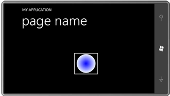
You can use this technique with any ContentControl derivative, or even ContentControl itself.
Let's define that DataTemplate in the Resources collection of a MainPage.xaml files:
<phone:PhoneApplicationPage.Resources>
<DataTemplate x:Key="brushTemplate">
<Ellipse Width="100"
Height="100"
Fill="{Binding}" />
</DataTemplate>
</phone:PhoneApplicationPage.Resources>
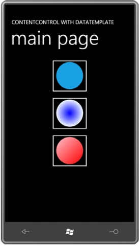
Let's give the content panel of this page three Button instances, each
with its ContentTemplate property set to that resource, but with three
different types of Brush objects set to the Content property:
<Grid x:Name="ContentPanel" Grid.Row="1" Margin="12,0,12,0">
<StackPanel>
<Button HorizontalAlignment="Center"
ContentTemplate="{StaticResource brushTemplate}">
<SolidColorBrush Color="{StaticResource PhoneAccentColor}" />
</Button>
<Button HorizontalAlignment="Center"
ContentTemplate="{StaticResource brushTemplate}">
<RadialGradientBrush>
<GradientStop Offset="0" Color="Blue" />
<GradientStop Offset="1" Color="AliceBlue" />
</RadialGradientBrush>
</Button>
<Button HorizontalAlignment="Center"
ContentTemplate="{StaticResource brushTemplate}">
<LinearGradientBrush>
<GradientStop Offset="0" Color="Pink" />
<GradientStop Offset="1" Color="Red" />
</LinearGradientBrush>
</Button>
</StackPanel>
</Grid>
Here's the result:
Examining the Visual Tree
I've been mentioning visual trees. Let's look at a example:
The ButtonTree program lets you dump the visual tree for
a rather conventional Button
(one with its Content
just set to text), a
Button with its
Content property set
to an Image
element, and two others with their Content
properties set to the
RadialGradientBrush
and Clock (as
shown in the examples above) together with a
ContentTemplate. The
program's content Grid
displays each Button
in a cell:
<Grid
x:Name="ContentPanel"
Grid.Row="1"
Margin="12,0,12,0">
<Grid.RowDefinitions>
<RowDefinition
Height="Auto" />
<RowDefinition
Height="Auto" />
<RowDefinition
Height="*" />
</Grid.RowDefinitions>
<Grid.ColumnDefinitions>
<ColumnDefinition
Width="*" />
<ColumnDefinition
Width="*" />
</Grid.ColumnDefinitions>
<Button
Grid.Row="0"
Grid.Column="0"
Content="Click to Dump"
HorizontalAlignment="Center"
VerticalAlignment="Center"
Click="OnButtonClick"
/>
<Button
Grid.Row="0"
Grid.Column="1"
HorizontalAlignment="Center"
VerticalAlignment="Center"
Click="OnButtonClick">
<Image
Source="ApplicationIcon.png"
Stretch="None" />
</Button>
<Button
Grid.Row="1"
Grid.Column="0"
HorizontalAlignment="Center"
VerticalAlignment="Center"
Click="OnButtonClick">
<Button.Content>
<RadialGradientBrush>
<GradientStop
Offset="0"
Color="Blue" />
<GradientStop
Offset="1"
Color="AliceBlue" />
</RadialGradientBrush>
</Button.Content>
<Button.ContentTemplate>
<DataTemplate>
<Ellipse
Width="100"
Height="100"
Fill="{Binding}"
/>
</DataTemplate>
</Button.ContentTemplate>
</Button>
<Button
Grid.Row="1"
Grid.Column="1"
HorizontalAlignment="Center"
VerticalAlignment="Center"
Click="OnButtonClick">
<Button.Content>
<petzold:Clock
/>
</Button.Content>
<Button.ContentTemplate>
<DataTemplate>
<StackPanel>
<TextBlock
Text="The time is:"
TextAlignment="Center"
/>
<StackPanel
Orientation="Horizontal"
HorizontalAlignment="Center">
<TextBlock
Text="{Binding
Hour}" />
<TextBlock
Text=":" />
<TextBlock
Text="{Binding
Minute}" />
<TextBlock
Text=":" />
<TextBlock
Text="{Binding
Second}" />
</StackPanel>
</StackPanel>
</DataTemplate>
</Button.ContentTemplate>
</Button>
<ScrollViewer
Grid.Row="2"
Grid.Column="0"
Grid.ColumnSpan="2"
HorizontalScrollBarVisibility="Auto">
<StackPanel
Name="stackPanel" />
</ScrollViewer>
</Grid>
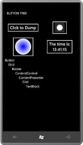
Way down at the bottom is a StackPanel inside a ScrollViewer for displaying the visual tree. The code-behind file uses the static VisualTreeHelper class for enumerating an element's children in a recursive method, and then displays their names in a hierarchical list:
void
OnButtonClick(object sender,
RoutedEventArgs args)
{
Button btn = sender
as Button;
stackPanel.Children.Clear();
DumpVisualTree(btn, 0);
}
void DumpVisualTree(DependencyObject
parent, int indent)
{
TextBlock txtblk =
new TextBlock();
txtblk.Text = String.Format("{0}{1}",
new string('
', 4 * indent),
parent.GetType().Name);
stackPanel.Children.Add(txtblk);
int numChildren =
VisualTreeHelper.GetChildrenCount(parent);
for (int
childIndex = 0; childIndex < numChildren; childIndex++)
{
DependencyObject child =
VisualTreeHelper.GetChild(parent,
childIndex);
DumpVisualTree(child, indent + 1);
}
}
Click the button in the upper-left corner that has its Content set to text and the program displays the visual tree of the Button:
ControlTemplate Basics
A DataTemplate allows you to customize the display of content in a ContentControl. The ControlTemplate-which you can set to the Template property of any Control-allows you to customize the appearance of the control itself-what's commonly referred to as the control "chrome."
Keep in mind that the ContentTemplate property is defined by ContentControl and is only something you'll find only in classes that derive from ContentControl. But the Template property is defined by Control, and it's presence is perhaps the primary distinction between controls and FrameworkElement derivatives like TextBlock and Image.
Whenever you think you need a custom control, you should ask yourself if it is truly a new control you need, or if it's merely a new look for an existing control. For example, suppose you need a control that has a particular appearance, and when you tap it, it changes appearance, and then you tap it again, it goes back to the original appearance. This is a ToggleButton with just different visuals-a different ControlTemplate.
Join the conversation! Your thoughts help the community grow.