Button style
Bootstrap provides different styles of buttons - Basic, Default, Success, Info, Warning, Danger, Link.
Bootstrap button classes
There are seven types of bootstrap button classes, as given below.
- .btn
- .btn-default
- .btn-success
- .btn-info
- .btn-warning
- .btn-danger
- .btn-link
| Class |
Description |
| Btn |
Default/ Standard button. |
| btn-primary |
Provides extra visual weight and identifies the primary action in a set of buttons. |
|
btn-success
|
Indicates a successful or positive action.
|
| btn-info |
Contextual button for informational alert messages. |
| btn-warning |
Indicates caution should be taken with this action. |
| btn-danger |
Indicates a dangerous or potentially negative action. |
| btn-link |
Deemphasize a button by making it look like a link while maintaining button behavior. |
The Button Classes can be used on
These three tags can use button classes to create buttons.
Using different button classes program
- <!DOCTYPE html>
- <html>
-
- <head>
- <title>Bootstrap Installation</title>
- <meta charset="utf-8">
- <meta name="viewport" content="width=device-width, initialscale=1">
- <link rel="stylesheet" type="text/css" href="css/bootstrap.min.css" </head>
-
- <body>
- <div class="container">
- <div class="row well">
- <h1 class="text-center page-header text-primary">Bootstrap Button</h1> <a href="#" class="btn">Basic</a> <a href="#" class="btn btn-default">Default</a> <a href="#" class="btn btn-primary">Primary</a> <button type="button" class="btn btn-warning">Warning</a>
-
- <button type="button” class="btn btn-info">Info </a>
-
- < button type="button" class="btn btn-success">Success</a>
-
- <input type="submit" class="btn btn-danger">Danger </a>
-
- <input type="submit" class="btn btn-link">Link </a>
-
- </div>
-
- </div>
-
- <script type="text/javascript" src="js/bootstrap.min.js"></script>
-
- <script type="text/css" src="js/jquery"></script>
-
- </body>
-
- </html>
Output

Button Size
Bootstrap provides buttons in four sizes - Large, medium, small, extrasmall.
We can define the different sizes as
- .btn-lg
- .btn-md
- .btn-sm
- .btn-xs
| Class |
Description |
| .btn-lg |
This makes the button size large. |
| .btn-sm |
This makes the button size small. |
| .btn-xs |
This makes the button size extra small. |
| .btn-block |
This creates block level buttons—those that span the full width of a parent. |
Different button sizes program
- <!DOCTYPE html>
- <html>
-
- <head>
- <title>Button size</title>
- <meta charset="utf-8">
- <meta name="viewport" content="width=device-width, initial scale=1">
- <link rel="stylesheet" type="text/css" href="css/bootstrap.min.css" </head>
-
- <body>
- <div class="container">
- <div class="row well">
- <h1 class="text-center page-header text-danger">Different Button size</h1> <button class="btn btn-lg btn-success">click here</button> <button class="btn btn-md btn-danger">click here</button> <button class="btn btn-sm btn-info">click here</button> <button class="btn btn-xs btn-warning">click here</button> </div>
- </div>
- <script type="text/javascript" src="js/bootstrap.min.js"></script>
- <script type="text/css" src="js/jquery"></script>
- </body>
-
- </html>
Output

Active/Disabled Buttons
Active State
- A button can be set to active (appear pressed and pressable) and disabled (unclickable) state.
- Buttons will appear pressed (with a darker background, darker border, and inset shadow) when active.
- The .active class is used to show that we can press the button.
| Element |
Class |
| Button element |
Use .active class to show that it is activated. |
| Anchor element |
Use .active class to <a> buttons to show that it is activated. |
Disabled
- Disable button makes unclickable movement.
- When you disable a button, it gets fade in color by 50%, and loses the gradient.
| Element |
Class |
| Button element |
Add the disabled attribute to <button> buttons. |
| Anchor element |
Add the disabled class to <a> buttons. |
Program for making buttons Active/Disabled
- <!DOCTYPE html>
- <html>
-
- <head>
- <title>Button size</title>
- <meta charset="utf-8">
- <meta name="viewport" content="width=device-width, initial scale=1">
- <link rel="stylesheet" type="text/css" href="css/bootstrap.min.css" </head>
-
- <body>
- <div class="container">
- <div class="row well">
- <h1 class="text-center page-header text-danger">Different Button size</h1> <button class="btn btn-success active">click here</button> <button class="btn btn-success disabled">click here</button> </div>
- </div>
- <script type="text/javascript" src="js/bootstrap.min.js"></script>
- <script type="text/css" src="js/jquery"></script>
- </body>
-
- </html>
Output 1

Example 2
- <!DOCTYPE html>
- <html>
-
- <head>
- <title>Button size</title>
- <meta charset="utf-8">
- <meta name="viewport" content="width=device-width, initial scale=1">
- <link rel="stylesheet" type="text/css" href="css/bootstrap.min.css" </head>
-
- <body>
- <p> <button type="button" class="btn btn-default btn-lg">
-
- Default Button
-
- </button> <button type="button" class="btn btn-default btn-lg" disabled="disabled">
-
- Disabled Button</button> </p>
- <p> <button type="button" class="btn btn-success btn-lg">
-
- Active button </button> <button type="button" class="btn btn-success btn-lg" disabled="disabled">
-
- Disabled Primary button</button> </p>
- <p> <a href="#" class="btn btn-info btn-lg" role="button">
-
- Active Link </a> <a href="#" class="btn btn-info btn-lg disabled" role="button">
-
- Disabled Link</a> </p>
- <script type="text/javascript" src="js/bootstrap.min.js"></script>
- <script type="text/css" src="js/jquery"></script>
- </body>
-
- </html>
- </p>
Output 2
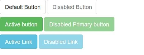
- The first button is active and the second button is disabled.
Block Level Buttons
- A block level button spans the entire width of the parent element.
- We can create a block level button using the following class.
.btn-block
Program for Block Level Buttons
- <!DOCTYPE html>
- <html>
-
- <head>
- <title>Button size</title>
- <meta charset="utf-8">
- <meta name="viewport" content="width=device-width, initial scale=1">
- <link rel="stylesheet" type="text/css" href="css/bootstrap.min.css"> </head>
-
- <body>
- <div class="container">
- <div class="row well col-md-12">
- <h1 class="text-center page-header text-danger">button block</h1> <button class="btn btn-success btn-block">click here</button> </div>
- </div>
- <script type="text/javascript" src="js/bootstrap.min.js"></script>
- <script type="text/css" src="js/jquery"></script>
- </body>
-
- </html>
Output

Button Group
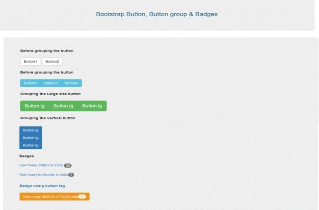
- We learned how to create ordinary buttons in the previous programs. Now, let's learn how to create the button group.
- Button group means removing the space between two buttons and group them together.
Badge
- Badge is used to highlight the information in a circle.
Button Group & Badge Example program
- <!DOCTYPE html>
- <html>
-
- <head>
- <title>Button size</title>
- <meta charset="utf-8">
- <meta name="viewport" content="width=device-width, initial scale=1">
- <link rel="stylesheet" type="text/css" href="css/bootstrap.min.css" </head>
-
- <body>
- <div class="container">
- <div class="jumbotron text-center">
- <h3 class="text-info">Bootstrap Button, Button group & Badges</h3>
- </div>
- <div class="container">
- <div class="jumbotron">
- </h4><b>Before grouping the button</b></h4><br><br> <button class="btn btn-default">Button1</button> <button class="btn btn-default">Button2</button> <br> <br> </h4><b>Before grouping the button</b></h4> <br> <br>
- <div class="btn-group"> <button class="btn btn-info">Button1</button> <button class="btn btn-info">Button2</button> <button class="btn btn-info">Button3</button> </div> <br> <br> </h4><b>Grouping the Large size button</b></h4> <br> <br>
- <div class="btn-group btn-group-lg"> <button class="btn btn-success">Button lg</button> <button class="btn btn-success">Button lg</button> <button class="btn btn-success">Button lg</button> </div> <br> <br> <br> </h4><b>Grouping the vertical button</b></h4> <br>
- <div class="btn-group btn-group-vertical"> <button class="btn btn-primary">Button lg</button> <button class="btn btn-primary">Button lg</button> <button class="btn btn-primary">Button lg</button> </div> <br> <br> </h4><b>Badges</b></h4> <br> <br> <a href="#">How many States in India <span class="badge">29</span><a>
-
- <br>
-
- <br>
-
- <a href="#">How many territories in India<span class="badge">7</spa<a>
-
- </div>
-
- </div>
-
- <script type="text/javascript" src="js/bootstrap.min.js"></script>
-
- <script type="text/css" src="js/jquery"></script>
-
- </body>
-
- </html>
Output
Conclusion
I hope now you understand how to create Bootstrap Button, Button group, and Badge. In future articles, we will learn more Bootstrap techniques step by step. Stay tuned.


Join the conversation! Your thoughts help the community grow.