

Hey folks, let’s continue to explore Ignite UI igGrid features. Here’s the link to my previous article, where I've discussed how to get started with it.
Getting Started with Ignite UI igGrid
Ignite UI igGrid control allows a number of customizations. Following are the features, we can play around with.
- Column Resizing: It allows the user to change the width of the grid’s columns. The resizing feature can be enabled at two levels – for the entire grid (default) and per column (not supported on the touch devices).
- Column Hiding: It gives an opportunity to hide the column(s) and is disabled by default.
- Column Summaries: It allows the grid to display a summary row for the data in the columns of the grid. There are predefined summary functions, but you can create a custom function to calculate the custom summaries. We will discuss this later.
- Row Selectors: It allows us to select the cell(s) or entire row(s) by clicking the row selector column, placed on the left of the first column of the grid.
- GroupBy: It enables the user to employ the data in one or more columns in a grid as a primary and secondary criterion respectively for organizing the records in the group.
- Tooltips: It provides the tooltips that allow the user to select and copy the text i.e. the tooltip container.
- Sorting: It enables single or multiple columns sorting in an ascending or descending order.
- Filtering: It allows the users to do Excel-style filtering of the data.
- Paging: The paging feature allows you to pide your data into pages. Thus, you can achieve better performance by retrieving only a predefined number of records from your original data source.
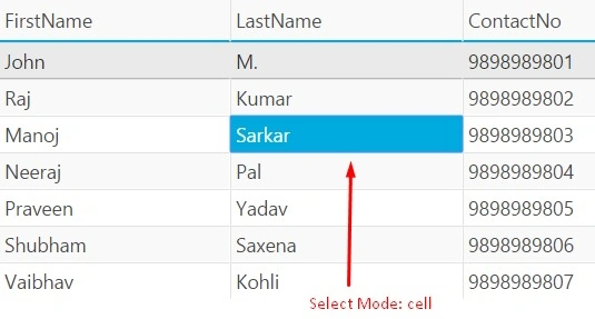
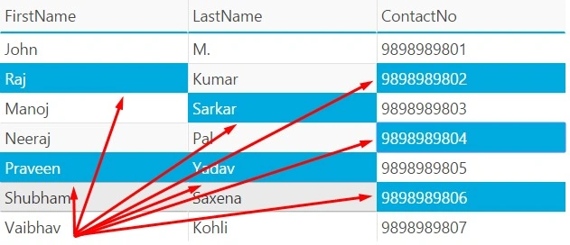
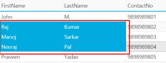
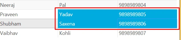
- Selection: It enables the selection of the rows and the cells of the igGrid control. The behavior closely follows Microsoft Windows Explorer style.
- Updating: It includes three different interactions: updating, adding new rows, and deleting the rows.
- jQuery templates: It allows substitution, using jQuery templating.
- Virtual Scrolling: Virtualization is a feature of the igGrid control, that reduces the number of active in-memory DOM objects.
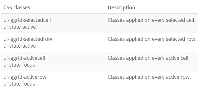
Let's start with the selection features and explore them one by one progressively. The Selection feature allows us to highlight the selected rows or cells. You can always intercept the selection of the events and do what your heart says with the selected rows/cells. As it highlights the selection, it adds certain CSS classes to the cells, which you can use to modify the theme at your will.
I am extending the sample code from my previous demo Getting Started with Ignite UI igGrid to explain this feature. igGrid control's config object accepts an array of the objects (features), allowing customization. To add or modify a feature, you need to add a feature object to this array. Every feature is identified by a name.
Please note, that the name of the feature starts with a capital letter.
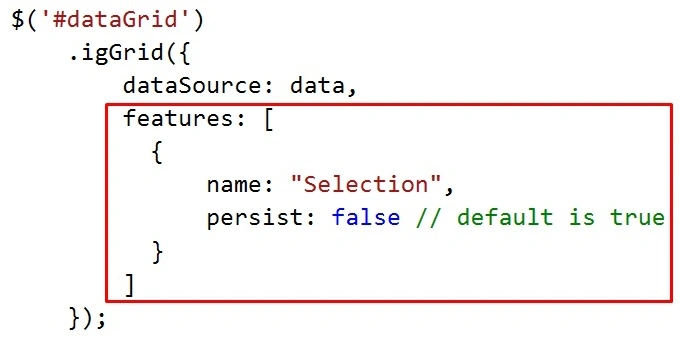
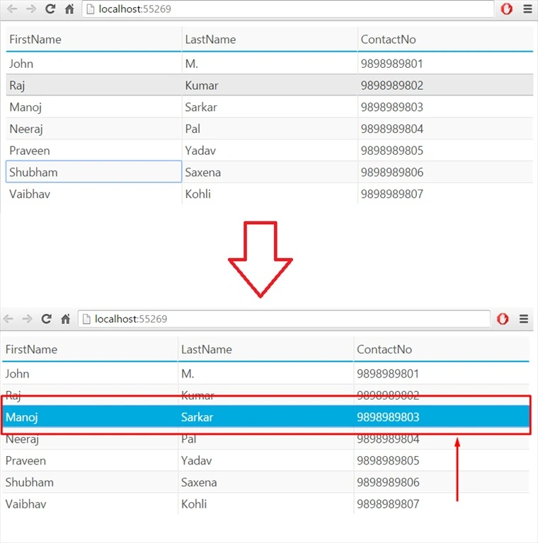
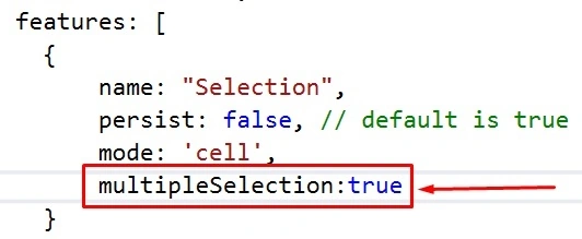
The color/texture of the highlighted cells/rows will depend on the referenced theme. Another attribute you will see along with the feature name is "persist". It allows the grid control to persist the selected cells or the rows after you've done some filtering or sorting on it. The attribute is true by default.





Shobana JPosted Jul 16, 2016, 6:28 AM
Good one sir
kalu singh raoPosted Jul 7, 2016, 1:29 AM
Nice...
RajaPosted Jul 7, 2016, 12:12 AM
Good One...