

Introduction
We have already discussed in my previous article that the LinearLayout arranges views in a single column or single row. It displays child View elements in a linear direction, either vertically or horizontally. Like a box it contains controls inside; controls are drawn one after each other either horizontally or vertically according to the Orientation of the layout.
When dealing with Linear layout there are five properties that we can deal with:
- Orientation
- Fill model
- Weight
- Gravity
- padding
- Gravity: By default, widgets are positioned in the top-left of the screen but if you want you can specify the "gravity" for each component that's in the LinearLayout. This determines whether the component is left or right-aligned, and top or bottom aligned, or a combination of these.
Basically, we use six types of gravity properties with LinearLayout:--left
--center
--center_vertical
--center_horizontal--right--bottomI know based on the above documentation it was not very clear how the above layout parameters work. So, I read and find out more details and finally understood how to use gravity with LinearLayout. I will explain these properties with examples:left gravity- <TextView
- android:layout_gravity="left"
- android:background= "#aa0000"
- android:textColor="#ffffffff"
- android:text="TextView with Left Gravity"
- android:layout_width="wrap_content"
- android:layout_height= "wrap_content"/>
Output center gravity
- <TextView
- android:layout_gravity="center"
- android:background= "#00aa00"
- android:textColor="#ffffffff"
- android:text="TextView with center Gravity"
- android:layout_width="wrap_content"
- android:layout_height="wrap_content"/>
Output: center_vertical gravityOutput:
- <TextView
- android:layout_gravity="center_vertical"
- android:background= "#0000aa"
- android:textColor="#ffffffff"
- android:text="TextView with center vertical Gravity"
- android:layout_width= "wrap_content"
- android:layout_height= "wrap_content" />
 center_horozontal gravityOutput:
- <TextView
- android:layout_gravity="center_horizontal"
- android:background="#00FFFF"
- android:textColor="#ffffffff"
- android:text="TextView with center horizontal Gravity"
- android:layout_width= "wrap_content"
- android:layout_height="wrap_content" />
 right gravity
- <TextView
- android:layout_gravity="right"
- android:background= "#FF00FF"
- android:textColor="#ffffffff"
- android:text="TextView with right Gravity"
- android:layout_width= "wrap_content"
- android:layout_height= "wrap_content" />
Output: bottomOutput:
- <TextView
- android:layout_gravity="bottom"
- android:background= "#0999ff"
- android:textColor="#ffffffff"
- android:text="TextView with bottom Gravity"
- android:layout_width= "wrap_content"
- android:layout_height= "wrap_content" />
 Here is the complete application to understand all properties of gravity in a single application:Output:
- <?xml version="1.0" encoding="utf-8"?>
- <LinearLayout xmlns:android="http://schemas.android.com/apk/res/android"
- android:orientation="vertical"
- android:layout_width="fill_parent"
- android:layout_height="fill_parent">
- <TextView
- android:layout_gravity="left"
- android:background= "#aa0000"
- android:textColor="#ffffffff"
- android:text="TextView with Left Gravity"
- android:layout_width="wrap_content"
- android:layout_height= "wrap_content"/>
- <TextView
- android:layout_gravity="center"
- android:background= "#00aa00"
- android:textColor="#ffffffff"
- android:text="TextView with center Gravity"
- android:layout_width= "wrap_content"
- android:layout_height= "wrap_content"/>
- <TextView
- android:layout_gravity="center_vertical"
- android:background= "#0000aa"
- android:textColor="#ffffffff"
- android:text="TextView with center vertical Gravity"
- android:layout_width= "wrap_content"
- android:layout_height= "wrap_content" />
- <TextView
- android:layout_gravity="center_horizontal"
- android:background= "#00FFFF"
- android:textColor="#ffffffff"
- android:text="TextView with center horizontal Gravity"
- android:layout_width= "wrap_content"
- android:layout_height= "wrap_content" />
- <TextView
- android:layout_gravity="right"
- android:background= "#FF00FF"
- android:textColor="#ffffffff"
- android:text="TextView with right Gravity"
- android:layout_width= "wrap_content"
- android:layout_height= "wrap_content" />
- <TextView
- android:layout_gravity="bottom"
- android:background= "#0999ff"
- android:textColor="#ffffffff"
- android:text="TextView with bottom Gravity"
- android:layout_width= "wrap_content"
- android:layout_height= "wrap_content" />
- </LinearLayout >

-
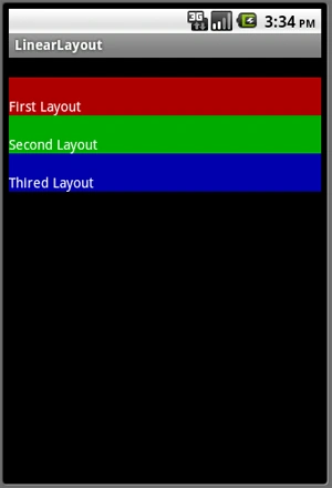
Padding: The "android:padding" property sets the padding between widgets. If you specify the padding property to the container then the container with all of its widgets would be shifted by the value, if you specify it to a single widget then the contents of that widget would be shifted by the specified value.I set the layout_height property to "wrap_content" which means the height of the TextView should be increased according to the size of text, but because I use the padding property the height of the TextView is increased according to the size of the text as well as the value of "android:paddingTop".Output:
- <?xml version="1.0" encoding="utf-8"?>
- <LinearLayout xmlns:android="http://schemas.android.com/apk/res/android"
- android:orientation="vertical"
- android:paddingTop="20px"
- android:layout_width="fill_parent"
- android:layout_height="fill_parent">
- <TextView
- android:text= "First Layout"
- android:background= "#aa0000"
- android:textColor="#ffffffff"
- android:layout_width= "fill_parent"
- android:paddingTop="20px"
- android:layout_height= "wrap_content"/>
- <TextView
- android:text= "Second Layout"
- android:background= "#00aa00"
- android:textColor="#ffffffff"
- android:layout_width= "fill_parent"
- android:paddingTop="20px"
- android:layout_height= "wrap_content"/>
- <TextView
- android:text= "Thired Layout"
- android:background= "#0000aa"
- android:textColor="#ffffffff"
- android:layout_width= "fill_parent"
- android:paddingTop="20px"
- android:layout_height= "wrap_content" />
- </LinearLayout>
I hope you enjoy learning how to work with LinearLayout
in Android using Visual Studio 2010.
Gowtham RajamanickamPosted Apr 12, 2016, 2:09 AM
Good One, Thanks for sharing