
Why Customize the SharePoint Edit Form?
SharePoint’s default edit form is functional but often lacks visual appeal and logical grouping, especially for lists with many fields. JSON-form formatting empowers you to.
- Improve usability by organizing fields into collapsible sections.
- Enhance aesthetics with icons, headers, and consistent spacing.
- Add functionality like help links or dynamic buttons.
In this article, you will learn to customize the header, body, and footer of the edit form popup using JSON. Let’s dive in.
Step 1. Enable JSON Customization for Your List.
- Navigate to your SharePoint list where you want to customize the edit form.
- Click on the “Add new item” button.
- In the form, click on the “Edit Form” option (top-right corner).
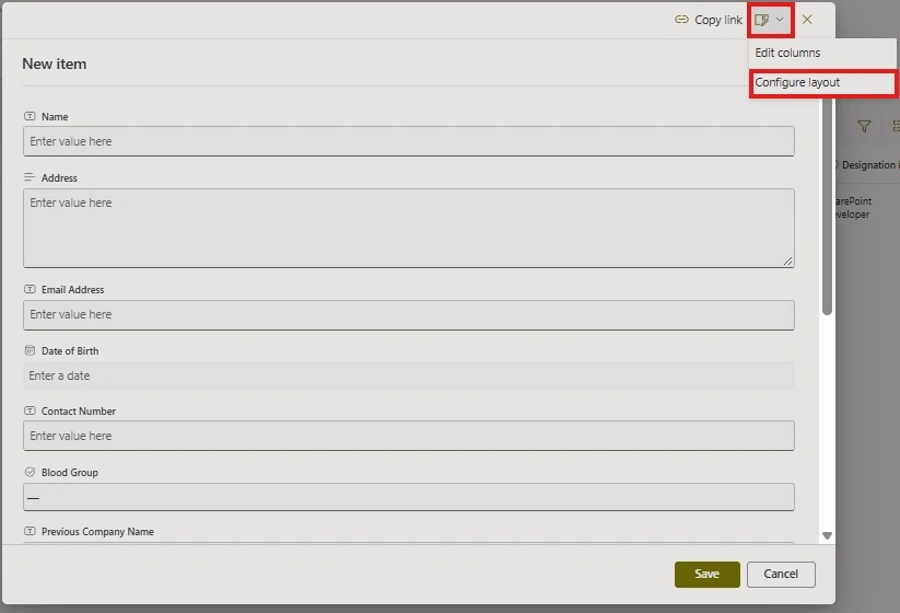
- Select “Configure Layout” from the dropdown.
- A panel will appear with three sections: Header, Body, and Footer.
- Choose the section you want to customize and paste your JSON code into the editor.
Step 2. Structure of JSON form formatting.
SharePoint Forms are divided into three sections.
- Header: Modify the form header to display a title, icon, or additional details.
- Body: Organize fields into sections for better readability.
- Footer: Customize the footer with buttons and actions.
Step 3. Customizing the Header.
The header appears at the top of the form. We can add.
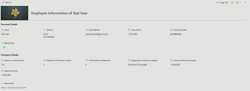
The header appears at the top of the form, and we can customize it to enhance its appearance by adding an icon, title, or even a custom logo.
Adding an Icon in the header.
{
  "elmType": "div",
  "attributes": {
    "class": "ms-borderColor-neutralTertiary"
  },
  "style": {
    "width": "100%",
    "border-top-width": "0px",
    "border-bottom-width": "1px",
    "border-left-width": "0px",
    "border-right-width": "0px",
    "border-style": "solid",
    "margin-bottom": "16px"
  },
  "children": [
    {
      "elmType": "div",
      "style": {
        "display": "flex",
        "box-sizing": "border-box",
        "align-items": "center"
      },
      "children": [
        {
          "elmType": "div",
          "attributes": {
            "iconName": "Onboarding",
            "class": "ms-fontSize-42 ms-fontWeight-regular ms-fontColor-themePrimary",
            "title": "Details"
          },
          "style": {
            "flex": "none",
            "padding": "0px",
            "padding-left": "0px",
            "height": "36px"
          }
        }
      ]
    },
    {
      "elmType": "div",
      "attributes": {
        "class": "ms-fontColor-neutralSecondary ms-fontWeight-bold ms-fontSize-24"
      },
      "style": {
        "box-sizing": "border-box",
        "width": "100%",
        "text-align": "left",
        "padding": "21px 12px",
        "overflow": "hidden"
      },
      "children": [
        {
          "elmType": "div",
          "txtContent": "= 'Employee Information of ' + [$Title]"
        }
      ]
    }
  ]
}
Where to make changes for popup form Appearance.
| Change Required | Modify This Part in JSON |
|---|---|
| Change Icon | "iconName": "Onboarding" (Replace with another Fluent UI icon) |
| Change Icon Size | “ms-fontsize-42" (increase/decrease number) |
| Change Icon Color | “ms-fontColor-themePrimary" (change theme color) |
| Change Header Background Color | Add “background-color” : “#F32F1” inside style |
| Change Title Text | Modify “txtContent”: “= 'Employee Information of ' + [$Title]" |
| Change Title Font Size | “ms-fontSize-24" (increase/decrease number) |
| Change Title Alignment | “text-align”: “left” ->” center” or “right” |
| Adjust Header Height & Spacing | Modify “height”, “margin-bottom”, “padding” |

How to select an Icon for the Header?
You can select any Fluent UI icon for your header. Follow these steps to get the correct icon name.
- Go to https://uifabricicons.azurewebsites.net/.
- Search for the icon you want.
- Right-click the icon and select “Copy Friendly Name”.
- Paste the copied name into the “iconName” field in the JSON above.
This will display the selected icon in your SharePoint form header.
Adding a Custom logo in the header.
If you want to display a custom logo instead of an icon, modify the JSON as follows.
{
  "elmType": "img",
  "attributes": {
    "src": "https://yourtenant.sharepoint.com/sites/YourSite/Shared%20Documents/Logo.jpg",
    "title": "Company Logo",
    "class": "ms-borderRadius-circle"
  },
  "style": {
    "width": "200px",
    "height": "100px",
    "margin-right": "10px"
  }
}

Explanation of Changes
- ElmType changed from “div” to “img” - this tells SharePoint to display an image instead of an icon.
- Src attribute- Replace the placeholder URL with the actual URL of your logo stored in a SharePoint document library.
- Style changes- Adjust the width, height, and margin as needed.
Note: Ensure that the image URL is publicly accessible or that SharePoint permissions allow users to view the image.
Step 4. Customizing the Body into Sections.
{
  "sections": [
    {
      "displayname": "Personal Details",
      "fields": [
        "Title",
        "Address",
        "Email Address",
        "Date of Birth",
        "Contact Number",
        "Blood Group"
      ]
    },
    {
      "displayname": "Company Details",
      "fields": [
        "Previous Company Name",
        "Experience of Previous Company",
        "Total Number of Experience",
        "Designation in Previous Company",
        "Income of Previous Company",
        "Expected Income"
      ]
    }
  ]
}
Where to make changes to affect the popup form appearance.
| Change Required | Modify This Part in JSON |
|---|---|
| Change Section Heading | Modify “displayname”: “Personal Details” or “displayname”: “Company Details. |
| Add a New Section | Copy a section and create a new “display name” with relevant “fields. |
| Add a Field to an Existing Section | Add the field name to the “fields” array. |
| Remove a Field | Delete the field name from the “fields” array |
| Rearrange Fields in a Section | Change the order of fields in the “fields” array |
Step 5. Customizing the Footer with Action Buttons.
{
  "elmType": "div",
  "style": {
    "width": "100%",
    "text-align": "left",
    "overflow": "hidden",
    "border-top-width": "1px"
  },
  "children": [
    {
      "elmType": "div",
      "style": {
        "width": "100%",
        "padding-top": "10px",
        "height": "24px"
      },
      "children": [
        {
          "elmType": "a",
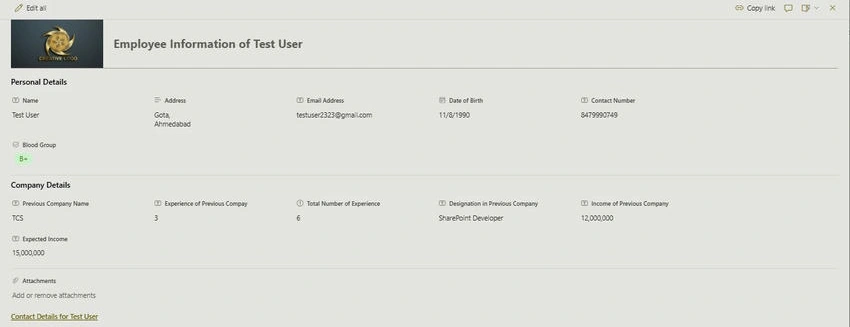
          "txtContent": "='Contact Details for ' + [$Title]",
          "attributes": {
            "target": "_blank",
            "href": "https://www.google.com/",
            "class": "ms-fontColor-themePrimary ms-borderColor-themePrimary ms-fontWeight-semibold ms-fontSize-m ms-fontColor-neutralSecondary–hover ms-bgColor-themeLight–hover"
          }
        }
      ]
    }
  ]
}
Where to make changes for popup form Appearance.
| Change Required | Modification of This Part in JSON |
|---|---|
| Change the Link URL | Replace “href”: https://www.google.com/ with your desired link(e.g. [$ProfileURL] for dynamic links |
| Open in Same Tab | Change “target”: “_blank” to “target”: “_self”. |
| Change Link Text | Modify “txtContent”: “=’Contact Details for ‘ + [$Title]” |
| Change Text Color | Modify “class” and replace ms-fontColor-themePrimary with ms-fontColor-red. |
| Make it a Button instead of a link | Change “elmType” : “a” to “elmtype” : “button” |
Step 6. Testing and Debugging.
- Copy the complete JSON code (header, body, and footer).
- Paste it into the JSON customization panel in SharePoint.
- Click Save and refresh your list.
- Edit an item to see the customized popup form in action.
Tips for Advanced Customization
- Conditional Formatting: Hide/show sections based on field values using “visible”: “=[$status]== ‘Active’”
- Theming: Match your organization’s colors with “style”: { “background”: “#f0f0f0”}
- Integrate Power Automate: Add buttons that trigger workflows using “actionType”: “executeFlow”.
Conclusion
Customizing forms with JSON in SharePoint makes it much easier to create clean and user-friendly edit forms. You can organize fields better, add helpful icons, and customize buttons to make the form look good and work smoothly. This helps users save time and makes using the form more enjoyable.
Join the conversation! Your thoughts help the community grow.