
Introduction #region EmailID #region Age To make the application look good I am going to design it in Blend 3, don't worry this will be a simple design. <dataInput:Label Target="{Binding ElementName=txtUserName}" HorizontalAlignment="Right" Margin="0" Grid.Row="2" d:LayoutOverrides="Height" VerticalAlignment="Center" Content="User Name"/>
<dataInput:Label Target="{Binding ElementName=txtEmailID}" HorizontalAlignment="Right" Margin="0" VerticalAlignment="Center" Grid.Row="3" Content="Email ID"/> Adding Description to Description Viewer Controls <dataInput:DescriptionViewer Description="Enter User Name" HorizontalAlignment="Left" Margin="0" Grid.Column="3" Grid.Row="2" d:LayoutOverrides="Height" VerticalAlignment="Center"/>
<dataInput:DescriptionViewer Description="Enter Email ID" HorizontalAlignment="Left" Margin="0" VerticalAlignment="Center" Grid.Column="3" Grid.Row="3"/>
Binding Text Property of TextBox <TextBox x:Name="txtUserName" TextWrapping="Wrap" Margin="0" Grid.Column="2" Grid.Row="2" d:LayoutOverrides="Height" VerticalAlignment="Center" Text="{Binding UserName, Mode=TwoWay, NotifyOnValidationError=True, ValidatesOnExceptions=True}"/>
<TextBox x:Name="txtEmailID" Margin="0" VerticalAlignment="Center" Grid.Column="2" Grid.Row="3" TextWrapping="Wrap" Text="{Binding EmailID, Mode=TwoWay, NotifyOnValidationError=True, ValidatesOnExceptions=True}"/>
UserInfo user = new UserInfo(); That's it play more with these Data Input control to know more about it.
In my last article titled "Data Annotations In Silverlight 3 Applications", we saw how it is very helpful to validate the user input. In this article we will see how Data Input Controls are helpful for Data Validation in Silverlight 3 application.
Crating Silverlight Project
Fire up Visual Studio 2008 and create a Silverlight Application. Name it as DataInputControlsInSL3.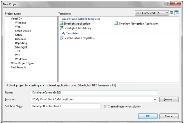
Our main aim of this article is to use the Data Input controls. To do that we need to refer the following assembly (System.Windows.Controls.Data.Input)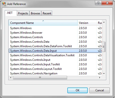
The above DLL consists of three controls such as:
public class UserInfo
{
#region UserName
private string _UserName;
[Required(ErrorMessage = "User Name is Required")]
[StringLength(12, MinimumLength = 6, ErrorMessage = "User Name must be in between 6 to 12 Characters")]
public string UserName
{
get { return _UserName; }
set
{
Validator.ValidateProperty(value, new ValidationContext(this, null, null) { MemberName = "UserName" });
_UserName = value;
}
}
#endregion
private string _EmailID;
[Required(ErrorMessage = "Email ID is Required")]
public string EmailID
{
get { return _EmailID; }
set
{
Validator.ValidateProperty(value, new ValidationContext(this, null, null) { MemberName = "EmailID" });
_EmailID = value;
}
}
#endregion
private string _Age;
[Range(18, 40, ErrorMessage = "Age must be 18 ~ 40")]
public string Age
{
get { return _Age; }
set
{
Validator.ValidateProperty(value, new ValidationContext(this, null, null) { MemberName = "Age" }
;
_Age = value;
}
}
#endregion
}
Label Control
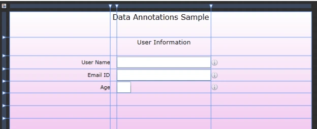
It displays a caption, required field indicator, and validation error indicator for an associated control. This is the way it differs from ordinary TextBlock control.
You need to refer to the assembly Named "System.Windows.Controls.Data.Input".
It is typically used together with an input control, such as a TextBox. We will see more about its properties further in our article.
Description Viewer
A Description Viewer control displays an information glyph and shows a text description in a tooltip when the mouse pointer is over the glyph. It also tracks validation error states so that you can implement a custom error display a description by itself or be associated with another control.
Validation Summary
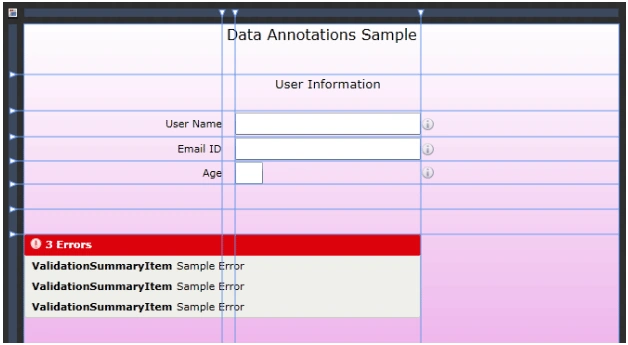
It displays a consolidated list of validation errors for a given container. By default it displays both object and property level errors.
By default, when an error message is selected in the Validation Summary, it attempts to set focus on the control where the error is originated.
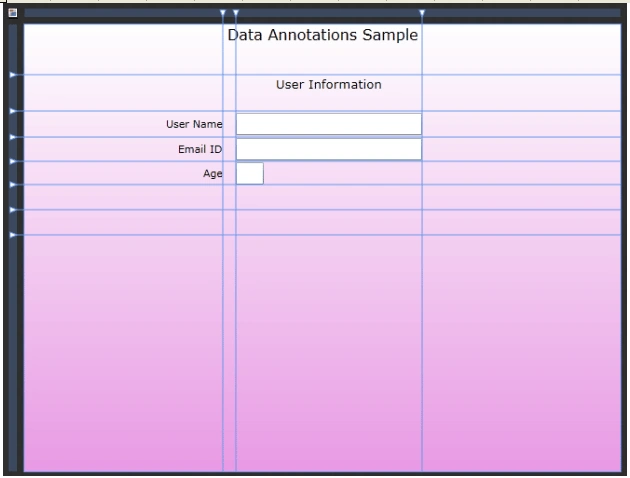
Now design part and adding controls are over we will go back to the Visual Studio 2008.
Binding Label Controls
As we discussed Label control is associated to an input control like TextBox to display the Error Indicator.
<dataInput:Label Target="{Binding ElementName=txtAge}" HorizontalAlignment="Right" Margin="0"
VerticalAlignment="Center" Grid.Row="4" Content="Age"/>
Description Viewer control contains a property called Description which displays the information.
Now we have to bind the properties defined in UserInfo class to the respective TextBoxes.
this.LayoutRoot.DataContext = user;
That's it go ahead and run your application.
As we made binding the Labels with the TextBoxes the required field Labels are made Bold.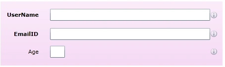
When you mouse over to the Description Viewer Glyph it will give you the messages you have already inserted.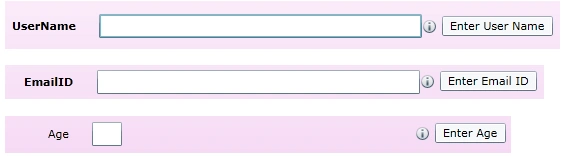
When you input wrong the Label and the Validation Summary gets activated.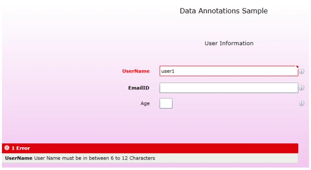
You can see the UserName Label has become Red.
Similarly you will get more than one error in our Validation Summary window.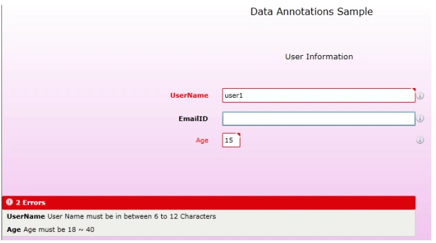
Enjoy Coding.

Data Input Controls in Silverlight 3 Application
Join the conversation! Your thoughts help the community grow.
Sign in to leave a comment
It is the same account you read, post and publish with — and you will come straight back to this page.
Surath RoutPosted Feb 17, 2011, 12:44 AM
" ValidationException was unhandled by user code".. solve the issue it will work for all the SL application,
Surath RoutPosted Feb 17, 2011, 12:44 AM
" ValidationException was unhandled by user code".. solve the issue it will work for all the SL application,