

This article has been
excerpted from book "Graphics Programming with GDI+".
Hatch brushes are brushes with a hatch style, a foreground color and a
background color. Hatches are a combination of rectangle lines and the area
between the lines. The foreground color defines the color of lines; the
background color defines the color between lines.
The HatchBrush class constructor takes HatchStyle as its first parameter and
Color as the second parameter. Second and third Color parameters represent the
Foreground and background colors. The following code snippet shows the
constructor signatures:
public HatchBrush(HatchStyle,
Color);
public HatchBrush(HatchStyle,
Color, Color);
Note: The HatchBrush class is defined in the System.Drawing.Drawing2D
namespace. An application needs to provide a reference to
System.Drawing.Drawing2D before using this class. Alternatively, an application
can refer to the HatchBrush class as System.Drawing.Drawing2D.HatchBrush.
The following code creates a hatch brush with a dashed-vertical hatch style,
blue background, and red foreground:
HatchBrush hBrush1 =
new HatchBrush
(HatchStyle.DashedVertical,
Color.Blue, Color.Red);
We can use this hatch brush to fill graphics objects such as rectangles or
ellipses. For example, the following code line fills and ellipse using hBrush1:
g.FillEllipse(hBrush, 20, 40, 100, 120);
HatchBrush has three properties: BackgroundColor, ForegroundColor and
HatchStyle.BackgroundColor returns the color of spaces between the hatch lines,
and ForegroundColor represents the color of the hatch lines.
HatchStyle returns the hatch brush style of type HatchStyle enumeration, whose
members are described in Table 4.1.
Let's create a Windows application that looks like Figure 4.4. The combo box
will list some of the available hatch styles. The Pick buttons let you select
background and foreground colors of the hatch brush, and the Apply Style button
creates a hatch brush based on the selection and uses it to draw a rectangle.
First we add one HatchStyle-type and two Color-type class-level variables that
represent the current hatch style, foreground, and background color of a hatch
brush, respectively. These variables are defined as follows:
private
HatchStyle style = new
HatchStyle();
private
Color forClr = Color.Blue;
private
Color backClr = Color.Red;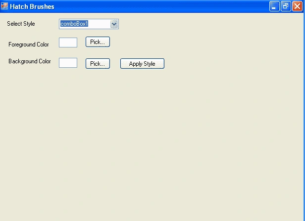
FIGURE 4.4: A sample hatch brush application
TABLE 4.1: HatchStyle member
| Member | Description |
BackwardDiagonal |
A patter of lines on a diagonal from upper right to lower left. |
|
Cross |
Horizontal and vertical lines that cross |
|
DrawDownwardDiagonal |
Diagonal lines that slant to the right from top points to bottom points, are spaced 50 percent closer together than in ForwardDiagonal, and are twice the width of ForwardDiagonal lines. |
|
DarkHorizontal |
Horizontal lines that are spaced 50 percent closer together than in Horizontal and are twice the width of Horizontal lines. |
|
DarkUpwardDiagonal |
Diagonal lines that slant to the left from top points to bottom points are spaced 50 percent closer together than BackwardDiagonal, and are twice the width of BackwardDiagonal lines. |
|
DarkVertical |
Vertical lines that are spaced 50 percent closer together than Vertical and are twice the width of Vertical lines. |
|
DashedDownwardDiagonal |
Dashed diagonal lines that slant to the right from top points to bottom points. |
|
DashedHorizontal |
Dashed horizontal lines. |
|
DashedUpwardDiagonal |
Dashed diagonal lines that slant to the left from top points to bottom points. |
|
DashedVertical |
Dashed vertical lines. |
|
DiagonalBrick |
A hatch with the appearance of layered bricks that slant to the left from top points to bottom points. |
|
DiagonalCross |
Forward diagonal and backward diagonal lines that cross. |
|
Divot |
A hatch with the appearance of divots. |
|
DottedDiamond |
Forward diagonal and backward diagonal lines each of which is composed of dots that cross. |
|
DottedGrid |
Horizontal and vertical lines, each of which is composed of dots that cross. |
|
ForwardDiagonal |
A pattern of lines on a diagonal from upper left to lower right. |
|
Horizontal |
A pattern of horizontal lines. |
|
HorizontalBrick |
A hatch with the appearance of horizontally layered bricks. |
|
LargeCheckerBoard |
A hatch with the appearance of a checkerboard with squares that are twice the size of SmallCheckerBoard. |
|
LargeConfetti |
A hatch with the appearance of confetti that is composed of larger pieces than SmallConfetti. |
|
LargeGrid |
Horizontal and vertical lines that cross and are spaced 50 percent farther apart than in Cross. |
|
LightDownwardDiagonal |
Diagonal lines that slant to the right from top points to bottom points. |
|
LightHorizontal |
Horizontal lines that are spaced 50 percent closer together than Horizontal lines. |
|
LightUpwardDiagonal |
Diagonal lines that slant to the left from top points to bottom points and are spaced 50 percent closer together than BackwardDiagonal lines. |
|
LightVertical |
Vertical lines that are spaced 50 percent closer together than Vertical lines. |
|
Max |
Hatch style SolidDiamond |
|
Min |
Hatch style Horizontal. |
|
NarrowHorizontal |
Horizontal lines that are spaced 75 percent closer together than Horizontal lines (or 25 percent closer together than LightHorizontal lines). |
|
NarrowVertical |
Vertical lines that are spaced 75 percent closer together than Vertical lines (or 25 percent closer together than LightVertical lines). |
|
OutlinedDiamond |
Forward diagonal and backward diagonal lines that cross. |
|
PercentXX |
Percent hatch. The "XX" number after "Percent" represent the ratio of foreground color to background color as xx: 100. The values of xx are 05, 10, 20, 25, 30, 40, 50, 60, 75, 80, and 90. |
|
Plaid |
A hatch with the appearance of a plaid material. |
|
Shingle |
A hatch with the appearance of diagonally layered shingles that slant to the right from top points to bottom points. |
|
SmallCheckerBoard |
A hatch with the appearance of a checkerboard. |
|
SmallConfetti |
A hatch with the appearance of confetti. |
|
SmallGrid |
Horizontal and vertical lines that cross and are spaced 50 percent closer together than Cross lines. |
|
SolidDiamond |
A hatch with the appearance of a checkerboard placed diagonally. |
|
Sphere |
A hatch with the appearance of spheres laid adjacent to one another. |
|
Trellis |
A hatch with the appearance of a trellis. |
|
Vertical |
A pattern of vertical lines |
|
Wave |
Horizontal lines that are composed of tildes. |
|
Weave |
A hatch with the appearance of a woven material. |
|
WideDownwardDiagonal |
Diagonal lines that slant to the right from top points to bottom points, have the same spacing as in ForwardDiagonal, and are triple the width of ForwardDiagonal lines. |
|
WideUpwardDiagonal |
Diagonal lines that slant to the left from top points to bottom points, have the same spacing as in BackwardDiagonal, and are triple the width of BackwardDiagonal lines. |
|
ZigZag |
Horizontal lines that are composed of zigzags. |
On the form's load event handler (see Listing 4.4), we fill the combo box with
different hatch style and set the background color properties of our two text
boxes to the current colors.
LISTING 4.4: The form's load event handler
private void
Form1_Load(object sender, System.EventArgs
e)
{
//Fill Combo box with hatch styles
FillHatchStyles();
//Set foreground and background colors of text boxes
textBox1.BackColor = forClr;
textBox2.BackColor = backClr;
}
The FillHatchStyles method adds different styles to the combo box (see Listing
4.5). We have added only a few styles; man more are available (see Table 41.).
LISTING 4.5: The FillHatchStyles method
private
void FillHatchStyles()
{
//Add hatch styles
comboBox1.Items.Add(
HatchStyle.BackwardDiagonal.ToString());
comboBox1.Items.Add(
HatchStyle.Cross.ToString());
comboBox1.Items.Add(
HatchStyle.DashedVertical.ToString());
comboBox1.Items.Add(
HatchStyle.DiagonalCross.ToString());
comboBox1.Items.Add(
HatchStyle.HorizontalBrick.ToString());
comboBox1.Items.Add(
HatchStyle.LightDownwardDiagonal.ToString());
comboBox1.Items.Add(
HatchStyle.LightUpwardDiagonal.ToString());
comboBox.Text =
HatchStyle.BackwardDiagonal.ToString());
}
The Pick buttons in our combo box (see Figure 4.4) call the ColorDialog method
and save the selected foreground and background colors, respectively. These
methods also set the background color of the respective text boxes, as Listing
4.6 shows.
LISTING 4.6: The Pick button click event handler
private void
ForeColorBtn_Click(object sender, System.EventArgs
e)
{
//Use ColorDialog to selct a color
ColorDialog clrDlg =
new ColorDialog();
if (clrDlg.ShowDialog() ==
DialogResult.OK)
{
//Save color as foreground color,
//and fill text box with this color
forClr =
clrDlg.Color;
textBox1.BackColor = forClr;
}
}
private void
BackColorBtn_Click(object sender, System.EventArgs
e)
{
//Use ColorDialog to select a color
ColorDialog clrDlg =
new ColorDialog();
if (clrDlg.ShowDialog() ==
DialogResult.OK)
{
//Save color as background color,
//and fill text box with this color
backClr =
clrDlg.Color;
textBox2.BackColor = backClr;
}
}
The last step is to apply the selected styles and colors, create a hatch brush,
and use this brush to draw a rectangle. This is all done on the Apply Style
button click event handler, which is shown in Listing 4.7. As you can see from
this listing, first we create a HatchStyle object based on the user selection in
the combo box. Then we create a HatchBrush object using the hatch style,
background, and foreground colors. After that we simply fill a rectangle with
the hatch brush.
LISTING 4.7: The Apply Style button click event handler
private void
ApplyBtn_Click(object sender, System.EventArgs
e)
{
//Create a Graphic object
Graphic g =
this.CreateGraphics();
g.Clear(this.BackColor);
//Read current style from combo box
string str = comboBox1.Text;
//find out the style and set it as the current style
switch (str)
{
case
"BackwardDiagonal":
style
= HatchStyle.BackwardDiagonal;
break;
case
"DashedVertical":
style
= HatchStyle.DashedVertical;
break;
case "cross":
style
= HatchStyle.Cross;
break;
case "DiagonalCross":
style
= HatchStyle.DiagonalCross;
break;
case
"HorizontalBrick":
style
= HatchStyle.HorizontalBrick;
break;
case
"LightDownwardDiagonal":
style
= HatchStyle.LightDownwardDiagonal;
break;
case "LigthUpwardDiagonal":
style
= HatchStyle.LightUpwardDiagonal;
break;
default:
break;
}
//Create a hatch brush with selected hatch style and
colors
HatchBrush brush =
new HatchBrush(style,
forClr, backClr);
//Fill rectangle
g.FillRectangle(brush, 50, 100, 200, 200);
//Dispose of objects
brush.Dispose();
g.Dispose();
}
If you compile and run the application and then click the Apply Style button,
the default rectangle looks like Figure 4.5.
Let's select LightDownwardDiagonal for the hatch style, change the foreground
and background colors, and click the Apply Style button. Now the output looks
like Figure 4.6.
Let's change the hatch style and colors one more time. This time we pick
DiagonalCross as out hatch style. Now the output looks like Figure 4.7.
Conclusion
Hope the article would have helped you in understanding Hatch Brushes in GDI+. Read other articles on GDI+ on the website.
 |
This book teaches .NET developers how to work with GDI+ as they develop applications that include graphics, or that interact with monitors or printers. It begins by explaining the difference between GDI and GDI+, and covering the basic concepts of graphics programming in Windows. |
Join the conversation! Your thoughts help the community grow.