

By default, a GroupBox can have one child only but multiple child controls can be added by placing a container control on a GroupBox such as a Grid or StackPanel.
The GroupBox element in XAML represents a GroupBox control. The following code snippet creates a GroupBox control, sets its background and font. The code also sets the header by using GroupBox.Header.
- <GroupBox Margin="10,10,10,10" FontSize="16" FontWeight="Bold" Background="LightGray">
- <GroupBox.Header>
- C# Corner
- </GroupBox.Header>
- <TextBlock FontSize="14" FontWeight="Regular">
- This is a group box control content.
- </TextBlock>
- </GroupBox>
The output looks like the following windows where a group box is displayed with its content.
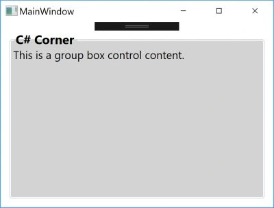
The content of a GroupBox can be any content including multiple child controls. If you need to place multiple controls, you may need to use a container control such as a panel or grid.
You can format a GroupBox header’s color and border thickness.
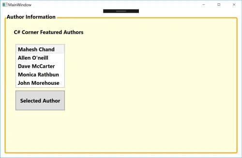
The following code example creates a GroupBox with an orange border with multiple controls.
- <GroupBox Margin="10,10,10,10" FontSize="16" FontWeight="Bold"
- Background="LightYellow" BorderBrush="Orange" BorderThickness="3">
- <GroupBox.Header>
- Author Information
- </GroupBox.Header>
- <Grid>
- <Label Margin="20,20,0,0" Content="C# Corner Featured Authors">
- </Label>
- <ListBox Margin="30,61,519,183" Height="131">
- <ListBoxItem IsSelected="true">Mahesh Chand</ListBoxItem>
- <ListBoxItem>Allen O'neill</ListBoxItem>
- <ListBoxItem>Dave McCarter</ListBoxItem>
- <ListBoxItem>Monica Rathbun</ListBoxItem>
- <ListBoxItem>John Morehouse</ListBoxItem>
- </ListBox>
- <Button Margin="30,213,519,127" Content="Selected Author"/>
- </Grid>
- </GroupBox>
The new Window looks like the following.
In this article, we saw how to use a WPF GroupBox.
Sujeet SumanPosted Sep 26, 2015, 1:35 AM
Nice Article....................