

The ControlTemplate contains the tree of elements that define the desired look. After you define a ControlTemplate you can attach it to any Control or Page by setting it's TemplateProperty.
In this example I am also showing you how to use Triggers with ControlTemplate. I am using Triggers on ButtonClick and MouseOver.
<Window x:Class="WpfApplication4.Window1"
xmlns="http://schemas.microsoft.com/winfx/2006/xaml/presentation"
xmlns:x="http://schemas.microsoft.com/winfx/2006/xaml"
Title="Window1" Height="300" Width="300">
<Grid>
<Grid.Resources>
<ControlTemplate x:Key="buttonTemplate">
<Grid>
<Ellipse Width="160" Height="160" x:Name="outerCircle">
<Ellipse.Fill>
<LinearGradientBrush StartPoint="0,0" EndPoint="0,1">
<GradientStop Offset="0" Color="Green"></GradientStop>
<GradientStop Offset="1" Color="Purple"></GradientStop>
</LinearGradientBrush>
</Ellipse.Fill>
</Ellipse>
<Ellipse Width="120" Height="120">
<Ellipse.Fill>
<LinearGradientBrush StartPoint="0,0" EndPoint="0,1">
<GradientStop Offset="0" Color="Gray"></GradientStop>
<GradientStop Offset="1" Color="Blue"></GradientStop>
</LinearGradientBrush>
</Ellipse.Fill>
</Ellipse>
</Grid>
<ControlTemplate.Triggers>
<Trigger Property="Button.IsMouseOver" Value="True">
<Setter TargetName="outerCircle" Property="Fill" Value="Black"></Setter>
</Trigger>
<Trigger Property="Button.IsPressed" Value="True">
<Setter Property="RenderTransform">
<Setter.Value>
<ScaleTransform ScaleX=".8" ScaleY=".8"></ScaleTransform>
</Setter.Value>
</Setter>
<Setter Property="RenderTransformOrigin" Value=".6,.6"></Setter>
</Trigger>
</ControlTemplate.Triggers>
</ControlTemplate>
</Grid.Resources>
<Button Template="{StaticResource buttonTemplate}">Click Me</Button>
</Grid>
</Window>
Result looks like this :
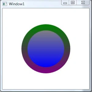
Figure 1.
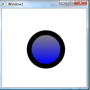
After MouseOver:

Figure 2.
After KeyPressed:
This is it.
Join the conversation! Your thoughts help the community grow.