Introduction
This article discusses many aspects involved in extending a standard server side control to produce something new and useful. In this case, we will extend the ASPX Panel control to generate an HTML DIV with rounded corners without corner images. The color of this control may be easily changed by setting its HTML attribute.
Aspects explored in this article are:
-
Inheriting the ASPX Panel control and overriding some its methods.
-
Overload the Panel control's method to produce the desired effect.
-
Declaring the proper method attributes that during design time will provide us both the intellisense drop down list when adding HTML attributes or when using the properties window.
-
Encapsulating the style sheets and JavaScripts required to produce the rounded corners in the control. These scripts will be added both to the header and body sections of the page.
-
Adding the necessary checks to ensure that we don't add these styles and JavaScripts twice to the page in the case of multiple instances of the control being used on the page.
-
Adding a custom toolbox image to the control.
The Curved Corner Technique
The technique that is used to round the corners is done using CSS styles and JavaScript and is document in the article called "More Nifty Corners" at http://webdesign.HTML.it/articoli/leggi/528/more-nifty-corners/.
To round the corners using this method (without the subject control) you would need to manually include script references to the "nifty.js", "niftyCorners.css" and "niftyPrint.css" files in the page header. Then, for each DIV you want to round, you will need to add a JavaScript call to the "Rounded" function with a statement similar to:
Rounded('DIV#ID','CORNERS_CURVED','CONTAINER_COLOR','DIV_COLOR','CORNER_STYLE');
See http://webdesign.HTML.it/articoli/leggi/528/more-nifty-corners/ for a description of how to use each of these parameters.
This technique is not difficult to use but the subject control should make this even simpler. The control will encapsulate these script files. Once the control has been added to the toolbox then it can be dragged and dropped onto the page. Intellisense will also make setting the properties easier.
Download Files
The CurvedDiv.zip file contains the two projects used. Once you unzip this file you will see two folders: CurvedDivControl and CurvedDiv. The CurvedDivControl folder contains the control project and was created using Visual 2005 Express. The other folder contains the web site that uses the control and was created as a File System Web Project in 2005 Visual Web Developer.
Code Review
Visual 2005 Express was used to create the control's dll.
Figure 1 shows the methods and properties for the control.
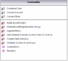
Figure 1 - Class Diagram
Class Header
The "CustomDiv" is extended from an ASPX Panel Control and is shown in figure 2. The attributes at the top of the class are used to configure the design time environment when we use the control. The "ToolboxBitmap" attribute is where we specify the bitmap that will be displayed when we add our control to the toolbox. "ToolboxData" attribute defines what the control will be called in the Toolbox. The DefaultProperty attribute specifies which of the properties will be the default property.
Figure 2 - CustomDiv Class Header
/// <summary>
/// A custom control to produced curved corners
/// </summary>
[DefaultProperty("CornersStyle"),
ToolboxData("<{0}:CustomDiv runat=server></{0}:CustomDiv>"),
ToolboxBitmap(@"C:\Documents and Settings\Mike\My Documents\Visual Studio 2005\Projects\CustomControls\CustomControls\images\CCContainer_icon.bmp")]
public class CustomDiv : System.Web.UI.WebControls.Panel
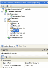
Including script files as Web Resources
The script files, which are included as web resources in the control, have their build action set to "embedded resource" (see figure 3).
Figure 3- Files included as web resources have their build action set to "Embedded Resource"
Also for these web resources to be available the following lines of code need to be added to AssemblyInfo.cs (figure 4).
Figure 4 - Coded to be added to Assembly Info.cs
[assembly: System.Web.UI.WebResource("CurvedDivControl.Resources.Menu.css", "text/css")]
[assembly: System.Web.UI.WebResource("CurvedDivControl.Resources.layout.css", "text/css")]
[assembly: System.Web.UI.WebResource("CurvedDivControl.Resources.niftyCorners.css", "text/css")]
[assembly: System.Web.UI.WebResource("CurvedDivControl.Resources.layout.js", "text/javascript", PerformSubstitution = true)]
[assembly: System.Web.UI.WebResource("CurvedDivControl.Resources.MenuAdapter.js", "text/javascript", PerformSubstitution = true)]
[assembly: System.Web.UI.WebResource("CurvedDivControl.Resources.nifty.js", "text/javascript", PerformSubstitution = true)]
The RegisterNifty method (figure 5) takes care of adding the scripts to the page and is called by the overridden OnInit method.
Figure 5 - RegisterNifty Method
/// <summary>
/// Load the scripts from the WebResources
/// </summary>
private void RegisterNifty()
{
string csslink = null;
LiteralControl include = null;
// add main javascript file required to round the corners to the header
HtmlGenericControl script = new HtmlGenericControl("script");
script.ID = "nifty_js";
if(!isHeaderScriptRegistered(script.ID ))
{
script.Attributes["type"] = "text/javascript";
script.Attributes["src"] = Page.ClientScript.GetWebResourceUrl(this.GetType(), "CustomControls.Resources.nifty.js");
this.Page.Header.Controls.Add(script);
}
// add the css files to create the rounded corners
csslink = "<link rel='stylesheet' type='text/css' href='" + Page.ClientScript.GetWebResourceUrl(this.GetType(),
"CustomControls.Resources.niftyCorners.css") + "' />";
include = new LiteralControl(csslink);
include.ID = "niftyCorners_css";
if (!isHeaderScriptRegistered(include.ID))
{
this.Page.Header.Controls.Add(include);
}
csslink = "<link rel='stylesheet' type='text/css' href='" + Page.ClientScript.GetWebResourceUrl(this.GetType(),
"CustomControls.Resources.niftyPrint.css") + "' />";
include = new LiteralControl(csslink);
include.ID = "niftyPrint_css";
if (!isHeaderScriptRegistered(include.ID))
{
this.Page.Header.Controls.Add(include);
}
}
If you notice, we always check if the script has been already added to the header section of the page with "isHeaderScriptRegistered" since there may be multiple "CustomDiv" controls on the page and we don't need to add them more than once. The "isHeaderScriptRegistered" is a simple method that checks to see if the script or literal control has already been added to the Header control collection, See figure 6.
Figure 6 - isHeaderScriptRegistered Method
/// <summary>
/// Check to see if the script is already part of the header
/// </summary>
/// <param name="pstrID">Id of the Control</param>
/// <returns></returns>
private bool isHeaderScriptRegistered(string pstrID)
{
foreach (Control lControl in Page.Header.Controls)
{
if (lControl.ID == pstrID)
{
return true;
}
}
return false;
}
Enabling Intellisense For Control's Properties
Getting a dropdown list during design time for either the HTML view or properties window is achieved by using enum type properties. Figure 7 will produce a dropdown list of names cooresponding to the "EcornersStyle" enum names.
Figure 7 - CornersStyle Property
/// <summary>
/// Specifies the style of corner
/// </summary>
private ECornersStyle _cornersStyle;
[Category("Custom Properties")]
[DefaultValue(ECornersStyle.normal)]
[Description("Select a value from the dropdown list.")]
[Browsable(true)]
public ECornersStyle CornersStyle
{
get { return _cornersStyle; }
set { _cornersStyle = value; }
}
To create the rounded corners, the control must know both the color of the control and the container's color. The User may set the "ContainerColor" manually or let the code attempt to determine it. For the code to determine it correctly, the control's container must be either a server webcontrol with it's backcolor set or an HTML control with the "runat=server" attribute set and the background-color style attribute set. If the control's container color has not been explicitly set, the "setContainerColor(Control)" method will go up the parent control tree until it finds a parent control with a color set, see figure 8. If the User manually sets the ContainerColor, then the "setContainerColor" method is not used.
Figure 8 - Get/Set the Container Color
/// <summary>
/// Recursively set the container color if it has not been specifically set
/// </summary>
/// <param name="pControl"></param>
private void setContainerColor(Control pControl)
{
if (_sContainerColor != Color.Empty) return;
if (pControl == null) return;
if (pControl is WebControl)
{
WebControl lWebControl = ((WebControl)pControl);
if (!lWebControl.BackColor.IsEmpty)
{
_sContainerColor = ((WebControl)pControl).BackColor;
return;
}
}
if (pControl is HtmlControl)
{
string lsHtmlColor = ((HtmlControl)pControl).Style["background-color"];
if (lsHtmlColor != null)
{
_sContainerColor = ColorTranslator.FromHtml(lsHtmlColor);
return;
}
}
setContainerColor(pControl.Parent);
}
The "Nifty Corner" method is not without its quirks. I found when setting the width and height that the control seemed to behave normally if I used two-nested DIVs instead of just one. I then applied the width to the outer DIV and the height to the inner DIV. To add this extra DIV tag, I override the control's CreateChildControl method, see figure 9. I created a new DIV and moved the child controls to this new DIV and then added the new DIV as a child control of our subject control.
Figure 9- Overridden CreateChildControls method
/// <summary>
/// Create the child controls
/// </summary>
protected override void CreateChildControls()
{
// Add another Div tag to enable adding padding the inner contents
Panel lPanel = new Panel();
lPanel.Height = Height;
Height = new Unit();
Control[] ArrayControls = new Control[Controls.Count];
Controls.CopyTo(ArrayControls, 0);
foreach (Control lControl in ArrayControls)
{
lPanel.Controls.Add(lControl);
}
this.Controls.Clear();
this.Controls.Add(lPanel);
base.CreateChildControls();
}
Using the CustomDiv Control
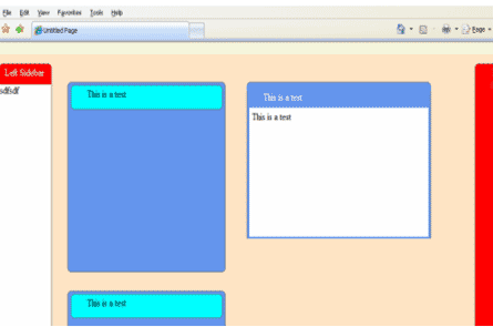
I used the new control in a File System Web Project in 2005 Visual Web Developer.
To use the new control, I first added it to the Toolbox panel by right clicking the Toolbox panel and selecting "Add Items" from the context menu. Then, click the "Browse" button from the dialog. Browse to the new the dll containing the CustomDiv control and load it. The CustomDiv should be added to the bottom of the Toolbox. We can use this control like any other control. We can drag and drop the control onto a new web form and resize it either in the VS Designer, visually, or using the HTML tag. We can nest normal child HTML controls underneath the CustomDiv control, the same way we used our ASPX Panel control.
Most of our control's properties appear in the "Custom Properties" section of the properties panel, see figure 10.
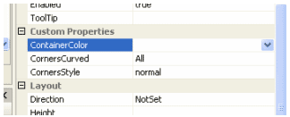
Figure 10- Custom Properties
The other property that must be set is the control's "BackColor" property, which shows up in the "Appearance" Category. If we want to create a DIV with a border we need to also set the "BorderColor" property and then set the CornerSyle property to "border".
Conclusion
The control is easy to use but is not without its quirks. I've tested the control in IE 7.0, only. I've noticed applying padding directly to the control's outer DIV using a CSS style tends to mess up it's rendering. Adding the padding to the inner seems to works fine. Also, you can add another HTML element inside the CustomDiv control and apply margin to it using CSS styles.
Unless you explicitly set the container color each time, you want to have one of the CustomDiv's parent control as a server control with its "BackColor" explicitly set so that the CustomDiv can determine its container color.
This article shows how you can encapsulate scripting techniques into a server side control to make them easier to use.