This article discusses how to create and use the TabControl available in Silverlight 2.0.
Creating a Silverlight Application
Create a Silverlight application using Visual Studio 2008 by selecting New Project >> Silverlight Application from the Templates list. See Figure 1.
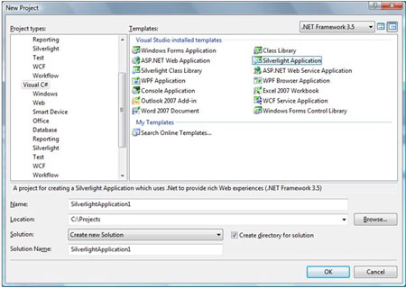
Figure 1. Creating a Silverlight Application.
After the application is created, you land on Page.xaml page in the designer. The XAML of Page.xaml looks like following:
<UserControl
x:Class="MyFirstSilverlightApplication.Page"
xmlns="http://schemas.microsoft.com/winfx/2006/xaml/presentation"
xmlns:x="http://schemas.microsoft.com/winfx/2006/xaml"
Width="800" Height="600">
<Grid x:Name="LayoutRoot" VerticalAlignment="Top" Background="White">
</Grid>
</UserControl>
In the left side bar, you will see a Toolbox that lists Silverlight controls available to you. Now simply drag a TabControl from the Toolbox to your XAML file inside the Grid tag. This action will add System.Controls.Extended namespace reference to your XAML file that looks like this:
xmlns:my="clr-namespace:System.Windows.Controls;assembly=System.Windows.Controls.Extended"
You will also see the following tag is added for the tab control.
<my:TabControl />
Now, similar to any other XAML controls, you can set tab control properties using XAML attributes. For example, the following code sets the height, font, font size, and background color of the tab control.
<my:TabControl Height="150" FontFamily="Verdana" FontSize="12" Background="Orange">
</my:TabControl>
You may also add some properties outside of the tab control. For example, the following code sets the background property of the tab control using TabControl.Background.
<my:TabControl Height="150" FontFamily="Verdana" FontSize="12" >
<my:TabControl.Background>
<SolidColorBrush Color="Green" Opacity="0.30"/>
</my:TabControl.Background>
</my:TabControl>
Adding Tab Items
You will hardly recognize a tab control without tab items. The <TabItem \> tag represents a tab item. The Header property of TabItem represents the header text of the header. The following code creates a tab item with header text "Circle".
<my:TabItem Header="Circle">
</my:TabItem>
A tab item can host other XAML controls similar to a panel or grid control. For example, the following code adds a StackPanel to the tab item and on that StackPanel, it creates a circle with height and width 100.
<my:TabItem Header="Circle">
<StackPanel>
<Ellipse Height="100" Width="100" StrokeThickness="5" Stroke="black"
Fill="gold"/>
</StackPanel>
</my:TabItem>
Using the same above approach, I add three tab items to the tab control called Circle, Rectangle, and Polygon. See the code listed in Listing 1.
<my:TabControl Height="150" FontFamily="Verdana" FontSize="12" >
<my:TabControl.Background>
<SolidColorBrush Color="Green" Opacity="0.30"/>
</my:TabControl.Background>
<my:TabItem Header="Circle">
<StackPanel>
<Ellipse Height="100" Width="100" StrokeThickness="5" Stroke="black"
Fill="gold"/>
</StackPanel>
</my:TabItem>
<my:TabItem Header="Rectangle">
<StackPanel>
<Rectangle Fill="Yellow" Width="100" Height="100" Stroke="Blue" StrokeThickness="5">
</Rectangle>
</StackPanel>
</my:TabItem>
<my:TabItem Header="Polygon">
<StackPanel>
<Polygon Points="100,50 50,100 150,100 100,50 100,30"
Stroke="green" StrokeThickness="3" Fill="Yellow"/>
</StackPanel>
</my:TabItem>
</my:TabControl>
Listing 1. Adding three tab items to a tab control.
If I run the application, the Circle tab shows me a circle looks like Figure 2.
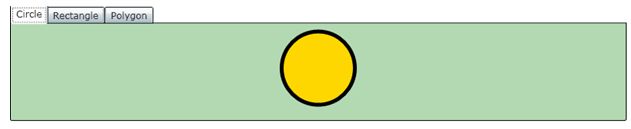
Figure 2.
If I click on Rectangle and Polygon, the output looks like Figure 3 and Figure 4 respectively.
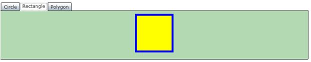
Figure 3.
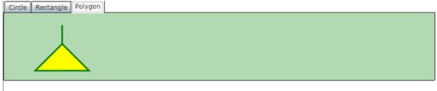
Figure 4.
Formatting Tab Items
Let's get some creative. We will display the images on the tab items as the part of tab item headers. The final tab control would look like Figure 5.
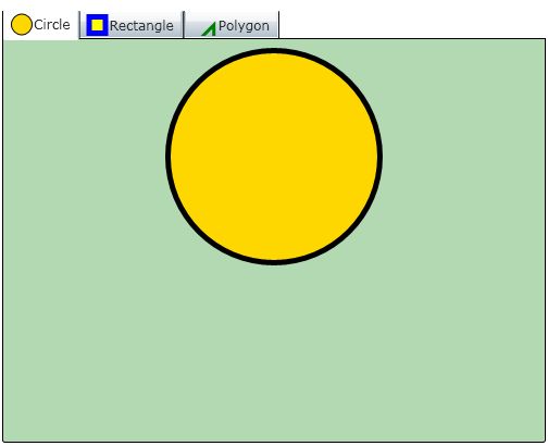
Figure 5. Tab item header with drawings
To achieve this, I separated tab item header and put a stack panel within it. The stack panel then hosts a text and a drawing depending on what tab item it is.
<my:TabItem.Header>
<StackPanel Orientation="Horizontal">
<Polygon Points="20,10 20,10 15,15 20,10 20,15" Stroke="green" StrokeThickness="3" Fill="Yellow"/>
<TextBlock Text="Polygon" Margin="1,1,1,1" VerticalAlignment="Center" />
</StackPanel>
</my:TabItem.Header>
Note: If you would like to load images at the top of text of the header, simply remove Orientation="Horizontal" from the stack panel in the above code. The default orientation is vertical.
Using the same approach, you may load an image in the header of a tab item. Simply, replace tab header code above that is creating a polygon with the following code. Make sure your image is available in your project.
<Image Height="20" Source="MyImage.jpg" />
Summary
In this article, we saw how to create and use a TabControl in a Silverlight application. We also saw, how to make a tab item header and its contents more interactive by simply adding a few lines of code to our XAML file.