

Introduction
This article make use of the code snippets and demo projects from Github. I have made all attributions to the author(s) who put their effort in building samples.
Before reading this article, I highly recommend reading the following previous parts of the series - Introduction to Android Wear
Android Wearable UI Components
WatchViewStub
The WatchViewStub is a very helpful view component that can be used to select the layout based on the device whether it’s a rectangular or circular one. This component automatically inflates the view based on the rounded or rectangular type of screens.
The following code snippet shows the high level usage, the key thing is coding the layouts and setting the same for WatchViewStub component.
Quote: Reference - GitHub Sample
Please note – The following code snippet is part of the open source sample.
- <android.support.wearable.view.WatchViewStub
- xmlns:android="http://schemas.android.com/apk/res/android"
- xmlns:app="http://schemas.android.com/apk/res-auto"
- xmlns:tools="http://schemas.android.com/tools"
- android:id="@+id/watch_view_stub"
- android:layout_width="match_parent"
- android:layout_height="match_parent"
- app:rectLayout="@layout/rect_activity_main"
- app:roundLayout="@layout/round_activity_main"
- tools:context=".SimpleListActivity"
- tools:deviceIds="wear">
- </android.support.wearable.view.WatchViewStub>
The following is the layout code snippet for Wearable Square.
- <?xml version="1.0" encoding="utf-8"?>
- <LinearLayout xmlns:android="http://schemas.android.com/apk/res/android"
- xmlns:tools="http://schemas.android.com/tools"
- android:layout_width="match_parent"
- android:layout_height="match_parent"
- android:orientation="vertical"
- tools:context=".SimpleListActivity"
- tools:deviceIds="wear_square">
- <android.support.wearable.view.WearableListView
- xmlns:android="http://schemas.android.com/apk/res/android"
- android:layout_width="match_parent"
- android:layout_height="match_parent"
- android:id="@+id/listView1"/>
- </LinearLayout>
- <?xml version="1.0" encoding="utf-8"?>
- <RelativeLayout xmlns:android="http://schemas.android.com/apk/res/android"
- xmlns:tools="http://schemas.android.com/tools"
- android:layout_width="match_parent"
- android:layout_height="match_parent"
- tools:context=".SimpleListActivity"
- tools:deviceIds="wear_round">
- <android.support.wearable.view.WearableListView
- xmlns:android="http://schemas.android.com/apk/res/android"
- android:layout_width="match_parent"
- android:layout_height="match_parent"
- android:id="@+id/listView1"/>
- </RelativeLayout>
The WearableFrameLayout is a view component which extends itself from android.view.ViewGroup. It is meant for wearables and works the same way as that of a FrameLayout with the additional properties in layout parameters that one can apply for rounded watches.
WearableListView
The WearableListView is a view component for wearables; much like a ListView component.
The following is how you can use the WearableListView. In order to display the list items, we need an Adapter and data that you wish to display.
With wearables, the adapter implementation is done by extending from WearableListView.Adapter abstract class and implementing the onCreateViewHolder and onBindViewHolder methods.
Quote: Reference - GitHub Sample
Please note - The WearableListView demo app is developed based on the open source code by PareshMayani
- <?xml version="1.0" encoding="utf-8"?>
- <RelativeLayout xmlns:android="http://schemas.android.com/apk/res/android"
- xmlns:tools="http://schemas.android.com/tools"
- android:layout_width="match_parent"
- android:layout_height="match_parent"
- tools:context=".SimpleListActivity"
- tools:deviceIds="wear_round">
- <android.support.wearable.view.WearableListView
- xmlns:android="http://schemas.android.com/apk/res/android"
- android:layout_width="match_parent"
- android:layout_height="match_parent"
- android:id="@+id/listView1"/>
- </RelativeLayout>
There is one dependency on ViewHolder, it requires a view instance to be passed in as a constructor parameter. Below you can see the view instance is created by inflating the Layout that we created to display a list item.
The onBindViewHolder gets called for each of list item, we will be getting a TextView instance for the associated view within the ViewHolder instance so that we can set the TextView text.
- private class ListViewAdapter extends WearableListView.Adapter {
- private final LayoutInflater mInflater;
- private ListViewAdapter(Context context) {
- mInflater = LayoutInflater.from(context);
- }
- @Override
- public WearableListView.ViewHolder onCreateViewHolder(ViewGroup parent, int viewType) {
- return new WearableListView.ViewHolder(
- mInflater.inflate(R.layout.row_simple_item_layout, null));
- }
- @Override
- public void onBindViewHolder(WearableListView.ViewHolder holder, int position) {
- TextView view = (TextView) holder.itemView.findViewById(R.id.textView);
- view.setText(listItems.get(position).toString());
- holder.itemView.setTag(position);
- }
- @Override
- public int getItemCount() {
- return listItems.size();
- }
- }
Here’s what we are doing.
- Get the WatchViewStub instance by making a call to findViewById and passing in the watch view stub id.
- Next, make a call to setOnLayoutInflatedListener method of WatchViewStub instance to set the OnLayoutInflatedListener instance.
- You can notice the override code for onLayoutInflated, where we will be getting the ListView instance so that we can set the adapter that we have created for displaying the list view items.
- public class SimpleListActivity extends Activity implements WearableListView.ClickListener{
- private WearableListView mListView;
- @Override
- protected void onCreate(Bundle savedInstanceState) {
- super.onCreate(savedInstanceState);
- setContentView(R.layout.activity_listview);
- final WatchViewStub stub = (WatchViewStub) findViewById(R.id.watch_view_stub);
- stub.setOnLayoutInflatedListener(new WatchViewStub.OnLayoutInflatedListener() {
- @Override
- public void onLayoutInflated(WatchViewStub stub) {
- mListView = (WearableListView) stub.findViewById(R.id.listView1);
- mListView.setAdapter(new ListViewAdapter(SimpleListActivity.this));
- mListView.setClickListener(SimpleListActivity.this);
- }
- });
- }
- ….
- }
CircledImageView
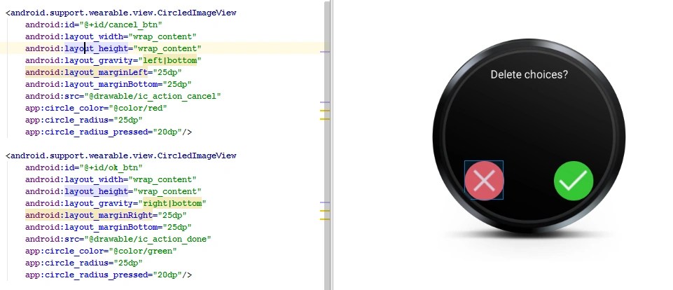
CircledImageView is part of android.support.wearable.view. As the class name says, it’s a circled image view which extends itself from android.view.View. Here’s the usage.
Quote: Reference - GitHub Sample
Please note – It’s a reused code from here:
- <android.support.wearable.view.CircledImageView
- android:id="@+id/cancel_btn"
- android:layout_width="wrap_content"
- android:layout_height="wrap_content"
- android:layout_gravity="left|bottom"
- android:src="@drawable/action_cancel"
- app:circle_color="@color/red"
- app:circle_radius="25dp"
- app:circle_radius_pressed="20dp"/>
CardFrame
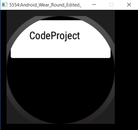
The CardFrame is a simplest of card view component. It extends itself from android.view.ViewGroup. The CardFrame composes or wraps other view components. When rendered, these cards shows up with a white background and rounded corners. Has an optional icon that can be set. Here’s the sample usage of CardFrame.
- <?xml version="1.0" encoding="utf-8"?>
- <RelativeLayout xmlns:android="http://schemas.android.com/apk/res/android"
- xmlns:tools="http://schemas.android.com/tools"
- android:layout_width="wrap_content"
- android:layout_height="80dp"
- tools:context=".CardFrame"
- android:layout_centerInParent="true"
- tools:deviceIds="wear_round">
- <android.support.wearable.view.CardFrame
- android:id="@+id/card_frame"
- android:layout_width="wrap_content"
- android:layout_height="wrap_content" >
- <TextView
- android:id="@+id/text_view_1"
- android:layout_width="wrap_content"
- android:layout_height="wrap_content"
- android:gravity="left"
- android:textAlignment="center"
- android:text="@string/codeproject"
- android:textColor="@color/black"
- android:textSize="18sp" />
- </android.support.wearable.view.CardFrame>
- </RelativeLayout>
CardScrollView
The CardScrollView is a view component that extends itself from android.widget.FrameLayout. It composes CardFrame and provides a mechanism to scroll the contents towards upward or downward direction.
One of the best example where you can see the CardScrollView being used is while sending messages, a list of all scrollable contacts are displayed so that user can select one and send a message.
This component is not so frequently used and developers have reported issues stating the scroll does not happen as expected. Not sure whether there’s really an issue or it’s not working in emulator. Here's a link.
Now let us see the sample usage of CardScrollView component. The following is the code snippet of activity layout xml file. You can see how the CardScrollView composes the CardFrame.
Quote: Reference - GitHub Sample
Please note – The following example is reused and modified code based on the above fix. Here's the GitHub link.
- <android.support.wearable.view.CardScrollView
- xmlns:android="http://schemas.android.com/apk/res/android"
- xmlns:app="http://schemas.android.com/apk/res-auto"
- android:id="@+id/card_scroll_view"
- android:layout_height="match_parent"
- android:layout_width="match_parent"
- app:layout_box="all">
- <android.support.wearable.view.CardFrame
- android:layout_height="wrap_content"
- android:layout_width="wrap_content"
- android:id="@+id/card_scrollview_card_frame">
- <LinearLayout
- android:layout_height="wrap_content"
- android:layout_width="match_parent"
- android:orientation="vertical"
- android:paddingLeft="5dp">
- <TextView
- android:fontFamily="sans-serif-light"
- android:layout_height="wrap_content"
- android:layout_width="match_parent"
- android:text="CodeProject Test, CodeProject Test, CodeProject Test,
- CodeProject Test, CodeProject Test,
- CodeProject Test, CodeProject Test,
- CodeProject Test, CodeProject Test,
- CodeProject Test, CodeProject Test,
- CodeProject Test, CodeProject Test,
- CodeProject Test, CodeProject Test,"
- android:textColor="@color/black"
- android:textSize="15sp"/>
- <TextView
- android:fontFamily="sans-serif-light"
- android:layout_height="wrap_content"
- android:layout_width="match_parent"
- android:text="Demo"
- android:textColor="@color/black"
- android:textSize="14sp"/>
- </LinearLayout>
- </android.support.wearable.view.CardFrame>
- </android.support.wearable.view.CardScrollView>
- public class CardScrollViewDemo extends Activity {
- @Override
- protected void onCreate(Bundle savedInstanceState) {
- super.onCreate(savedInstanceState);
- setContentView(R.layout.activity_card_scroll_view);
- CardScrollView cardScrollView = (CardScrollView) findViewById(R.id.card_scroll_view);
- CardFrame cardFrame = (CardFrame) findViewById(R.id.card_scrollview_card_frame);
- cardScrollView.setExpansionEnabled(true);
- cardScrollView.setExpansionDirection(1);
- cardScrollView.setExpansionFactor(10.0F);
- cardFrame.setExpansionEnabled(true);
- cardFrame.setExpansionDirection(1);
- cardFrame.setExpansionFactor(10.0F);
- }
- }
The CardFragment is a view component extends itself from a Fragment and holds scrollable card. The CardFragment basically provides a default card layout. There is a provision to set a title, icon and text.
Let us take a look into an example to understand the usage. We are going to make use of a FrameLayout and compose a CardFragment within it.
The following is the code snippet of the Activity layout xml file.
- <android.support.wearable.view.BoxInsetLayout
- xmlns:android="http://schemas.android.com/apk/res/android"
- xmlns:app="http://schemas.android.com/apk/res-auto"
- android:layout_height="match_parent"
- android:layout_width="match_parent">
- <FrameLayout
- android:id="@+id/frame_layout"
- android:layout_width="match_parent"
- android:layout_height="match_parent"
- app:layout_box="bottom">
- </FrameLayout>
- </android.support.wearable.view.BoxInsetLayout>
- Create an instance of FragmentManager.
- Create an instance of FragmentTransaction by making a call to beginTransaction method of FragmentManager.
- Create an instance of CardFragment by making a call to static method “create” passing in the card fragment title, text and an icon to be displayed.
- public class CardFragmentDemo extends Activity {
- @Override
- protected void onCreate(Bundle savedInstanceState) {
- super.onCreate(savedInstanceState);
- setContentView(R.layout.activity_card_fragment_demo);
- FragmentManager fragmentManager = getFragmentManager();
- FragmentTransaction transaction = fragmentManager.beginTransaction();
- CardFragment cardFragment = CardFragment.create(getString(R.string.card_fragment_title),
- getString(R.string.card_fragment_text),
- R.drawable.card_frame);
- cardFragment.setCardGravity(Gravity.BOTTOM);
- transaction.add(R.id.frame_layout, cardFragment);
- transaction.commit();
- }
- }
2D Picker or GridViewPager
The GridViewPager is a view component that extends itself from android.view.ViewGroup. If your application has more than one page, then GridViewPager is best suited to show the user one page at a time and let him/her scroll through the pages horizontally or vertically to access related pages.
An Adapter is something which is required to display the data. We are going to set the GridViewPager’s adapter by making a call to its setAdapter method.
The GridView adapter is created by extending from FragmentGridPagerAdapter and then overriding getRowCount, getColumnCount, getFragment, getBackgroundForPage methods.
Quote: Reference - GitHub Sample
We are building a sample based on the following wearable.
Please note, this code is licensed under - Apache License, Version 2.0 with a Copyright (C) 2014 The Android Open Source Project.
The following is the code snippet for GridViewPager adapter, the two key we need to understand is to return the fragment based on the row and column position and to return a Drawable instance for setting the page background.
- public class SampleGridPagerAdapter extends FragmentGridPagerAdapter{
- Map<Point, Drawable> mBackgrounds = new HashMap<Point, Drawable>();
- private Context mContext;
- private static final int NUM_ROWS = 10;
- private static final int NUM_COLS = 3;
- public SampleGridPagerAdapter(Context ctx, FragmentManager fm) {
- super(fm);
- mContext = ctx;
- }
- @Override
- public int getRowCount() {
- return NUM_ROWS;
- }
- @Override
- public int getColumnCount(int rowNum) {
- return NUM_COLS;
- }
- @Override
- public Fragment getFragment(int rowNum, int colNum) {
- return MainFragment.newInstance(rowNum, colNum);
- }
- @Override
- public Drawable getBackgroundForPage(int row, int column) {
- Point pt = new Point(column, row);
- Drawable drawable = mBackgrounds.get(pt);
- if (drawable == null) {
- Bitmap bm = Bitmap.createBitmap(200, 200, Bitmap.Config.ARGB_8888);
- Canvas c = new Canvas(bm);
- Paint p = new Paint();
- // Clear previous image.
- c.drawRect(0, 0, 200, 200, p);
- p.setAntiAlias(true);
- p.setTypeface(Typeface.DEFAULT);
- p.setTextSize(64);
- p.setColor(Color.LTGRAY);
- p.setTextAlign(Align.CENTER);
- c.drawText(column+ "-" + row, 100, 100, p);
- drawable = new BitmapDrawable(mContext.getResources(), bm);
- mBackgrounds.put(pt, drawable);
- }
- return drawable;
- }
- }
- class MainFragment extends CardFragment {
- static MainFragment newInstance(int rowNum, int colNum) {
- Bundle args = new Bundle();
- args.putString(CardFragment.KEY_TITLE, "Row:" + rowNum);
- args.putString(CardFragment.KEY_TEXT, "Col:" + colNum);
- MainFragment f = new MainFragment();
- f.setArguments(args);
- return f;
- }
- }
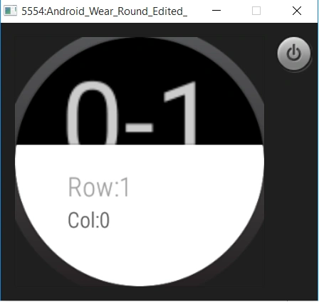
Let’s now see how we can set the GridViewPager. All we need to do is create an instance of the custom grid view pager adapter and set the same to the GridViewPager by making a call to its setAdapter method.
- public class GridViewPagerDemo extends Activity {
- SampleGridPagerAdapter mAdapter;
- GridViewPager mPager;
- @Override
- protected void onCreate(Bundle savedInstanceState) {
- super.onCreate(savedInstanceState);
- setContentView(R.layout.activity_grid_view_pager_demo);
- mPager = (GridViewPager) findViewById(R.id.pager);
- mAdapter = new SampleGridPagerAdapter(this, getFragmentManager());
- mPager.setAdapter(mAdapter);
- }
- }
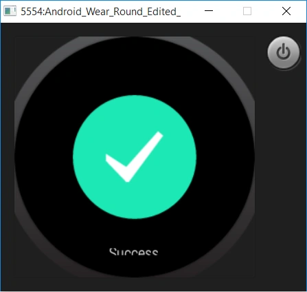
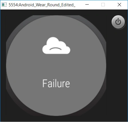
The ConfirmationActivity is a view component that can be used to provide a visual feedback to the user. There are various cases where you wish to provide confirmation say after performing an activity. The following are some of the animation types.
- ConfirmationActivity.SUCCESS_ANIMATION
- ConfirmationActivity.FAILURE_ANIMATION
- ConfirmationActivity.OPEN_ON_PHONE_ANIMATION
The following is an example which demonstrates the usage of ConfirmationActivity. We have an activity screen with two buttons to show the confirmation for success and failure.
Quote: Reference - GitHub Sample
Please note - The following example is based on WearViewSample.
- <RelativeLayout xmlns:android="http://schemas.android.com/apk/res/android"
- android:layout_width="match_parent"
- android:layout_height="match_parent"
- android:paddingLeft="@dimen/activity_horizontal_margin"
- android:paddingRight="@dimen/activity_horizontal_margin"
- android:paddingTop="@dimen/activity_vertical_margin"
- android:paddingBottom="@dimen/activity_vertical_margin"
- android:layout_centerInParent="true">
- <Button
- android:id="@+id/success_button"
- android:layout_width="wrap_content"
- android:layout_height="wrap_content"
- android:text="@string/success"/>
- <Button
- android:id="@+id/failure_button"
- android:layout_width="wrap_content"
- android:layout_height="wrap_content"
- android:layout_below="@id/success_button"
- android:text="@string/failure"/>
- </RelativeLayout>
- private void startConfirmationActivity(int animationType, String message) {
- Intent confirmationActivity = new Intent(this, ConfirmationActivity.class)
- .setFlags(Intent.FLAG_ACTIVITY_NEW_TASK | Intent.FLAG_ACTIVITY_NO_ANIMATION)
- .putExtra(ConfirmationActivity.EXTRA_ANIMATION_TYPE, animationType)
- .putExtra(ConfirmationActivity.EXTRA_MESSAGE, message);
- startActivity(confirmationActivity);
- }
- <activity android:name="android.support.wearable.activity.ConfirmationActivity" />
DelayedConfirmationView
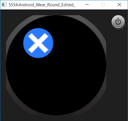
The DelayedConfirmationView is a wearable view component that extends itself from android.support.wearable.view.CircledImageView. As the same says it provides a confirmation with a delay.
The delay allows the user to cancel the operation if she/he wishes to do so. Let us take a look into the example and try to understand more about it.
Quote: Reference - GitHub Sample
Please note – We are reusing the code sample from the same WearViewSample (link mentioned above)
Here’s the code snippet of our activity xml file. You can see below, we are making use of a DelayedConfirmationView view component.
- <RelativeLayout xmlns:android="http://schemas.android.com/apk/res/android"
- xmlns:tools="http://schemas.android.com/tools" android:layout_width="match_parent"
- android:layout_height="match_parent" android:paddingLeft="@dimen/activity_horizontal_margin"
- android:paddingRight="@dimen/activity_horizontal_margin"
- android:paddingTop="@dimen/activity_vertical_margin"
- android:paddingBottom="@dimen/activity_vertical_margin"
- tools:context="com.example.ranjan.androidwearuicomponents.DelayedConfirmationDemo">
- <android.support.wearable.view.DelayedConfirmationView xmlns:app="http://schemas.android.com/apk/res-auto"
- android:id="@+id/timer"
- android:layout_width="wrap_content"
- android:layout_height="wrap_content"
- android:layout_marginBottom="8dp"
- android:layout_marginLeft="8dp"
- app:circle_border_width="8dp"
- android:src="@drawable/cross_white"
- app:circle_color="@color/blue"
- app:circle_padding="4dp"
- app:circle_radius="40dp" />
- </RelativeLayout>
- public class DelayedConfirmationDemo extends Activity {
- private DelayedConfirmationView mDelayedConfirmationView;
- @Override
- protected void onCreate(Bundle savedInstanceState) {
- super.onCreate(savedInstanceState);
- setContentView(R.layout.activity_delayed_confirmation_demo);
- mDelayedConfirmationView = (DelayedConfirmationView) findViewById(R.id.timer);
- startConfirmationTimer();
- }
- private void startConfirmationTimer() {
- mDelayedConfirmationView.setTotalTimeMs(4 * 1000);
- mDelayedConfirmationView.setListener(
- new android.support.wearable.view.DelayedConfirmationView.DelayedConfirmationListener() {
- @Override
- public void onTimerFinished(View view) {
- }
- @Override
- public void onTimerSelected(View view) {
- finish();
- }
- }
- );
- mDelayedConfirmationView.start();
- }
- }
DismissOverlayViewActivity
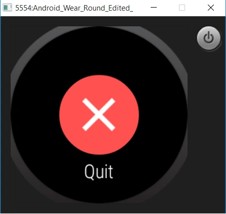
The DismissOverlayView is a view component which can be used to dismiss or exit an application on demand. It’s one of the efficient ways to exit an application without the user having to swipe cards from left to right. Imagine if you have a grid of cards, the user will then have to manually swipe each of the cards to exit the application. Instead with the help of DismissOverlayView, the user can just long press on the activity to dismiss or exit an application on demand.
Let us take a look into the demo sample and try to understand more about the usage of DismissOverlayView.
Here’s the code snippet of the dismiss overlay activity xml file.
Quote: Reference - GitHub Sample
Please note – We are reusing the code sample from the same WearViewSample (link mentioned above)
- <RelativeLayout xmlns:android="http://schemas.android.com/apk/res/android"
- android:layout_width="match_parent"
- android:layout_height="match_parent">
- <android.support.wearable.view.DismissOverlayView
- android:id="@+id/dismiss_overlay"
- android:layout_width="match_parent"
- android:layout_height="match_parent" />
- </RelativeLayout>
- public class DismissOverlayViewDemo extends Activity {
- private GestureDetectorCompat mGestureDetector;
- private DismissOverlayView mDismissOverlayView;
- @Override
- protected void onCreate(Bundle savedInstanceState) {
- super.onCreate(savedInstanceState);
- setContentView(R.layout.activity_dismiss_overlay_view_demo);
- mDismissOverlayView = (DismissOverlayView) findViewById(R.id.dismiss_overlay);
- mDismissOverlayView.setIntroText(R.string.intro_text);
- mDismissOverlayView.showIntroIfNecessary();
- mGestureDetector = new GestureDetectorCompat(this, new LongPressListener());
- }
- private class LongPressListener extends GestureDetector.SimpleOnGestureListener {
- @Override
- public void onLongPress(MotionEvent event) {
- mDismissOverlayView.show();
- }
- }
- @Override
- public boolean dispatchTouchEvent(MotionEvent event) {
- return mGestureDetector.onTouchEvent(event) || super.dispatchTouchEvent(event);
- }
- }
BoxInsetLayout
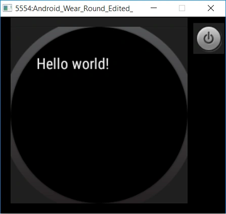
The BoxInsetLayout is a wearable component which extends itself from a FrameLayout. It’s an important view component that can be used to layout the composed components in a square or a round based screens. So you don’t really have to worry about fitting in the UI specific to the screen types.
Let us see a demo sample on how to use a BoxInsetLayout. Here’s the code snippet of activity layout xml file. You can see below, we have one TextView component within the BoxInsetLayout where the layout parameter layout_box is set to “all” indicating there’s an offset from any side. You can go with left|top|right|bottom or all values for layout_box.
- <android.support.wearable.view.BoxInsetLayout xmlns:android="http://schemas.android.com/apk/res/android"
- xmlns:tools="http://schemas.android.com/tools"
- xmlns:app="http://schemas.android.com/apk/res-auto"
- android:layout_width="match_parent"
- android:layout_height="match_parent"
- tools:context="com.example.ranjan.androidwearuicomponents.BoxInsetLayoutDemo">
- <TextView android:text="@string/hello_world" android:layout_width="wrap_content"
- android:layout_height="wrap_content" app:layout_box="all" />
- </android.support.wearable.view.BoxInsetLayout>
Conclusion
It was a wonderful experience in learning something new on Wearable UI components. There are too many things to appreciate, say when it comes to the components and design for wearables. Small computing is always challenging and it always makes me to explore and discover the possibilities.
Sr KarthigaPosted Feb 14, 2016, 7:53 AM
Good one sir
Ankit BansalPosted Oct 19, 2015, 12:43 AM
nice one..thanks for sharing with us..
Santhakumar MunuswamyPosted Oct 18, 2015, 2:20 AM
Good article
Priyaranjan K SPosted Oct 17, 2015, 1:18 PM
Thanks for the share ...
Nilesh JadavPosted Oct 17, 2015, 12:13 AM
This is great sir !! Good going !! :)
Harshad PansuriyaPosted Oct 17, 2015, 12:11 AM
Great Work ||
Ranjan DailataPosted Oct 16, 2015, 5:27 PM
Thanks you all! I'm excited to share my experience on wearables :)
RakeshPosted Oct 16, 2015, 2:57 PM
Good share
Mukesh KumarPosted Oct 16, 2015, 2:17 PM
Good one...thanks for shaing
Kamlesh BhorPosted Oct 16, 2015, 10:37 AM
nice...