

Introduction
PnP initiative is very useful, since, among many other things such as sample codes, guidance documentation, community calls, etc., it has also provided some reusable controls that can be used in SPFx web parts and extensions. You can refer to this link for more details.
There are 2 types of controls, SPFx react controls that can be used in the content of the web part and other SPFx property pane controls which can be used in the property pane of SPFx web part.
SPFx react control Version 1.17.0 was released recently, which added 4 new controls and other enhancements and bug fixes. You can find a summary of the current release at this link.
In this article, we will learn how to use PnP Combo box List Item control in the SPFx web part.
Create WebPart
Run below commands in sequence.
Open a command prompt and create a directory for the SPFx solution and go to that directory.
- md PnPControlsDemo
- cd PnPControlsDemo
Let us now create our solution:
- yo @microsoft/sharepoint
Select the below options:
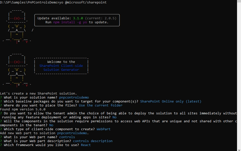
Once you select all options in wizard one by one, it will take some time to generate the code structure.
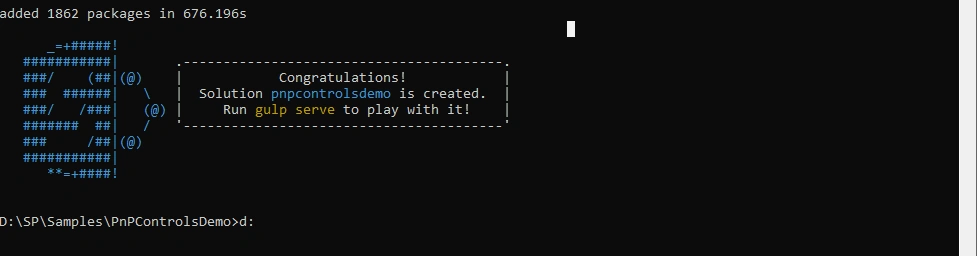
Now let's install the required npm packages to use PnP controls. Run the below command:
- npm install @pnp/spfx-controls-react@next --save
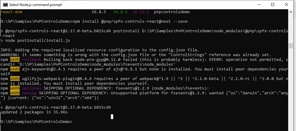
After it is completed, open the same folder in Visual Studio code (you can use any other editor as well).
Now let's modify code to use these controls.
Passing WebPart context to React components
Combobox List Item Picker requires Sharepoint site context to work with, therefore we will pass it from our web part file to react components.
Modify the code to what is shown below:
- import { WebPartContext } from '@microsoft/sp-webpart-base';
- export interface IControlsProps {
- description: string;
- context: WebPartContext;
- }
Open src\webparts\controls\ControlsWebPart.ts
Modify the render method to the pass context.
- public render(): void {
- const element: React.ReactElement<IControlsProps > = React.createElement(
- Controls,
- {
- description: this.properties.description,
- context:this.context
- }
- );
- ReactDom.render(element, this.domElement);
- }
Please note we have just added line ‘context:this.context’ .
Modify the React component associated with the Web Part.
Open src\webparts\controls\components\Controls.tsx
Import the ComboBoxListItemPicker Control
- import { ComboBoxListItemPicker } from '@pnp/spfx-controls-react/lib/listItemPicker';
Modify the render method:
- public render(): React.ReactElement<IControlsProps> {
- return (
- <div className={ styles.controls }>
- <div className={ styles.container }>
- <div className={ styles.row }>
- <div className={ styles.column }>
- <span className={ styles.title }>Welcome to SharePoint!</span>
- <p className={ styles.subTitle }>Customize SharePoint experiences using Web Parts.</p>
- <p className={ styles.description }>{escape(this.props.description)}</p>
- <a href="https://aka.ms/spfx" className={ styles.button }>
- <span className={ styles.label }>Learn more</span>
- </a>
- </div>
- </div>
- </div>
- <br>
- </br>
- <ComboBoxListItemPicker listId='ba682bc2-351e-45ae-8cbe-b0512ba0291a'
- columnInternalName='Desc'
- keyColumnInternalName='Id'
- // filter="Title eq 'SPFx'"
- onSelectedItem={this.onSelectedComboBoxItemPicker}
- webUrl={this.props.context.pageContext.web.absoluteUrl}
- spHttpClient={this.props.context.spHttpClient}
- multiSelect={true}
- />
- </div>
- );
- }
If you look at above code, what we are doing is:
- Adding a Combobox List Item Picker control
- Passing a listId of targeted List
- webUrl – Passing the url of web where our targeted list is available.
- Provide a columnInternalName which is name of column which you want to display in dropdown
- Provide a keyColumnInternalName which is the name of the column which you want to use as an Id(value)
- Binding an onSelectedEvent event with custom method (this.onSelectedComboBoxItemPicker)
- private onSelectedComboBoxItemPicker(items:any[]) {
- console.log("selected items:", items);
- }
Note
There was an issue with the initial release of this control which was not passing objects values in items array. This was fix as part of Release 1.1.18.
For now, let us see this web part in the action. Run gulp serve
gulp serve
Open the SharePoint workbench page.
https://spevents.com/sites/spsahmd2019/_layouts/15/workbench.aspx
Add a target web part, and when the page loads, we will see below output:
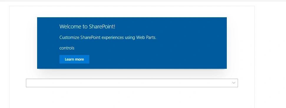
Click on Dropdown and select some items:
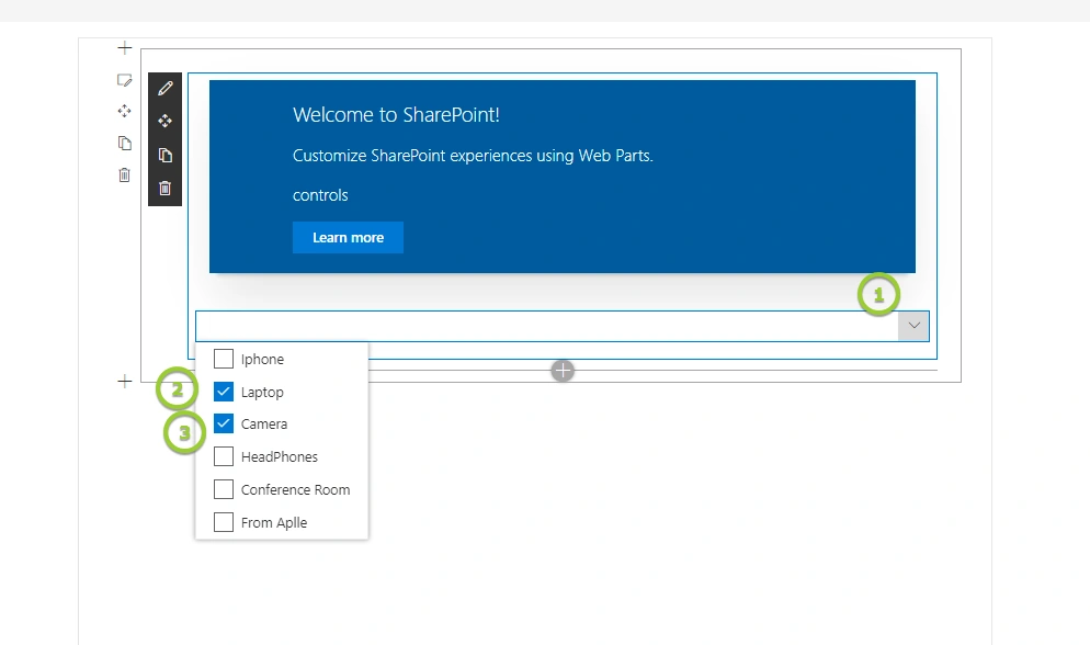
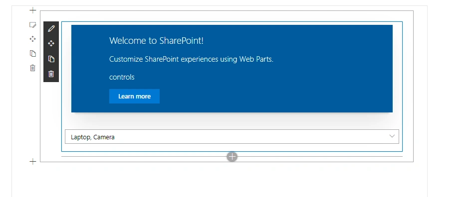
Below is how it will look with the selected items:
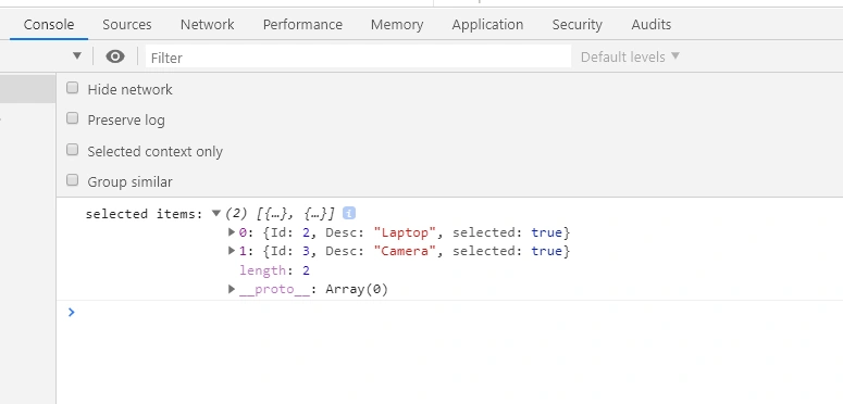
If you go to the console, you can see below the object logged in the console. Please note that onSelectedItem event will be called every time an item is selected:
Conclusion
This control will be very useful when we wanted functionality to allow the user to select multiple items from the List.
Thanks for reading, hope you enjoyed it.
SUNNY SINHAPosted May 31, 2020, 1:43 AM
Hi Siddharth, where can i find the code of the demo you have provided in "SPFx Deep Dive Webinar Series: PnP Controls for SPFx"....?
Siddharth VaghasiaPosted May 27, 2020, 1:43 PM
Hey sunny, it should work if you are giving as defaultSelectedItems: [1,2,3] ...debug and check you lookup column id array is exactly the same ? it might be object and not array...
SUNNY SINHAPosted May 27, 2020, 6:00 AM
How to pass "defaultselectedItems" in control when we fetch saved data from multiple lookup.like i have multipleselect lookup field which gives values as Items.LookupColId: (3) [1, 2, 3]assigning this value to array of any or number state & paassing state to "defaultselectedItems" is not working... but if i pass hardcoded value [1,2,3] in "defaultselectedItems", it is working...please help