
Normally in mobile when we run website pages,
most off the pages are not fitted in to the screen that means its not proper
aligned, we have to scroll horizontally lots.
It is same like when we drag a browser and squeeze it small the web pages are
getting cutting out, like the below picture:
Now I am sharing you a smart trick.
If you don't have any mobile simulator (windows, apple, android) to test your
web application, don't worry, just drag your browser and squeeze it just like a
mobile phone width size say 320px.
Then if your web page fitted on it ,means all your page content are not getting
cut-of. You win the jackpot.
So for achieving this we have to design our web pages control in such a manner
that it will fit the width, alignment in any media screen size.
Now here the css3 power comes (normally we know css2).
In css3 we have a property name "MEDIA QUERY".
"by using Media Queries, presentations can be tailored to a specific range of
output devices without changing the content itself ".......that means we will
apply this css
into our web controls (for e.g div, p, table). So the control will adjust its
width according to the device.
Note: The css3 supports only chrome, mozilla 4+,safari,I.E 9.
The media query syntax will be
@media screen and (max-width:999px)
{
}
Now I will create a small web application where we will implement this css3media
screen property.
Step 1: Create an ASP.NET webapplication.
Step 2 : Now in our application we have a Parent DIV say
<div
id="container">
Inside this div we have the below 3 child div
<div
id="nav">
<div
id="content">
<div
id="extras">
Under Each DIV we have different content say text, image like the below code
segment:
<div
id="container">
<h1>
Site name
</h1>
<div
id="nav">
<%--
<ul>
<li><a href="#">Link 1</a></li>
<li><a href="#">Link 2</a></li>
<li><a href="#">Link 3</a></li>
</ul>--%>
</div>
<div
id="content">
<h2>
Main heading here
</h2>
<p>
<img
class ="feature-image"
src="heart_and_rose.png"
alt="Holi"
/>
A rose is a woody
perennial.................range of garden roses.
</p>
</div>
<div
id="extras">
<h3>
Related info
</h3>
<p>
he leaves are borne alternately
on the stem.............are evergreen or nearly so.
</p>
</div>
</div>
Create a style sheet file into your web project (say mquery.css) and make style
sheet for each image, div including parent div just like the below code segment:
#nav
{
float: left;
width: 200px;
background: lime;
}
#content
{
background-position:
yellow center;
border-style: solid;
border-color:
#FF0000;
float: left;
width: 550px;
margin: 5
0 0
25px;
background: #0066CC;
background-repeat:
no-repeat;
}
#extras
{
float: right;
width: 200px;
background: gray;
}
.feature-image
{
border: thick
outset #008000;
float: right;
margin: 0
0 10px
10px;
}
Now in the stylesheet apply the media query css3 property like the below code
segment:
@media
screen and (max-width:380px)
{
#container {
width: 300px; }
#nav
{
float: none;
width: auto;
}
#content
{
float: none;
width: auto;
margin: 0;
}
#extras
{
float: none;
width: auto;
margin: 0;
}
.feature-image
{
float: none;
width: auto;
margin: 0;
}
See here first I have mentioned the mediascreen max width property with 380px.
Normally in fullscale browser the pix will be 1200+px.
So when we squeeze the browser and drag it width small and make it similar like
smart phone screen width that time the browser screen width pix will be (below
320px).
After that I am doing the main div(#container) size it into 300 px and also
making other div (nav,content,extrax) and ".feature-image" into width=auto,
float =none, margin=0.
Now after running the application in chrome browser and make the browser width
just like tablet width by making it sqiz, the application will look like the
below picture:
See Here the Image with content are not getting cutting out.
Now we will make the browser width more small (300px) like a standard smart
phone screen width by dragging the browser. See the result like the below
picture: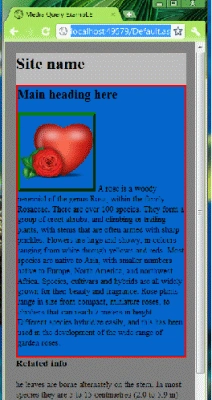
See the width of the browser. Its just similar to any standard smart phone
screen width.
And see all the content in the web pages are not getting cutoff.
Its fits the alignment width of the browser even the image also. Its al about
the css3 magic of media screen.
Dont test this application into any I.E browser that lower than 9 ver.css3
supports only I.E 9 browser.
I have atatched the project file also here.
Conclusion
So in this article we get to know Making ASP.NET webapplication display size
compatibility into any Smart Phone device or tablet using CSS3.

Making ASP.NET Web Application to Display Size Compatibility Into Smart Phone or Tablet Using CSS3
Join the conversation! Your thoughts help the community grow.
Sign in to leave a comment
It is the same account you read, post and publish with — and you will come straight back to this page.
Former memberPosted Mar 20, 2015, 4:53 AM
i am not css guy but i like this article but do not understand first you write css for few element like #nav,#content,#extras etc but again you define more or less same css inside @media screen and (max-width:380px) { } for those same element #nav,#content,#extras etc. it seems that u r duplicating css for same element #nav,#content,#extras etc..........why ? is it require when some one write media query then he/she need to define css twice for the same element. please guide in details. thanks
Rajagopalan R VPosted Sep 12, 2014, 4:50 AM
i had looking for this type of concept only after Reading this article got an Idea ,Nice one
Varuna GPosted Jun 27, 2013, 5:38 AM
Very useful article. Thank you
Jose LopezPosted Jul 13, 2012, 11:46 AM
Thanks!!! Very interesting!
Anshuman MishraPosted Jul 4, 2012, 7:50 AM
it's good but it is working only browser when i use the simulator it's not working.
Maria JohnsonPosted Jan 24, 2012, 12:37 AM
Its an amazing concept which you have shared through article. I will surely try to implement this.
Abhishek DubeyPosted Jan 24, 2012, 12:22 AM
this a new and best idea for handling the screen pixel problem for mobile browser thanks.....
Alok PandeyPosted Jan 24, 2012, 12:20 AM
Nice article. thanks for sharing.
Emmy DickensPosted Jan 24, 2012, 12:20 AM
Very interesting... must be given 5 out 5.
Sanjoli GuptaPosted Jan 24, 2012, 12:18 AM
good explanation
Davin MartynPosted Jan 24, 2012, 12:16 AM
Nice Representation...How can we use CSS3 in our application?