Introduction:
This article describes a simple way to mimic the appearance of Microsoft's Outlook sidebar within an ASP.NET 2.0 web application. The approach is based upon the use of the existing Multi-View control contained in the standard ASP.NET 2.0 toolbox and does not require much time or effort to implement.
This article includes a sample web application that presents an example of the approach in use.
Getting Started:
In order to begin, unzip the downloaded files and open the project provided. Within the project you will find a simple ASP.NET 2.0 application written in C#.NET; the web application contains a single web page (Default.aspx).
The default.aspx page is built from a template table containing a sidebar, a header, and a main display area. In order to add a similar table to a project, create a new web page, open the "Layout" menu option, then select "Insert Table" from that option. The insert table dialog will then appear (Figure 1). From this dialog, select the "Template" option at the top of the dialog, then open the combo box to reveal the table options. Select the option showing "Header and Side". When you click "Ok" a table in format specified will be added to the open web page. You may wish to set the size properties for each of the table's areas before adding any additional controls; it is typically easier to set up the proportions of the table when no controls are yet placed within its bounds. One thing you might want to do at this point is to set the sidebar area's vertical alignment property to bottom. You can set the banner and main display area as you set fit.
Once the table is placed and you are happy with its arrangement, it is time to add the controls necessary to support the appearance of Microsoft Outlook.
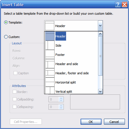
Figure 1: Insert Table Dialog in Visual Studio 2005
Take a look at Outlook (figure 2) and note that the sidebar is really pretty simple. There are a set buttons at the bottom of the sidebar and, above the buttons, is a display area used to display the controls relevant to the button selected. Whenever a new button is clicked from the bottom of the sidebar, the contents of the sidebar's display area are updated to show the selection's control options.
At the top of the sidebar is a label that displays the contents of the sidebar. Whenever a new option is selected by clicking one of the buttons at the bottom of the sidebar, the label is updated to reflect the selection.
Inside the sidebar's display area, there can be additional collapsible panels that may be expanded or contracted to reveal or hide the panel's content. These are very simple to construct from the Microsoft multi-view panel as well and a simple example of such a panel is included in the demonstration.
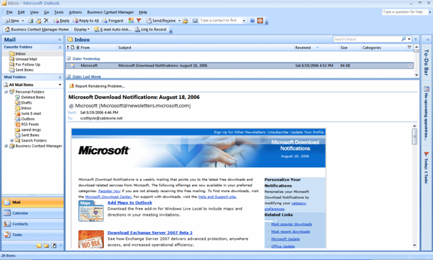
Figure 2: Microsoft Outlook with Sidebar Visible (on left)
Once the table has been configured, drag a label from the toolbox and place it in the sidebar area of the table, next, drag a multi-view control under the label, and then drag three view controls inside of the multi-view control. Lastly, drag three button controls into bottom of the sidebar area.
You may drag some other controls inside each of the view panels; I merely placed some checkbox and radio button lists into the views for the purposes of this demonstration however the view control is container control and you may place any other controls inside a view control that you wish.
To demonstrate the collapsible panel, I constructed a simple user control that you will find in the demonstration project. The user control is entitled, "CollapsePanel.cs"; if you open it up for a look, you will see that it contains a single panel with its width set to 100%, inside the panel you will find a small table with three rows, the second row contains two table cells, in the left hand cell is a label, and in the right hand cell, there are two image button controls. The left button control is named, "btnOpen" and the right hand button control is named "btnClose". Each image button is assigned an arrow looking icon, one pointing down and one pointing to the right. The visibility of the "btnClose" image button is set to false.
I placed a single label control in rows 1 and 3 and set the text property to "<hr/>" to draw a horizontal line above and below the title. Below the table there is a single multi-view control and inside the multi-view control is a single view control. When a page loads this control, the view control will default to show no panels at all, if you prefer to have the control load with the panel visible, you will need to set the active view index property of the multi-view control to "0" or "View1" (our single panel) and swap the visibility between the two image button controls.
The "btnClose" click event handler will set the multi-view control's active index property to "-1" to hide the view control. The event handler will also swap the visibility of the "btnClose" button to false and the "btnOpen" button's visibility to true. The entire user control's code behind page is as follows:
public partial class CollapsePanel : System.Web.UI.UserControl
{
protected void Page_Load(object sender, EventArgs e)
{
}
protected void btnClose_Click(object sender, System.Web.UI.ImageClickEventArgs e)
{
MultiView1.ActiveViewIndex = -1;
btnOpen.Visible = true;
btnClose.Visible = false;
}
protected void btnOpen_Click(object sender, System.Web.UI.ImageClickEventArgs e)
{
MultiView1.ActiveViewIndex = 0;
btnOpen.Visible = false;
btnClose.Visible = true;
}
}
Once this user control has been built, add it to one of the views in the default.aspx page.
The code for the main page is just about as simple as it is for the user control. Here again the objective is merely to swap visible panels in response to button click events originating from the three buttons beneath the multi-view control. Given it would be nice to open up one of the panels on page load, the page load event contains a little bit of code to handle that task. In this case, page load looks like this:
protected void Page_Load(object sender, EventArgs e)
{
if (!(Page.IsPostBack))
{
this.MultiView1.SetActiveView(View1);
}
}
Here, if the page is not a post back, the multi-view control is configured to display view 1 of the three available views. You can set this value with a integer if you prefer. If you don't want any of the panels to display on the initial page load, set the value to "-1" or do nothing as by default the multi-view control will hide all of the views.
The only task remaining is to set the event handlers for the three button controls used to select each of the three separate views contained in the multi-view control, that is accomplished with the following bit of code:
protected void Button1_Click(object sender, System.EventArgs e)
{
this.MultiView1.SetActiveView(View1);
Button1.Font.Bold = true;
Button2.Font.Bold = false;
Button3.Font.Bold = false;
txtHeader.Text = "Days";
}
protected void Button2_Click(object sender, System.EventArgs e)
{
this.MultiView1.SetActiveView(View2);
Button1.Font.Bold = false;
Button2.Font.Bold = true;
Button3.Font.Bold = false;
txtHeader.Text = "Tools";
}
protected void Button3_Click(object sender, System.EventArgs e)
{
this.MultiView1.SetActiveView(View3);
Button1.Font.Bold = false;
Button2.Font.Bold = false;
Button3.Font.Bold = true;
txtHeader.Text = "Cars";
}
This is also pretty simple, in each event handler the multi-view controls set active view is passed the view to be displayed; the multi-view control is only capable of displaying a single view control at a time so you need not write any additional code to hide the other views as you would have to do if you were to implement a similar project with a panel control.
After setting the current view, the selected button's text is bolded and the unselected buttons have the bolding removed, and lastly, the text box containing the sidebar's header text is updated to reflect the current selection.
That wraps it up, if you build and run the web application, you should see the following in your browser: (figure 3)
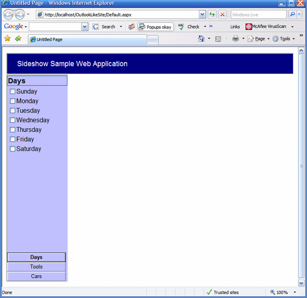
Figure 3: Demonstration Web Application
If you click on each of the buttons you should see the content of the sidebar update. If you select the "Cars" button, you should see the collapsible panel user control and if you click on its icon, you should see it reveal and hide the contents of its multi-view control: (Figures 4 and 5)
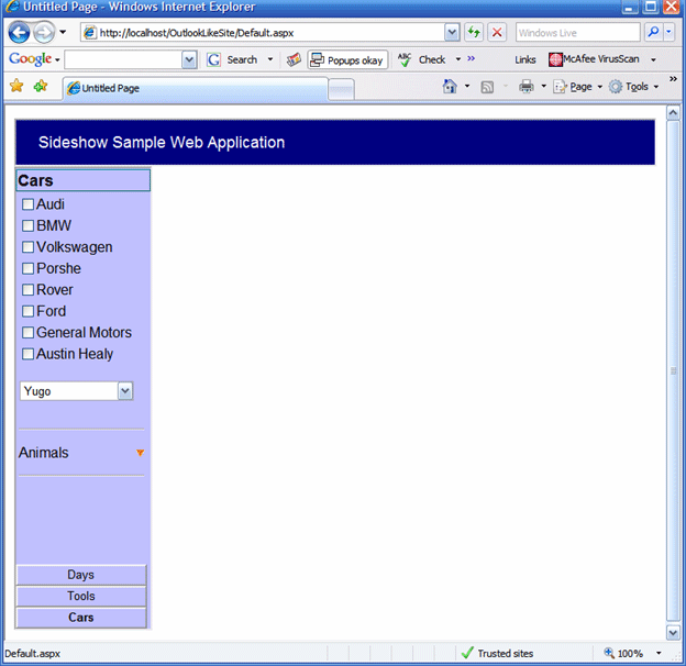
Figure 4: Collapsible Panel Closed
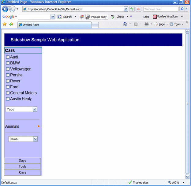
Figure 5: Collapsible Panel Opened
NOTE: THIS ARTICLE IS CONVERTED FROM VB.NET To C# USING A CONVERSION TOOL. ORIGINAL ARTICLE CAN BE FOUND ON C# CORNER (http://www.vbdotnetheaven.com/).