

Templates are an integral part of user interface design in WPF. This article explains templates, their types and how to use them in Windows applications.
WPF has the following three types of templates:
- Control Template
- Items Panel Template
- Data Template
Control Template
The ControlTemplate of a control defines the appearance of the control. We can change or define a new look and appearance of a control by simply changing the ControlTemplate of a control. ControlTemplates are even more useful when you write your own controls. You can define a default look of your controls. For example, a WPF Button control has a rectangular layout, but using ControlTemplates, you can build a custom button that has a circular layout and changes its color when you mouse over or press it.
The ControlTemplate element in XAML defines a ControlTemplate at design-time. Templates are usually defined as resources using a FrameworkElement's Resources property. The following code snippet is the syntax for defining a ControlTemplate for a Button element.
- <Grid>
- <Grid.Resources>
- <ControlTemplate x:Key="RoundButtonTemplate" />
- </Grid.Resources>
- </Grid>

Figure 1
The code snippet in Listing 1 creates a ControlTemplate and adds a Grid as contents of the ControlTemplate. Now, whatever content you put within a ControlTemplate, that is what your control will look like. As you can see from Listing 1, we add two Ellipse elements within a Grid with different radii and different color fills.
- <Grid.Resources>
- <ControlTemplate x:Key="RoundButtonTemplate" >
- <Grid>
- <Ellipse Width="100" Height="100" Name="ButtonBorder"
- Fill="OrangeRed" />
- <Ellipse Width="80" Height="80" Fill="Orange" />
- </Grid>
- </ControlTemplate>
- </Grid.Resources>
The following code snippet creates a Button element and sets its Template to the ControlTemplate that we created in Listing 1.
- <Button Template="{StaticResource RoundButtonTemplate}" >OK</Button>
TargetType Property
The TargetType property is used to restrict the type of element a ControlTemplate can be applied to. The following code snippet ensures that RoundButtonTemplate is applicable on Button elements only.
- <ControlTemplate x:Key="RoundButtonTemplate" TargetType="{x:Type Button}" >
Now how about adding some cool features to this control? Let's animate the button when you mouse over it and press it. We will change the color when you mouse over it and we will decrease the size of the button when it is pressed.
The Triggers property of a ControlTemplate handles the events. The code snippet in Listing 2 adds triggers for IsMouseOver and IsPressed events of Button. On an IsMouseOver event, I changed the color of the InnerCircle of the button. On the IsPressed event, I changed the width and height of InnerCircle and Fill of OuterCircle.
- <ControlTemplate.Triggers>
- <Trigger Property="Button.IsMouseOver" Value="True">
- <Setter TargetName="InnerCircle" Property="Fill" Value="LightGreen" />
- </Trigger>
- <Trigger Property="Button.IsPressed" Value="True">
- <Setter TargetName="InnerCircle" Property="Width" Value="60" />
- <Setter TargetName="InnerCircle" Property="Height" Value="60" />
- <Setter TargetName="OuterCircle" Property="Fill" Value="Gray" />
- </Trigger>
- </ControlTemplate.Triggers>
I also changed some code for the Fill property of Ellipses and filled them with gradient brushes as shown in Listing 3.
- <Ellipse Width="100" Height="100" Name="OuterCircle" >
- <Ellipse.Fill>
- <LinearGradientBrush StartPoint="0,0" EndPoint="0,0.5">
- <GradientStop Offset="0" Color="OrangeRed" />
- <GradientStop Offset="1" Color="Orange" />
- </LinearGradientBrush>
- </Ellipse.Fill>
- </Ellipse>
- <Ellipse Width="80" Height="80" Name="InnerCircle">
- <Ellipse.Fill>
- <LinearGradientBrush StartPoint="0,0" EndPoint="0,1">
- <GradientStop Offset="0" Color="White" />
- <GradientStop Offset="1" Color="OrangeRed" />
- </LinearGradientBrush>
- </Ellipse.Fill>
- </Ellipse>
The new button looks as in Figure 2. If you rollover the button, you will see the background of the inner circle is changed to Green and looks as in Figure 3.
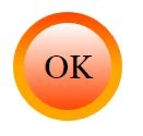
Figure 2
If you click on the button, you will see the background of outer circle changes to Gray and the width and height of the inner circle is reduced.
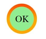
Figure 3
ItemsPanelTemplate
In the previous example, we saw how a Style element can be used within the resources to group multiple properties of elements and set them using the Style property of elements. However, Style functionality does not end here. Style can be used to group and share not only properties, but also resources and event handlers on any FrameworkElement or FrameworkContentElement.
Styles are resources and used as any other resource and can be applied to the current element, parent element, root element and even on the application level. The scope if styles are similar to any other resources. The resource lookup process first looks up for local styles and if not found, it traverses to the parent element in the logical tree and so on. In the end, the resource lookup process looks for styles in the application and themes.
The Style element in XAML represents a style. The typical definition of the Style element looks as in the following:
- <Style>
- Setters
- </Style>
Setters Property
The Setters property of Type represents a collection of Setter and EventSetter objects. Listing 4 uses the Setters property and adds a Setter and EventSetter object.
The code snippet in Listing 4 sets the Setters property of a Style by adding a few Setter elements and one EventSetter element using XAML at design-time.
- <Grid>
- <Grid.Resources>
- <Style TargetType="{x:Type Button}">
- <Setter Property="Width" Value="200"/>
- <Setter Property="Height" Value="30"/>
- <Setter Property="Foreground" Value="White"/>
- <Setter Property="Background" Value="DarkGreen"/>
- <Setter Property="BorderBrush" Value="Black"/>
- <EventSetter Event="Click" Handler="Button1_Click"/>
- </Style>
- </Grid.Resources>
- <Button>Click me</Button>
- </Grid>
In this article, we learned the basics of templates in WPF, their types and how to use them in Windows applications.
Rhishikesh LathePosted Dec 22, 2015, 12:07 AM
Article is nice. But where is the Data Template
Sujeet SumanPosted Sep 19, 2015, 6:04 AM
Nice Article...................
Jaipal ReddyPosted Jun 30, 2015, 5:16 AM
Nice article
Debasis SahaPosted Jun 30, 2015, 12:46 AM
Nice Article..
Chiheb ChebbiPosted Jun 29, 2015, 6:15 PM
nice article
Gopi ChandPosted Jun 29, 2015, 1:34 PM
Great one sir :)
Avirup BasuPosted Jun 29, 2015, 1:26 PM
Thank you sir for sharing this. Might be helpful in developing controlling apps.
Santhakumar MunuswamyPosted Jun 29, 2015, 11:18 AM
Thanks for good one sir
Former memberPosted Jun 29, 2015, 9:52 AM
Thanks for sharing sir