

Introduction
Hi friends!! In this article, we will explore the core components of Jetpack Compose. Text, Image, and Button are very common components to use in building a screen. Text represents a label, an Image is used to show an image on the UI, and a Button performs some action when the user clicks the button.

Text
Text is a composable function that allows us to display Text on the screen. The basic syntax of the Text is as follows.
Text(
    text = "Your text here",
    style = TextStyle(/* Define text style properties here */)
)
Example
@Composable
fun TextExample() {
    Text(
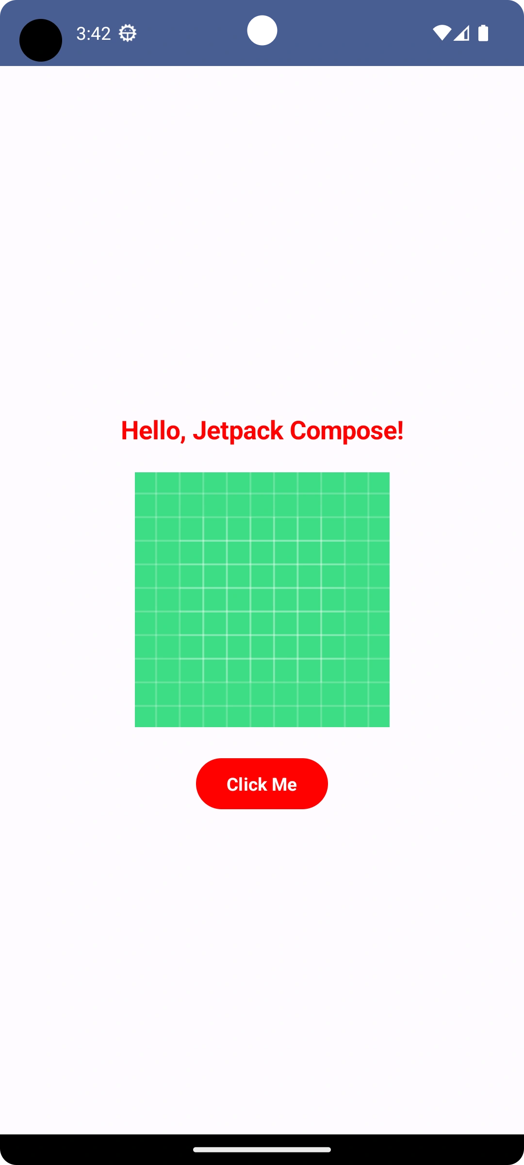
        text = "Hello, Jetpack Compose!",
        style = TextStyle(
            color = Color.Red,
            fontSize = 20.sp,
            fontWeight = FontWeight.Bold
        )
    )
}
In this example, we use the Text to display simple Text on the screen. We can customize the text appearance by using properties like fontSize, color, fontWeight, textAlign, etc.
Image
Image is a composable function that allows us to display an image on the screen. The basic syntax of the Image composable is as follows.
Image(
    painter = painterResource(R.drawable.your_image_resource),
    contentDescription = "Description for accessibility",
    contentScale = ContentScale.Fit,
    modifier = Modifier.size(width, height)
)
Here's what each parameter means:
painter: The painter resource that represents the image you want to display. You can usepainterResourceorpainterto provide the image.contentDescription: A description of the image used for accessibility purposes, such as for screen readers to describe the image to users with visual impairments.contentScale: Specifies how the image should be scaled to fit into the composable. It can beFill,Fit,Inside,Crop, etc.modifier: Modifier to specify the size and other layout properties of the Image composable.
Example
@Composable
fun ImageFromResourceExample() {
    Image(
        painter = painterResource(id = R.drawable.ic_launcher_background),
        contentDescription = "A beautiful image",
        modifier = Modifier.size(200.dp)
    )
}
In this example, we use the Image composable to display an image from a local resource.
Button
The button is a composable function that creates a clickable button UI element. The basic syntax of the Button composable is as follows.
Button(
    onClick = { /* Handle button click here */ },
    modifier = Modifier
) {
    Text(text = "Button Text")
}
Example
@Composable
fun ButtonExample() {
    Button(
      onClick = { /* Handle button click here */ },
      modifier = Modifier,
      colors = ButtonDefaults.buttonColors(containerColor = Color.Red),
      content = {
           Text(
              text = "Click Me",
              color = Color.White,
              fontWeight = FontWeight.Bold
            )
          }
       )
}
Join the conversation! Your thoughts help the community grow.