
This article presents various data editors-all built with the help of MobileForms Toolkit from Resco.
Introduction
Windows Phone 7 (WP7) programming combines several technologies:
- .NET (WP7 uses a subset of the full .NET class library.)
- C#
- Silverlight for WP7. (A simplification of the desktop SVL.)
Mastering these technologies for a programmer coming from (say) Windows Mobile programming is a real problem.
This article shows how to work with dates using MobileForms Toolkit from Resco.
Prerequisites
The target audience is a C# .NET programmer with a reading knowledge of Silverlight. At the very minimum the reader should understand basic Silverlight controls and layout.
You need to have installed Windows Phone Developer Tools.
Further you should install Resco MobileForms Toolkit, Windows Phone 7 Edition from http://www.resco.net/developer/mobileformstoolkit/. The Toolkit contains a set of useful controls that simplify Windows Phone 7 programming.
Simple use cases

The screenshots above are notoriously known to all Windows Phone 7 users. Yes, the famous date/time pickers.
The MobileForms Toolkit does not (yet) provide direct access to these pickers, instead it packages them into a few higher level controls. Following screenshot shows three of these controls in action:
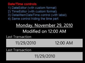
Here is the corresponding Xaml code:
 xmlns:r="clr-namespace:Resco.Controls;assembly=Resco.Controls"
...
<r:DateEditor Text="{Binding Path=ModifiedOn}"  TextDecoration="Underline" FormatString="{}{0:D}" />1
<r:TimeEditor Text="{Binding Path=ModifiedOn}"  FormatString="{}Modified on {0:t}" />
<r:DetailItemDateTime Label="Last Transaction"  DataMember="ModifiedOn" />
<r:DetailItemDateTime Label="Last Transaction"  DataMember="ModifiedOn" TimeVisibility="Collapsed" />
The DataContext is set to an object with the property
public DateTime ModifiedOn { get; set; } All controls act as editors of this property. (The effect is achieved through binding.)
DateEditor/TimeEditor are text controls that open corresponding picker upon a click. The above code demonstrates custom formatting; normally you would not use it.
DetailItemDateTime uses appearance typical for all DetailItem-derived classes 2, i.e. (optional) label and specific look&feel. You can set it up as date or time editor (using DateVisibility/TimeVisibility properties) or as a full DateTime editor (default). Instead of binding, you can use simpler DataMember syntax 3. You can customize date and time formats and a number of other properties.
2) These controls are primarily intended for use in DetailView form where they provide common look&feel. As the sample code demonstrates, they can be used independently as well.
3) DataMember refers to the property name to be used for binding that is created in the class code. This terminology is commonly used in the .NET world for data-related controls. In fact we could replace
DataMember="ModifiedOn"
by explicit binding
Value={Binding Path=ModifiedOn, Mode=TwoWay}
So much for the basic date controls. In the future more similar controls will be added depending on the user requests. The rest of this article will demonstrate some interesting uses of another control - MonthCalendar.
Selecting dates using MonthCalendar
MonthCalendar is a rather advanced control. Its task is to schematically present a series of appointments. However, all we need right now is the ability to select a single date. No appointments 4, just the reaction to selection change.
4) In other words, we shall use null DataSource.
The UI looks as follows:

A MonthCalendar control is in the bottom part. You can list individual months and select suitable day.
A TextBlock in the upper part will reflect current selection. This is just to prove the concept. Your arrangement will probably differ - for example a popup dialog with ok/cancel buttons.
The important code is almost trivial:
 // Excerpt from MonthCalendarPage.xaml
<StackPanel Orientation="Horizontal">
<r:PhoneTextControl  Text="Selected date:  />
<r:PhoneTextControl  x:Name="m_selected" />
</StackPanel>
<r:MonthCalendar x:Name="m_calendar"  Height="480" SelectionChanged="DayChanged"/>

Join the conversation! Your thoughts help the community grow.