

Date selection is one of the most common features in modern web applications. Whether you’re building a booking platform, event scheduler, admin dashboard, hotel reservation system, or appointment manager, a well-designed calendar improves the user experience.
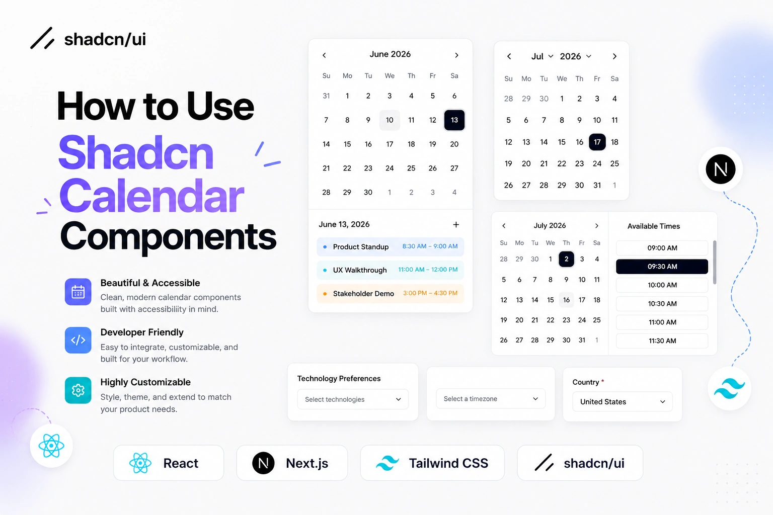
In this guide, you’ll learn how to install the Shadcn Calendar component, add it manually if needed, and build practical calendar examples like appointment scheduling and event management.
Official Shadcn Calendar
This Shadcn Calendar component provides a flexible and customizable date picker built on top of react-day-picker. Since it’s built with React and Tailwind CSS, you can easily style it to match your application’s design.
Install using CLI
Use the following command to install the Calendar component:
pnpm dlx shadcn@latest add calendar
Manual installation
Install the required dependencies:
npm install react-day-picker date-fns
Next, make sure the Button component is available in your project because the Calendar component uses it for navigation controls.
Then create a calendar.tsx file and add the following code:
"use client"

import * as React from "react"
import {
  ChevronDownIcon,
  ChevronLeftIcon,
  ChevronRightIcon,
} from "lucide-react"
import {
  DayPicker,
  getDefaultClassNames,
  type DayButton,
  type Locale,
} from "react-day-picker"

import { cn } from "@/lib/utils"
import { Button, buttonVariants } from "@/components/ui/button"

function Calendar({
  className,
  classNames,
  showOutsideDays = true,
  captionLayout = "label",
  buttonVariant = "ghost",
  locale,
  formatters,
  components,
  ...props
}: React.ComponentProps<typeof DayPicker> & {
  buttonVariant?: React.ComponentProps<typeof Button>["variant"]
}) {
  const defaultClassNames = getDefaultClassNames()

  return (
    <DayPicker
      showOutsideDays={showOutsideDays}
      className={cn(
        "group/calendar bg-background p-2 [--cell-radius:var(--radius-md)] [--cell-size:--spacing(7)] in-data-[slot=card-content]:bg-transparent in-data-[slot=popover-content]:bg-transparent",
        String.raw`rtl:**:[.rdp-button\_next>svg]:rotate-180`,
        String.raw`rtl:**:[.rdp-button\_previous>svg]:rotate-180`,
        className
      )}
      captionLayout={captionLayout}
      locale={locale}
      formatters={{
        formatMonthDropdown: (date) =>
          date.toLocaleString(locale?.code, { month: "short" }),
        ...formatters,
      }}
      classNames={{
        root: cn("w-fit", defaultClassNames.root),
        months: cn(
          "relative flex flex-col gap-4 md:flex-row",
          defaultClassNames.months
        ),
        month: cn("flex w-full flex-col gap-4", defaultClassNames.month),
        nav: cn(
          "absolute inset-x-0 top-0 flex w-full items-center justify-between gap-1",
          defaultClassNames.nav
        ),
        button_previous: cn(
          buttonVariants({ variant: buttonVariant }),
          "size-(--cell-size) p-0 select-none aria-disabled:opacity-50",
          defaultClassNames.button_previous
        ),
        button_next: cn(
          buttonVariants({ variant: buttonVariant }),
          "size-(--cell-size) p-0 select-none aria-disabled:opacity-50",
          defaultClassNames.button_next
        ),
        month_caption: cn(
          "flex h-(--cell-size) w-full items-center justify-center px-(--cell-size)",
          defaultClassNames.month_caption
        ),
        dropdowns: cn(
          "flex h-(--cell-size) w-full items-center justify-center gap-1.5 text-sm font-medium",
          defaultClassNames.dropdowns
        ),
        dropdown_root: cn(
          "cn-calendar-dropdown-root relative rounded-(--cell-radius)",
          defaultClassNames.dropdown_root
        ),
        dropdown: cn(
          "absolute inset-0 bg-popover opacity-0",
          defaultClassNames.dropdown
        ),
        caption_label: cn(
          "font-medium select-none",
          captionLayout === "label"
            ? "cn-calendar-caption text-sm"
            : "cn-calendar-caption-label flex items-center gap-1 rounded-(--cell-radius) text-sm [&>svg]:size-3.5 [&>svg]:text-muted-foreground",
          defaultClassNames.caption_label
        ),
        month_grid: cn("w-full border-collapse", defaultClassNames.month_grid),
        weekdays: cn("flex", defaultClassNames.weekdays),
        weekday: cn(
          "flex-1 rounded-(--cell-radius) text-[0.8rem] font-normal text-muted-foreground select-none",
          defaultClassNames.weekday
        ),
        week: cn("mt-2 flex w-full", defaultClassNames.week),
        week_number_header: cn(
          "w-(--cell-size) select-none",
          defaultClassNames.week_number_header
        ),
        week_number: cn(
          "text-[0.8rem] text-muted-foreground select-none",
          defaultClassNames.week_number
        ),
        day: cn(
          "group/day relative aspect-square h-full w-full rounded-(--cell-radius) p-0 text-center select-none [&:last-child[data-selected=true]_button]:rounded-r-(--cell-radius)",
          props.showWeekNumber
            ? "[&:nth-child(2)[data-selected=true]_button]:rounded-l-(--cell-radius)"
            : "[&:first-child[data-selected=true]_button]:rounded-l-(--cell-radius)",
          defaultClassNames.day
        ),
        range_start: cn(
          "relative isolate z-0 rounded-l-(--cell-radius) bg-muted after:absolute after:inset-y-0 after:right-0 after:w-4 after:bg-muted",
          defaultClassNames.range_start
        ),
        range_middle: cn("rounded-none", defaultClassNames.range_middle),
        range_end: cn(
          "relative isolate z-0 rounded-r-(--cell-radius) bg-muted after:absolute after:inset-y-0 after:left-0 after:w-4 after:bg-muted",
          defaultClassNames.range_end
        ),
        today: cn(
          "rounded-(--cell-radius) bg-muted text-foreground data-[selected=true]:rounded-none",
          defaultClassNames.today
        ),
        outside: cn(
          "text-muted-foreground aria-selected:text-muted-foreground",
          defaultClassNames.outside
        ),
        disabled: cn(
          "text-muted-foreground opacity-50",
          defaultClassNames.disabled
        ),
        hidden: cn("invisible", defaultClassNames.hidden),
        ...classNames,
      }}
      components={{
        Root: ({ className, rootRef, ...props }) => {
          return (
            <div
              data-slot="calendar"
              ref={rootRef}
              className={cn(className)}
              {...props}
            />
          )
        },
        Chevron: ({ className, orientation, ...props }) => {
          if (orientation === "left") {
            return (
              <ChevronLeftIcon
                className={cn("cn-rtl-flip size-4", className)}
                {...props}
              />
            )
          }

          if (orientation === "right") {
            return (
              <ChevronRightIcon
                className={cn("cn-rtl-flip size-4", className)}
                {...props}
              />
            )
          }

          return (
            <ChevronDownIcon className={cn("size-4", className)} {...props} />
          )
        },
        DayButton: ({ ...props }) => (
          <CalendarDayButton locale={locale} {...props} />
        ),
        WeekNumber: ({ children, ...props }) => {
          return (
            <td {...props}>
              <div className="flex size-(--cell-size) items-center justify-center text-center">
                {children}
              </div>
            </td>
          )
        },
        ...components,
      }}
      {...props}
    />
  )
}

function CalendarDayButton({
  className,
  day,
  modifiers,
  locale,
  ...props
}: React.ComponentProps<typeof DayButton> & { locale?: Partial<Locale> }) {
  const defaultClassNames = getDefaultClassNames()

  const ref = React.useRef<HTMLButtonElement>(null)
  React.useEffect(() => {
    if (modifiers.focused) ref.current?.focus()
  }, [modifiers.focused])

  return (
    <Button
      variant="ghost"
      size="icon"
      data-day={day.date.toLocaleDateString(locale?.code)}
      data-selected-single={
        modifiers.selected &&
        !modifiers.range_start &&
        !modifiers.range_end &&
        !modifiers.range_middle
      }
      data-range-start={modifiers.range_start}
      data-range-end={modifiers.range_end}
      data-range-middle={modifiers.range_middle}
      className={cn(
        "relative isolate z-10 flex aspect-square size-auto w-full min-w-(--cell-size) flex-col gap-1 border-0 leading-none font-normal group-data-[focused=true]/day:relative group-data-[focused=true]/day:z-10 group-data-[focused=true]/day:border-ring group-data-[focused=true]/day:ring-[3px] group-data-[focused=true]/day:ring-ring/50 data-[range-end=true]:rounded-(--cell-radius) data-[range-end=true]:rounded-r-(--cell-radius) data-[range-end=true]:bg-primary data-[range-end=true]:text-primary-foreground data-[range-middle=true]:rounded-none data-[range-middle=true]:bg-muted data-[range-middle=true]:text-foreground data-[range-start=true]:rounded-(--cell-radius) data-[range-start=true]:rounded-l-(--cell-radius) data-[range-start=true]:bg-primary data-[range-start=true]:text-primary-foreground data-[selected-single=true]:bg-primary data-[selected-single=true]:text-primary-foreground dark:hover:text-foreground [&>span]:text-xs [&>span]:opacity-70",
        defaultClassNames.day,
        className
      )}
      {...props}
    />
  )
}

export { Calendar, CalendarDayButton }

Join the conversation! Your thoughts help the community grow.