Introduction:
Tangram is a popular Chinese game, where a player is given with set of blocks and asked to form a specific shape (given an outline), there are several puzzles based on tangrams and forming square with given blocks is the most popular one, however I personally like the tangrams for 'T' and 'H' puzzles, which I came across when purchasing toys for my son. the tangram looks similar to what is shown in in figure (1)
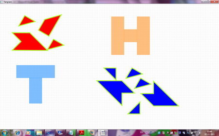
Figure 1
The objective of the game is to use red blocks to form 'T' and blue blocks to form 'H' so that they will fit in their corresponding silhouettes (layouts), Solving tangram puzzle involves moving and rotating tangram blocks, which provides interesting scope for learning creating custom shapes and transforms in WPF. So I wrote one as part of learning WPF and following sections explain the learning's in context of the game.
Designing Tangram blocks
Path:
From figure(1) we can see that what we need is ability to draw set of connected lines, which can be done using polyline or ploygon shapes, but the objective is to learn WPF as much as possible , Instead of polyline or ploygon I used Path, which is most powerful of shapes and can be used to create a wide varieaty of custom shapes. The only property defined by Path class is "Data", which of abstract type Geometry, so we can use Path to render any shape by specifying Geometry for eg:rectangle can be defined with Path as follows
<Path Fill="Blue" Stroke="Red" StrokeThickness="5">
<Path.Data>
<RectangleGeometry Rect="96 48 288 192" />
</Path.Data>
</Path> |
PathGeometry:
We have seen that Path defines "Data" which is of abstract type Geometry, which can set to any shape geomteries like Line,Ellipse and Rectangle, but a class called "PathGeometry"
Class is more powerful and allows Shape to be specified in terms of lines and curves and though we can use verbose XAML to describe shapes like Arc,Line, Bezier,etc most often it is not used and instead a "Path Mini Language" is used to specify these lines and curves. the list of commands is provided for reference
| Command |
Name |
Description |
| M x y |
Move |
Move to x,y |
| L x,y |
Line |
line to x,y |
| C x1,y1,x2,y2,x3,y3 |
Cubic Bezier |
Draw Bezier to (x3,y3) with control points (x1,y1) and (x1,y2) |
| S x1,y1,x2,y2,x3,y3 |
Smooth Cubic Bezier |
Draw Bezier to (x3,y3) with reflected control point and (x2,y2) |
| Z |
Close Figure |
|
Smaller letter commands are relative versions of above commands.
So for our Puzzle, all we need is lines and all of the blocks are closed shapes, so we restrict ourselves to commands 'M', 'L' and 'Z'.
so altogether we have ten blocks, but if we clearly observe there are only four distinct shapes and rest of them can be obtained by rotating other shapes.
T1 block:
so most used block is of type T1, which looks as follows in figure(2)

figure(2)
And for that we can define path as follows
<Path Stroke="GreenYellow" StrokeThickness="5" Fill="Red" Data="M 0,0 75,0 0,75 Z" Stretch="Fill"/>
Though command L is missing this is same as "M 0,0 L 75,0 0,75 Z", which is
- Move to (0,0) {relative to control}
- Draw a line from (0,0) to (75,0)
- Draw a line from (75,0) to (0,75)
- Draw a line which closes figure.
This is fine, but we are going to use path as template for control which we are going to see in next sections, so we will normalize path data and let that control decide actual height and width of tangram block.so we will make path data as below
<Path Stroke="GreenYellow" StrokeThickness="5" Fill="Red" Data="M 0,0 L 1,0 0,1 Z" Stretch="Fill"/>
T2 block:
Using similar concepts we will arrive at following data for T2 which looks as in figure(3)
figure(3)
<Path Stroke="GreenYellow" StrokeThickness="5" Fill="Red" Data="M 0,1 1,0, 3,0,1,2,1,1 Z" Stretch="Fill" />
T3 block:
Using similar concepts we will arrive at following data for T2 which looks as in figure(4)
figure(4)
<Path Stroke="GreenYellow" StrokeThickness="5" Fill="Red" Data="M 1,2 2,1 2,3,1,3 Z" Stretch="Fill"/>
H2 block:
Using similar concepts we will arrive at following data for T2 which looks as in figure(5)
<Path Stroke="GreenYellow" StrokeThickness="5" Fill="Blue" Data="M 0,1 1,0 1,1 2,1, 0,3 Z" Stretch="Fill" />
Moving the Tangram Blocks
The drag or moving the shapes is conventionally implemented by tracking MouseCapture state and performing necessary actions in Mouse Events like LeftMouseButtonDown, MouseMove and LeftMouseButtonUp events, while this is certainly possible in WPF, a more friendly way exists with help of Thumb control provided by WPF. The msdn says "The Thumb control provides drag functionality that can be used to move or resize controls by monitoring the DragStarted, DragDelta and DragCompleted events of the Thumb", these event handlers have additional information like change in horizontal and vertical coordinates when mouse moves,etc which we need not calculate again. so certainly using thumb control for moving things is promising.
MoveThumbControl:
Since we want to move tangrams blocks in canvas, and Thumb control is all about moving controls , we can derive MoveThumb from Thumb control and give different move thumbs look based on shapes we designed above. changing shape of control is done with control templates so we will start writing control template for different shapes we designed in above sections.
MoveThumbControl Shapes:
Control template for T1 block move thumb looks as below
<a:MoveThumb Cursor="SizeAll" Background="{TemplateBinding Control.Background}"> <Control.Template> <ControlTemplate> <Path Stroke="GreenYellow" StrokeThickness="5" Fill="{TemplateBinding Control.Background}" Data="M 0,0 L 1,0 0,1 Z" Stretch="Fill"/> </ControlTemplate> </Control.Template> </a:MoveThumb>
We have inserted Path data designed in above section into control template and used Template binding to get Fill color from Backround color of another control, this is becuase T1block is used both in 'T' and 'H' and T blocks are in red and H blocks are in blue, so we made a way so that we can specify this color at control creation time. similarly control templates are defined for 'T2','T3' and 'H2' blocks
MoveThumbControl Behavior:
So Thumb control provides "DragDelta" event when user drags Thumb control and we can subscribe to that event and do necessary calculations as shown below
private void MoveThumb_DragDelta(object sender, DragDeltaEventArgs e)
{
Control tangramblock = DataContext as Control; if (tangramblock != null)
{
Canvas.SetLeft(tangramblock, Canvas.GetLeft(tangramblock) + e.HorizontalChange);
Canvas.SetTop(tangramblock, Canvas.GetTop(tangramblock) + e.VerticalChange);
}
}
DragDeltaEventArgs has HorizontalChange and VerticalChange and we have bound tangram as DataContext using control template so we have position of actual control and changes since that position, so we move to new position of control using Canvas.SetLeft() and Canvas.SetTop() functions. we could have used "TranslateTransform" provided by WPF here, but we would have to track the transform with every move becuase transform does not affect actual position of control.
Rotating the Tangram Blocks
We can rotate shapes by dragging tangram blocks on corners , so thumb control suits fine for for this job as well, for easy rotation of tangram block we need to provide a "RotateHandle" at each corner of block so that user can use that handle to rotate block around that corner. so positions where we need to place these handles are different for different shapes , however the handle look and feel should be same for all shapes and conrners, so we need all RotateThumbs to appear same we will use "Style", so that all rotate thumbs get affected.
RotateThumbControl Shape:
A circle with corner of shape will be ideal for the RotateThumb, and this control should appear only when mouse hovers near the corner of control, so we define following style for the RotateThumb.
<Style TargetType="{x:Type a:RotateThumb}">
<Setter Property="RenderTransformOrigin" Value="0.5,0.5"/>
<Setter Property="Cursor" Value="Hand"/>
<Setter Property="Control.Template">
<Setter.Value>
<ControlTemplate TargetType="{x:Type a:RotateThumb}">
<Grid Width="30" Height="30">
<Ellipse x:Name="RotateHandle" Height="30" Width="30" Fill="Transparent"></Ellipse>
</Grid>
<ControlTemplate.Triggers>
<Trigger Property="Thumb.IsMouseOver" Value="True">
<Setter Property="BitmapEffect">
<Setter.Value>
<OuterGlowBitmapEffect GlowColor="DarkSeaGreen" GlowSize="10"/>
</Setter.Value>
</Setter>
<Setter TargetName="RotateHandle" Property="Fill" Value="#FFFFFF00">
</Setter>
</Trigger>
</ControlTemplate.Triggers>
</ControlTemplate>
</Setter.Value>
</Setter>
</Style>
Fill is transparent, and only when "IsMouserOver" property is set, we fill it with "Yellow" color so that "RotateHandle" appears.
Positioning Rotate Handles:
As already discussed positions where we need to place these handles are different for different shapes and for example we will see how we arrive at positions for "T1" block T1 block has three corners so we will need three handles, and we will define them as follows
<Control x:Name="RotateDecorator"
Visibility="Visible">
<Control.Template>
<ControlTemplate>
<Grid>
<a:RotateThumb Margin="-15,-15,0,0" VerticalAlignment="Top" HorizontalAlignment="Left" />
<a:RotateThumb Margin="0,-15,-15,0" VerticalAlignment="Top" HorizontalAlignment="Right"/>
<a:RotateThumb Margin="-15,0,0,-15" VerticalAlignment="Bottom" HorizontalAlignment="Left"/t>
</Grid>
</ControlTemplate>
</Control.Template>
</Control>
<a:RotateThumb Margin="-15,-15,0,0" VerticalAlignment="Top" HorizontalAlignment="Left" /> , will place the handle or circle to appear in top left corner of T1 block with width and heigth of 30 so center will be corner of T1 block.
RotateThumb Behaviour:
Rotate transforms:
Rotate transforms are the easiest way to Rotate the controls, Rotate Transforms "Rotates an object in 2D space by specifying an angle using the Angle property and a center point specified by the CenterX and CenterY properties", CenterX and CenterY properties are values around which you want to rotate object, but to set this we need to know size of element which is difficult, so WPF provides property called "RenderTransformOrigin", when we set "RenderTransformOrigin" to 0.5, 0.5 control or element moves around its center.
Calculating the angle to rotate:
WPF provides vectors to track direction and magnitude of line, for eg: Vector v12 = new Point(x2, y2) - new Point(x1, y1); represents line or vector from point1 to point2so when rotation starts a start vector is calculated btween center of control and the point on canvas where rotation starts and as user drags new point on canvas is used to calculate one more vector and angle is calculated between them. and transform is applied.
The rotate transform should be considered when moving the control and hence above code mentioned for move thumb should also be changed to accomodate the rotate transform.
Creating Controls for Tangram blocks
So each block (which is move thumb) should have even different rotate thumbs overlapped on it and rotate handles should become visible when mouse moves over corners, so another controltemplate is defined which is composition of rotatethumbs and movethumb and final control templates "T1BlockTemplate", "T2BlockTemplate" "T4BlockTemplate" and "H2BlockTemplate" are arrived. and ten tangram blocks or controls are created using these templates. and some rotate transforms are applied to controls so that game becomes more challenging. rotate transform for control is applied as follows
<Control Background="Blue" Width="75" Height="75" Canvas.Top="650" Canvas.Left="820" Template="{StaticResource T1BlockTemplate}">
<Control.RenderTransform>
<RotateTransform Angle="180"/>
</Control.RenderTransform>
</Control>
Silhouette's for 'T' and 'H' shapes
Finally rectangles are created so that user can rotate and place then on 'T' and 'H' shapes, RedBlocks should be used to form 'T' and BlueBlocks should be used to form 'H'. the important part is when block comes on to 'T' or 'H' shape , the move or rotate does not work if the rectangles used for 'T' or 'H' participate in hit tests, so we need to set "IsHitTestVisible" to false as shown below
<!--Rectangle for Holding H-->
<Rectangle Fill="#80FF8000" Canvas.Left="650" Canvas.Top="75" Height="225" Name="rectangle3" Stroke="#80FF8000" Width="75" IsHitTestVisible="False" />
<Rectangle Fill="#80FF8000" Canvas.Left="725" Canvas.Top="150" Height="75" Name="rectangle4" Stroke="#80FF8000" Width="75" IsHitTestVisible="False"/>
<Rectangle Fill="#80FF8000" Canvas.Left="800" Canvas.Top="75" Height="225" Name="rectangle5" Stroke="#80FF8000" Width="75" IsHitTestVisible="False" />
<!-- End Tangrams for H sha pe-->
Solution
The solved jpg is in code folder, you can download and see if you are interested in WPF but not in puzzle.
Conclusion:
We have seen that WPF provides different ways for doing things which are not provided by conventional languages till now , the thumb control instead of directly using mouse events is an example of this, so it would worthwhile to explore different options in WPF before starting from scratch.
References: