

Introduction
In this tutorial you will learn how to create a basic Bootstrap template using the Twitter Bootstrap v3.2.0 .
Here, you will learn how easy it is to create a web page using Twitter Bootstrap. Before beginning, be sure to have a code editor (Notepad, Dreamweaver and so on) and some working knowledge of HTML and CSS.
What Bootstrap is
Twitter Bootstrap is a very popular and powerful front-end framework currently. It is self-generated for faster and easier web development. Twitter Bootstrap comes prepared with HTML, CSS and JavaScript for various web and user interface components. Bootstrap provides iconography, dropdowns, navigation, alerts, popovers and much more. This is covered in detail in the section Layout Components.
Why to use Bootstrap
- Mobile First Approach: Since Bootstrap 3, the framework consists of Mobile first styles throughout the entire library instead of in separate files.
- Browser Support: It is supported by all popular browsers.
- Easy to Get Started: With just the knowledge of HTML and CSS anyone can get started with Bootstrap.
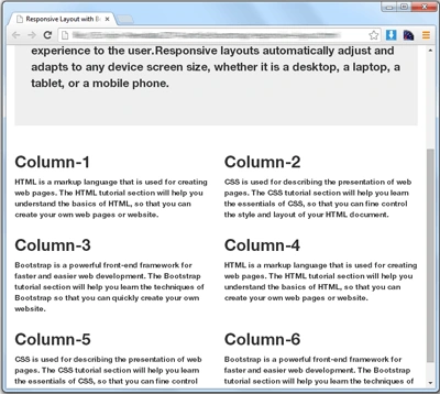
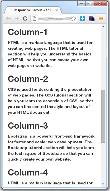
- Responsive Design: Bootstrap's responsive CSS adjusts to Desktops, Tablets and Mobiles.
- Provides a clean and uniform solution for building an interface for developers.
- It contains beautiful and functional built-in components that are easy to customize. It also provides web based customization.
Downloading the Bootstrap Files
You can download Bootstrap files from here. Compiled download contain compiled and minified CSS, JavaScript and fonts.
Understanding the File Structure
After downloading the Bootstrap files, unzip the compressed folder to see the structure. You'll find the following file structure and contents.
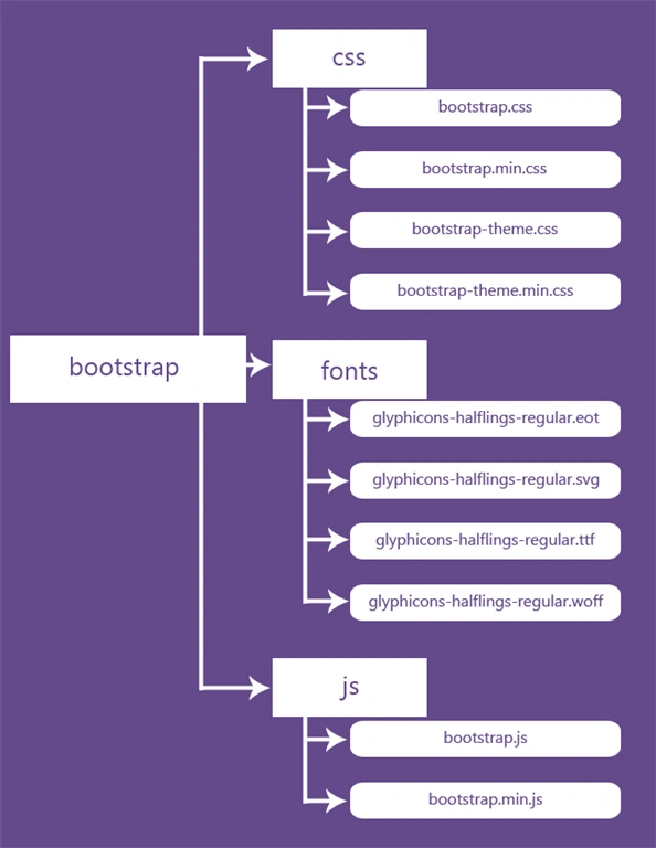
You can see that the compiled version of Bootstrap provides compiled CSS and JavaScript files (bootstrap.*), as well as compiled and minified CSS and JavaScript (bootstrap.min.*).
There are four font files (glyphicons-halflings-regular.*) inside the fonts folder. These fonts files includes 200 icons from the Glyphicon Halflings set.
Creating Your First Web Page with Twitter Bootstrap
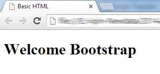
You have learned the structure and the purposes of Bootstrap files, now we'll create a basic Bootstrap template that includes everything we specified in the file structure. You will have made an HTML file that displays "Welcome Bootstrap" message in your web browser.
Step 1. Creating a Basic HTML File
Open up your code editor and create a new HTML file. Start with an empty window and type the following code:
<!DOCTYPE html >
<html>
<head>
<meta http-equiv="Content-Type" content="text/html; charset=utf-8" />
<title>Basic HTML</title>
</head>
<body>
    <h1>Welcome Bootstrap</h1>
</body>
</html>
Result
Step 2. Making this HTML File a Bootstrapped Template
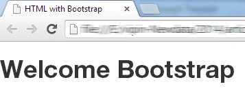
To make this HTML file a Bootstrapped template, just include the appropriate Bootstrap CSS and JavaScript files.
Note: You should include JavaScript files at the bottom of the page; before closing the <body> tag (in other words </body>) to improve the performance of your web pages.
<!DOCTYPE html >
 <html>
 <head>
 <meta http-equiv="Content-Type" content="text/html; charset=utf-8" />
 <title>HTML with Bootstrap</title>
 <!-- compiled and minified CSS -->
 <link rel="stylesheet" href="css/bootstrap.min.css">
 <!-- Optional theme -->
 <link rel="stylesheet" href="css/bootstrap-theme.min.css">
 </head>
 <body>
     <h1>Welcome Bootstrap</h1>
     <!-- compiled and minified JavaScript -->
     <script type="text/javascript" src="js/bootstrap.min.js"></script>
 </body>
</html>
Result
Bootstrap Grid System
The Twitter Bootstrap grid system provides the fastest and easiest way to create layouts of web pages. It introduces the responsive mobile first fluid grid system that appropriately scales up to 12 columns as the device or view port size increases. It includes predefined grid classes for making grid layouts for various types of devices, like phones, tablets, desktop, and so on, as well as powerful mixings for generating more semantic layouts.
The Grid Sizes
It has four tiers of classes xs, sm, md and lg. You can use any combination of these classes to create more dynamic and flexible layouts. The following is the breakdown of the various sizes of these classes.
| Classes | Devices | Size |
| .col-xs-* | Extra Small Phones | Less than 768px |
| .col-sm-* | Small Devices Tablets | 768px and Up |
| .col-md-* | Medium Devices Desktops | 992px and Up |
| .col-lg-* | Large Devices Large Desktops | 1200px and Up |
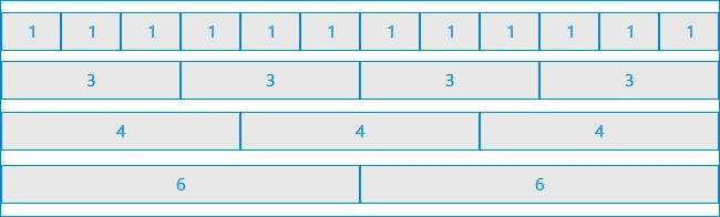
Structure of Bootstrap Grid Layout
Working of Bootstrap Grid System
Grid systems are used for creating page layouts through a series of rows and columns . Here's how the Bootstrap grid system works:
- Rows must be placed within a .container and .container-fluid class for proper alignment and padding.
- Use rows to create horizontal groups of columns.
- Content should be placed within columns and only columns may be immediate children of rows.
- Predefined grid classes like .row and .col-xs-4 are available for quickly making grid layouts. LESS mixings can also be used for more semantic layouts.
- Grid columns are created by specifying the number of twelve available columns you wish to span. For example, three equal columns would use three .col-xs-4.
Create Layouts with Bootstrap Grid System
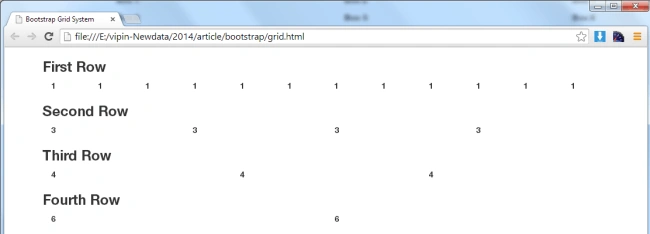
In the preceding image there are 4 rows. The first row contains 12 columns. The second row contains 4 columns. The third row contains 3 columns. And the last row contains 2 columns. Now we create a HTML file for the above grid image structure.
HTML Code
<!DOCTYPE html >
<html>
<head>
<meta http-equiv="Content-Type" content="text/html; charset=utf-8" />
<title>Bootstrap Grid System</title>
<!-- compiled and minified CSS -->
<link rel="stylesheet" href="css/bootstrap.min.css">
<!-- Optional theme -->
<link rel="stylesheet" href="css/bootstrap-theme.min.css">
</head>

<body>
    <div class="container">
        <!-- First Row -->
        <div class="row">
            <h3>First Row</h3>
            <div class="col-md-1">1</div>
            <div class="col-md-1">1</div>
            <div class="col-md-1">1</div>
            <div class="col-md-1">1</div>
            <div class="col-md-1">1</div>
            <div class="col-md-1">1</div>
            <div class="col-md-1">1</div>
            <div class="col-md-1">1</div>
            <div class="col-md-1">1</div>
            <div class="col-md-1">1</div>
            <div class="col-md-1">1</div>
            <div class="col-md-1">1</div>
        </div>

        <!-- Second Row -->
        <div class="row">
            <h3>Second Row</h3>
            <div class="col-md-3">3</div>
            <div class="col-md-3">3</div>
            <div class="col-md-3">3</div>
            <div class="col-md-3">3</div>
        </div>

        <!-- Third Row -->
        <div class="row">
            <h3>Third Row</h3>
            <div class="col-md-4">4</div>
            <div class="col-md-4">4</div>
            <div class="col-md-4">4</div>
        </div>

        <!-- Fourth Row -->
        <div class="row">
            <h3>Fourth Row</h3>
            <div class="col-md-6">6</div>
            <div class="col-md-6">6</div>
        </div>
    </div>

<!-- compiled and minified JavaScript -->
<script type="text/javascript" src="js/bootstrap.min.js"></script>
</body>
</html>
Result:
Now it's time to customize our layout for other devices. For other device's layout we use the sm, xs and lg class tier depending on the device. For a tablet we will use the same design layout structure so we use the .col-sm-* class as well as .col-md-*, for example:
<div class="col-md-1">1</div>
Is changed to:
<div class="col-md-1 col-sm-1">1</div>
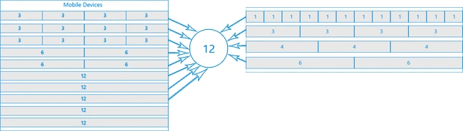
Now we have customized our layout for extra small devices. For extra small devices we use the .col-xs-* class. In a tablet and a desktop device we have a total of 21 columns. Now we break the grid system as:
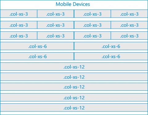
In the preceding image there are 10 rows. Now we create a HTML file for the above grid image structure.
HTML Code
<!DOCTYPE html >
<html>
<head>
<meta http-equiv="Content-Type" content="text/html; charset=utf-8" />
<title>Bootstrap Grid System</title>
<!-- compiled and minified CSS -->
<link rel="stylesheet" href="css/bootstrap.min.css">
<!-- Optional theme -->
<link rel="stylesheet" href="css/bootstrap-theme.min.css">
</head>

<body>
    <div class="container">
        <!-- First Row -->
        <div class="row">
            <h3>First Row</h3>
            <div class="col-md-1 col-sm-1 col-xs-3">1</div>
            <div class="col-md-1 col-sm-1 col-xs-3">1</div>
            <div class="col-md-1 col-sm-1 col-xs-3">1</div>
            <div class="col-md-1 col-sm-1 col-xs-3">1</div>
            <div class="col-md-1 col-sm-1 col-xs-3">1</div>
            <div class="col-md-1 col-sm-1 col-xs-3">1</div>
            <div class="col-md-1 col-sm-1 col-xs-3">1</div>
            <div class="col-md-1 col-sm-1 col-xs-3">1</div>
            <div class="col-md-1 col-sm-1 col-xs-3">1</div>
            <div class="col-md-1 col-sm-1 col-xs-3">1</div>
            <div class="col-md-1 col-sm-1 col-xs-3">1</div>
            <div class="col-md-1 col-sm-1 col-xs-3">1</div>
        </div>

        <!-- Second Row -->
        <div class="row">
            <h3>Second Row</h3>
            <div class="col-md-3 col-sm-3 col-xs-6">3</div>
            <div class="col-md-3 col-sm-3 col-xs-6">3</div>
            <div class="col-md-3 col-sm-3 col-xs-6">3</div>
            <div class="col-md-3 col-sm-3 col-xs-6">3</div>
        </div>

        <!-- Third Row -->
        <div class="row">
            <h3>Third Row</h3>
            <div class="col-md-4 col-sm-4 col-xs-12">4</div>
            <div class="col-md-4 col-sm-4 col-xs-12">4</div>
            <div class="col-md-4 col-sm-4 col-xs-12">4</div>
        </div>

        <!-- Fourth Row -->
        <div class="row">
            <h3>Fourth Row</h3>
            <div class="col-md-6 col-sm-6 col-xs-12">6</div>
            <div class="col-md-6 col-sm-6 col-xs-12">6</div>
        </div>
    </div>
<!-- compiled and minified JavaScript -->
<script type="text/javascript" src="js/bootstrap.min.js"></script>
</body>
</html> 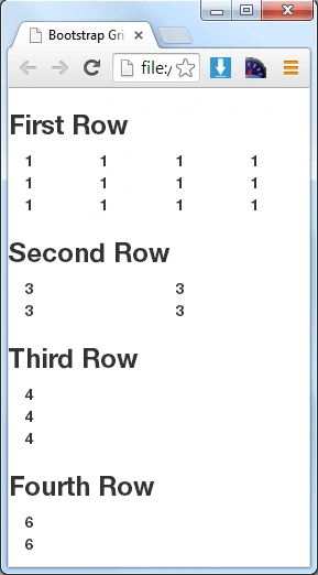
Deepak KaushikPosted Mar 21, 2017, 4:21 PM
Good article for the beginners!!
Madhanmohan DevarajanPosted Dec 27, 2016, 4:02 PM
Hope it will be useful for novices, keep going..
Manav PandyaPosted Dec 27, 2016, 11:13 AM
How to use bootstrap with mvc application
Manav PandyaPosted Dec 27, 2016, 11:12 AM
But provide example in visual studio
Manav PandyaPosted Dec 27, 2016, 11:12 AM
Thnks for sharing this article