

The WPF Grid Control is a content control that represents data in a flat columns and rows format where a row and a column may be managed independently.
The Grid element in XAML represents a WPF Grid control. The following code snippet creates a Grid control, sets its width and foreground color and ensures the grid lines are visible.
- <Grid Name="MCGrid" Width="400" Background="LightSteelBlue" ShowGridLines="True" \>
- <Grid.ColumnDefinitions>
- <ColumnDefinition />
- <ColumnDefinition />
- <ColumnDefinition />
- </Grid.ColumnDefinitions>
- <Grid.RowDefinitions>
- <RowDefinition Height="45" />
- <RowDefinition Height="45" />
- <RowDefinition Height="45" />
- </Grid.RowDefinitions>
- <TextBlock Grid.Row="1" Grid.Column="2" Foreground="Green"
- Text="Age" Height="20" VerticalAlignment="Top" />
- <Window x:Class="GridSample.Window1"
- xmlns="http://schemas.microsoft.com/winfx/2006/xaml/presentation"
- xmlns:x="http://schemas.microsoft.com/winfx/2006/xaml"
- Title="Window1" Height="300" Width="450" WindowStyle="ThreeDBorderWindow">
- <Grid Name="MCGrid" Width="400" Background="LightSteelBlue" ShowGridLines="True">
- <Grid.ColumnDefinitions>
- <ColumnDefinition />
- <ColumnDefinition />
- <ColumnDefinition />
- </Grid.ColumnDefinitions>
- <Grid.RowDefinitions>
- <RowDefinition Height="45" />
- <RowDefinition Height="45" />
- <RowDefinition Height="45" />
- </Grid.RowDefinitions>
- <TextBlock FontSize="14" FontWeight="Bold" Grid.Row="0" Grid.Column="0" Foreground="Green"
- Text="Author Name" Height="20" VerticalAlignment="Top" />
- <TextBlock FontSize="14" FontWeight="Bold" Grid.Row="0" Grid.Column="1" Foreground="Green"
- Text="Age" Height="20" VerticalAlignment="Top" />
- <TextBlock FontSize="14" FontWeight="Bold" Grid.Row="0" Grid.Column="2" Foreground="Green"
- Text="Book" Height="20" VerticalAlignment="Top"/>
- <TextBlock FontSize="12" Grid.Row="1" Grid.Column="0">Mahesh Chand</TextBlock>
- <TextBlock FontSize="12" Grid.Row="1" Grid.Column="1">33</TextBlock>
- <TextBlock FontSize="12" Grid.Row="1" Grid.Column="2">GDI+ Programming</TextBlock>
- <TextBlock FontSize="12" Grid.Row="2" Grid.Column="0">Mike Gold</TextBlock>
- <TextBlock FontSize="12" Grid.Row="2" Grid.Column="1">35</TextBlock>
- <TextBlock FontSize="12" Grid.Row="2" Grid.Column="2">Programming C#</TextBlock>
- </Grid>
- </Window>
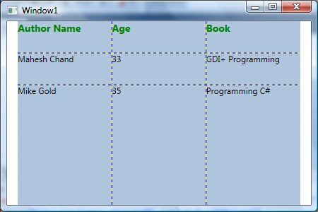
The following code snippet adds a Grid splitter to a Grid that you can use to resize a Grid row.
- <Grid Name="DynamicGrid" Width="466" Background="LightSteelBlue" ShowGridLines="True"
- Canvas.Top="119" Canvas.Left="8" Height="200">
- <Grid.ColumnDefinitions>
- <ColumnDefinition />
- <ColumnDefinition />
- <ColumnDefinition />
- </Grid.ColumnDefinitions>
- <Grid.RowDefinitions>
- <RowDefinition Height="50*" />
- <RowDefinition Height="Auto" />
- <RowDefinition Height="50*" />
- </Grid.RowDefinitions>
- <GridSplitter
- ResizeDirection="Rows"
- Grid.Column="0"
- Grid.ColumnSpan="10"
- Grid.Row="1"
- Width="Auto"
- Height="3"
- HorizontalAlignment="Stretch"
- VerticalAlignment="Stretch"
- Margin="0"
- Background="Green"/>
- </Grid>
- <Grid.Background>
- <LinearGradientBrush StartPoint="0,0" EndPoint="1,1" >
- <GradientStop Color="Blue" Offset="0.1" />
- <GradientStop Color="Orange" Offset="0.25" />
- <GradientStop Color="Green" Offset="0.75" />
- <GradientStop Color="Red" Offset="1.0" />
- </LinearGradientBrush>
- </Grid.Background>

Figure 1
This article has moved here: WPF Grid Panel tutorial
Praveen KumarPosted Dec 17, 2014, 10:54 PM
It's too good features in XAML