

Today we are going to learn about Tooltips in Windows Store Apps. A Tooltip is associated with controls to explain the information about the control with a short description, either in text or in another format such as an image. We can link a Tooltip to other controls.
Sometimes a Tooltip provides information to the user to understand the control that is not described properly in the UI. The main specialty of the Tooltip is that, it will dispaly automatticaly when the user hovers the mouse over the control; the tooltip automatically disappears when the user moves the mouse pointer away from the control.
The best use of a ToolTip is to reveal more information about a control before asking the user to perform an action. For example: To validate a control we can use the Tooltip for the control, showing a preview of the linked website when users touch a hyperlink etc.
We can add a Tooltip to a control element in one of 3 ways:
- Using XAML.
- Through code-behind.
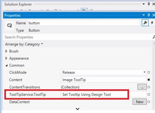
- Using a design tool.
In the later section we will see all ways to add a tooltip to a control with an example.
Adding a tooltip in XAML to button.
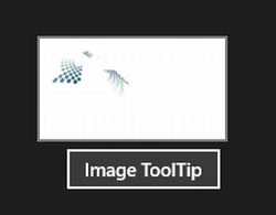
In this example I will add a simple image as a Tooltip to a button in XAML. To add a Tooltip, set the ToolTipService.ToolTip property to the associated UIElement.
<Button x:Name="button" Content="Image ToolTip" HorizontalAlignment="Center">
<ToolTipService.ToolTip>
<Image Source="logo.png"/>

La YalePosted May 7, 2015, 3:52 AM
Can we add a ToolTip to a IsEnable = "false" button?