

I have started an article series on Bootstrap and published three articles so far. Read the previous three parts here.
In this article we will learn how to create and modify buttons using Bootstrap Buttons Classes.
Bootstrap Buttons
Buttons play various role in websites and applications and are used to submit, reset, show and hide on click of button, link button etc.
Bootstrap Buttons
Buttons play various role in websites and applications and are used to submit, reset, show and hide on click of button, link button etc.
By using Bootstrap we can easily create and customize the buttons.
Bootstrap Button Styles
In Bootstrap different classes are used for styling the buttons and styles can be applied to any element like <a>, <button> and <input>.
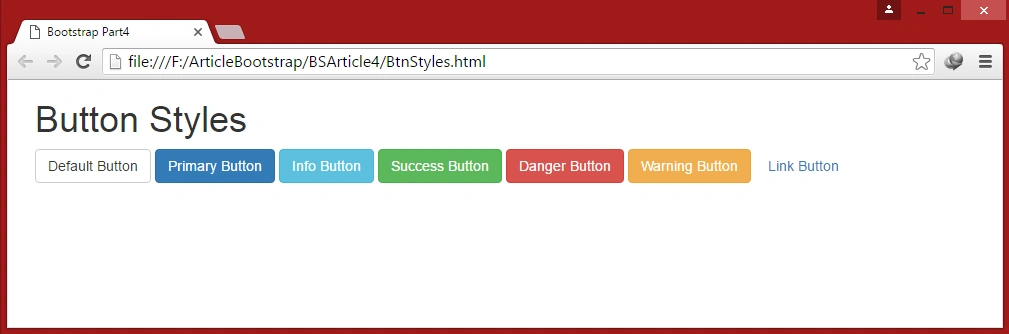
Bootstrap provides seven styles of buttons:

Bootstrap Button Styles
In Bootstrap different classes are used for styling the buttons and styles can be applied to any element like <a>, <button> and <input>.
Bootstrap provides seven styles of buttons:
To apply the button styles, Bootstrap provides the following classes:
- .btn-default: Default gray color Standard button
- .btn-primary:To indicate primary action button
- .btn-info:Used for informational alert messages
- .btn-success:Indicates a successful or positive action
- .btn-danger: Indicates a dangerous or negative action.
- .btn-warning:Indicates caution should be taken with this action
- .btn-link: Button look like a link with maintaining button behavior
Example 1: Bootstrap Button Styles
In this example we will create buttons and by using above classes we will apply styles on buttons through the following code.
- <!DOCTYPE html>
- <html lang="en">
- <head>
- <meta charset="utf-8">
- <title>Bootstrap Part4</title>
- <meta name="viewport" content="width=device-width,initial-scale=1">
- <link rel="stylesheet" type="text/css" href="css/bootstrap.min.css"> </head>
- <body>
- <div class="container">
- <h1>Button Styles</h1>
- <!--Button Style1:Default--><button type="button" class="btn btn-default">Default Button</button>
- <!--Button Style2:Primary--><button type="button" class="btn btn-primary">Primary Button</button>
- <!--Button Style3:Info--><button type="button" class="btn btn-info">Info Button</button>
- <!--Button Style4:Success--><button type="button" class="btn btn-success">Success Button</button>
- <!--Button Style5:Danger--><button type="button" class="btn btn-danger">Danger Button</button>
- <!--Button Style6:Warning--><button type="button" class="btn btn-warning">Warning Button</button>
- <!--Button Style7:Link--><button type="button" class="btn btn-link">Link Button</button> </div>
- <script src="js/jquery-2.1.4.min.js"></script>
- <script src="js/bootstrap.min.js"></script>
- </body>
- </html>
Output
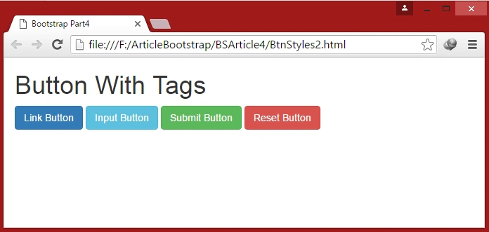
Example 2: Button classes used on <a> and <input> tag.
- <!DOCTYPE html>
- <html lang="en">
- <head>
- <meta charset="utf-8">
- <title>Bootstrap Part4</title>
- <meta name="viewport" content="width=device-width,initial-scale=1">
- <link rel="stylesheet" type="text/css" href="css/bootstrap.min.css"> </head>
- <body>
- <div class="container">
- <h1>Button With Tags</h1> <a href="#" class="btn btn-primary" role="button">Link Button</a> <input type="button" class="btn btn-info" value="Input Button" /> <input type="submit" class="btn btn-success" value="Submit Button" /> <input type="reset" class="btn btn-danger" value="Reset Button" /> </div>
- <script src="js/jquery-2.1.4.min.js"></script>
- <script src="js/bootstrap.min.js"></script>
- </body>
- </html>
Button Sizes
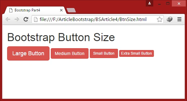
We can make buttons larger or smaller by using Bootstrap classes.
The classes that define the different sizes are:
The classes that define the different sizes are:
- .btn-lg : Used for makes the button size large.
- .btn-md: Used for makes the button size medium.
- .btn-sm: Used for makes the button size small.
- .btn-xs: Used for makes the button size extra small.
Example 3: Button Sizes
In this example we will create buttons and by using above classes we will apply size on buttons by writing the following code.
- <!DOCTYPE html>
- <html lang="en">
- <head>
- <meta charset="utf-8">
- <title>Bootstrap Part4</title>
- <meta name="viewport" content="width=device-width,initial-scale=1">
- <link rel="stylesheet" type="text/css" href="css/bootstrap.min.css"> </head>
- <body>
- <div class="container">
- <h1>Bootstrap Button Size</h1>
- <!--Button Size1:Large--><button type="button" class="btn btn-danger btn-lg">Large Button</button>
- <!--Button Size2:Medium--><button type="button" class="btn btn-danger btn-md">Medium Button</button>
- <!--Button Style3:Small--><button type="button" class="btn btn-danger btn-sm">Small Button</button>
- <!--Button Style4:XSmall--><button type="button" class="btn btn-danger btn-xs">Extra Small Button</button> </div>
- <script src="js/jquery-2.1.4.min.js"></script>
- <script src="js/bootstrap.min.js"></script>
- </body>
- </html>
Output
Block Level Buttons
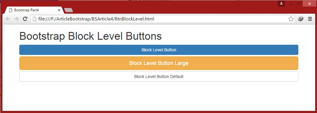
We can create block level buttons that span the full width of the parent elements by using class .btn-block.
Example 4: Block Level Buttons
In this example we will create buttons using .btn-block class by writing the following code.
Block Level Buttons
We can create block level buttons that span the full width of the parent elements by using class .btn-block.
Example 4: Block Level Buttons
In this example we will create buttons using .btn-block class by writing the following code.
- <!DOCTYPE html>
- <html lang="en">
- <head>
- <meta charset="utf-8">
- <title>Bootstrap Part4</title>
- <meta name="viewport" content="width=device-width,initial-scale=1">
- <link rel="stylesheet" type="text/css" href="css/bootstrap.min.css"> </head>
- <body>
- <div class="container">
- <h1>Bootstrap Block Level Buttons</h1>
- <!--Button:Block Level Button Primary--><button type="button" class="btn btn-primary btn-block">Block Level Button</button>
- <!--Button:Block Level Button Large--><button type="button" class="btn btn-warning btn-lg btn-block">Block Level Button Large</button>
- <!--Button:Block Level Button Default --><button type="button" class="btn btn-default btn-block">Block Level Button Default</button> </div>
- <script src="js/jquery-2.1.4.min.js"></script>
- <script src="js/bootstrap.min.js"></script>
- </body>
- </html>
Output
Button State(Active and Disabled Buttons)
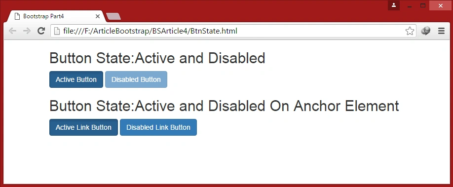
Bootstrap provides classes which are used to change the state of buttons.
Button State(Active and Disabled Buttons)
Bootstrap provides classes which are used to change the state of buttons.
- .active class: A button can be set to an active like pressed using .active class or
- .disabled class: A button can be disabled like unclickable state using .disabled class and it will fade in color. For <a> tag this class only change the appearance, not its functionality, and we need to use JavaScript to disable links.
Example 5 : Active and Disabled Buttons
In this example we will create buttons and apply state of buttons Active and Disabled by writing the following code.
In this example we will create buttons and apply state of buttons Active and Disabled by writing the following code.
- <!DOCTYPE html>
- <html lang="en">
- <head>
- <meta charset="utf-8">
- <title>Bootstrap Part4</title>
- <meta name="viewport" content="width=device-width,initial-scale=1">
- <link rel="stylesheet" type="text/css" href="css/bootstrap.min.css"> </head>
- <body>
- <div class="container">
- <h2>Button State:Active and Disabled</h2>
- <!--Button State: Active Button Primary--><button type="button" class="btn btn-primary active">Active Button</button>
- <!--Button State: Disabled Button Primary--><button type="button" class="btn btn-primary disabled">Disabled Button</button>
- <h2>Button State:Active and Disabled On Anchor Element</h2>
- <!--Button State: Active On Anchor Element--><a href="#" class="btn btn-primary active" role="button">Active Link Button</a>
- <!--Button State: Disabled On Anchor Element--><a href="#" class="btn btn-primary Disabled" role="button">Disabled Link Button</a> </div>
- <script src="js/jquery-2.1.4.min.js"></script>
- <script src="js/bootstrap.min.js"></script>
- </body>
- </html>
Output
In this article we focused on Bootstrap Buttons. In the next article we will understand all the components of Bootstrap step by step.
In this article we focused on Bootstrap Buttons. In the next article we will understand all the components of Bootstrap step by step.
Read more articles on Bootstrap:
Manish JainPosted Jul 1, 2019, 1:47 AM
Please provide information to use click event of any such button to call my Contoller's action in MVC project
Prasanna MuraliPosted May 20, 2016, 11:18 AM
Nice one....
Cao FangshengPosted May 5, 2016, 5:43 AM
good article
Sonu ChaudharyPosted May 2, 2016, 6:01 AM
Thanks for sharing
Vivek KumarPosted Apr 28, 2016, 3:02 PM
Good one
Humayun Kabir MamunPosted Apr 11, 2016, 12:32 AM
Nice...
Kuppurasu NagarajPosted Apr 9, 2016, 10:26 AM
Nice article..
Vignesh ManiPosted Apr 8, 2016, 5:20 PM
good one
Gowtham RajamanickamPosted Apr 8, 2016, 8:52 AM
nice one
Michael GriffithsPosted Apr 7, 2016, 6:04 PM
Nice
Rahul Kumar SaxenaPosted Apr 7, 2016, 1:34 PM
Good Show
Mohammed IbrahimPosted Apr 7, 2016, 12:48 PM
nice
MannanPosted Apr 7, 2016, 10:46 AM
Good one
Debasis SahaPosted Apr 7, 2016, 10:23 AM
Nice One..
Mohsin AzamPosted Apr 7, 2016, 9:26 AM
nice article for begginers