
Introduction
I am so excited! Today we will take some time to develop a custom control with our own custom property using Expressions Blend and Expressions Design. Every developer writing Windows Phone and Store applications would like to develop his/her own control. Without delay let's dig in and develop our control.
In this case I would develop a Custom Rating Control along you all with a custom property so it does not become really complex for beginners.
Brainstorming the control
The very first step for building a custom control is that you should brainstorm the control first, make a rough sketch on a page. Analyze the needs and determine the requirements. Make a rough draft and start developing it.
Divide it
It's known as proverb:
You can eat an elephant, bit by bit.
Divide your control into sub parts, for example our rating contains a slider and 5 stars that would determine the value of the rating.
Properties Needed
Every custom control you develop would need some custom properties, in our case it is Rating Value. Gather the requirements and note down the properties that your control may require.
Designing in Expressions Design
Expressions Design is a tool by Microsoft for designing just like Adobe's Photoshop, I personally recommend it because as it is from the Expressions family,
"As Expressions Design is from the Expressions family , and since Blend knows XAML, Design also knows in XAML the shapes you create in Expressions Design. You can copy it's XAML and paste it direct into Visual Studio or Expressions Blend".
Drawing Stars
For our control we need to draw stars, 5 stars actually aligned with each other, so for that I have used the polygon tool in Expressions Design.

When I click on it , it allows me to draw a polygon.When you first draw the polygon you will find that it draws a triangle.
You need to change it's edges and inner depth so that it draws the Star.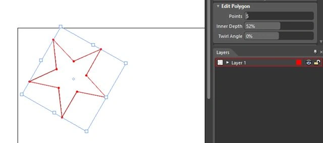
As you see above there is a star drawn, now use this star and paste it four more times.
Making Compound Path
A really handsome property of Expressions Design is that you can make a compound Path since each of the shapes drawn in Expressions Design is a Path. So I can make all the stars a single compound path.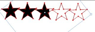
Provide Gradient Color
Now you need to provide it a gradient color and manage it such that both the color stops are at same place. It looks like a solid filled color as you can see in the preceding image.
Time To Copy XAML
Now just press:
Ctrl + Shift + C
Copy the XAML and now you can paste the XAML into Expressions Blend.
Creating Control in Expressions Blend
Well now we are ready to design our control, we have all the peices ready and the shapes drawn. It's now time for Blend to make life of the developer easy.
Go to the code part in the main grid and press Ctrl + V to paste the control , you will be able to see the control that is 5 stars with color.
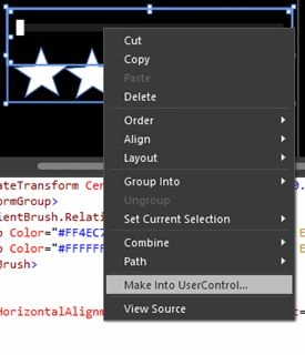
Making User Control
To make our shapes a user control we need to first give a color to our stars so that it's visible better since the Black color creates confusion. I have colored it Green.
Now place a slider into the grid so that with respect to the slider's value the very color of the star moves.
"That is the very reason I made both stops of the gradient color the same."
Since you have created a slider you need to do the very gradient's data binding with the value of the slider. You can just right-click on the stop and click on create data binding and select the property easily.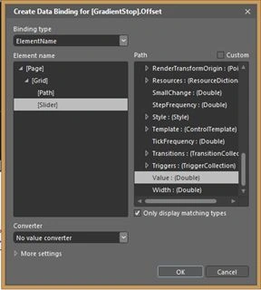
You need to do it for both of the gradient stops. The next step is to manipulate the slider depending on the ratings that are:
Step frequency = 0.1 , Maximum = 1 , Minimum = 0

Creating a Custom Control in Expression Blend With Custom Properties (Windows Phone & Store)
Join the conversation! Your thoughts help the community grow.
Sign in to leave a comment
It is the same account you read, post and publish with — and you will come straight back to this page.




Asfend YarPosted Feb 14, 2016, 2:58 PM
That's amazing !!!!