

Introduction
Understanding how different parts of your data relate to each other can be challenging. To simplify this, we'll focus on two types of plots: Pair Plots and Joint Plots. Pair Plots allow us to see correlations between each pair of variables in a dataset, while Joint Plots provide a detailed view of the relationship between two specific variables.
Pair Plot
This plot will help us visualize the relationships between multiple variables.
import pandas as pd
import matplotlib.pyplot as plt
from pandas.plotting import scatter_matrix

# Load a sample dataset
iris = pd.read_csv('https://raw.githubusercontent.com/mwaskom/seaborn-data/master/iris.csv')

# Create a pair plot
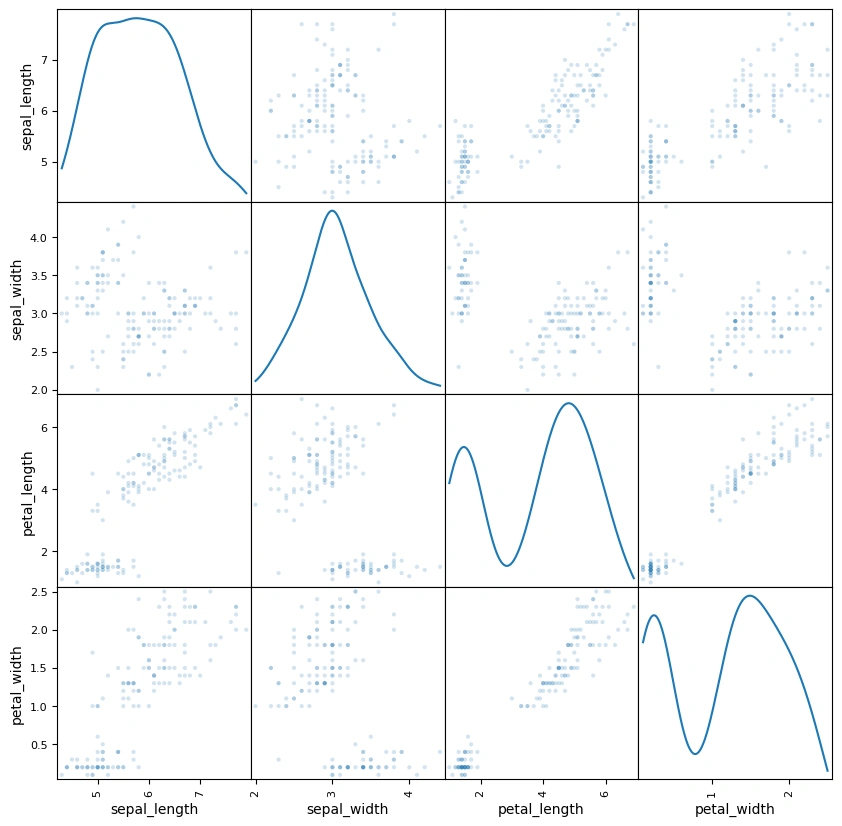
scatter_matrix(iris, figsize=(10, 10), diagonal='kde', alpha=0.2)

# Display the plot
plt.show()
Output
Explanation
- We load the 'iris' dataset using Pandas' read_csv function.
- We create a Pair Plot using Pandas' scatter_matrix function. The diagonal='kde' argument sets the diagonal plots to Kernel Density Estimates, and alpha=0.2 makes the points semi-transparent.
- The plot is displayed using plt.show().
Joint Plot
For the Joint Plot, we'll focus on two specific variables and use Matplotlib for a detailed view.
import pandas as pd
import matplotlib.pyplot as plt
import seaborn as sns

# Load the sample dataset
iris = pd.read_csv('https://raw.githubusercontent.com/mwaskom/seaborn-data/master/iris.csv')

# Create a joint plot
plt.scatter(iris['sepal_length'], iris['sepal_width'])
plt.xlabel('Sepal Length')
plt.ylabel('Sepal Width')

# Display histograms
plt.hist(iris['sepal_length'], bins=20, alpha=0.5)
plt.hist(iris['sepal_width'], bins=20, alpha=0.5)

# Display the plot
plt.show()
Output
Explanation
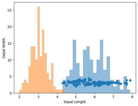
- We use Matplotlib to create a scatter plot of sepal length versus sepal width.
- We add histograms for each variable on the same axes.
- The plot is displayed with plt.show().
Conclusion
Using Python's Matplotlib and Pandas libraries, we've seen how straightforward it can be to create Pair Plots and Joint Plots. These tools are useful for uncovering relationships and patterns in your data. Try this and see the magic of Pandas and Matplotlib libraries.
Join the conversation! Your thoughts help the community grow.