

Introduction
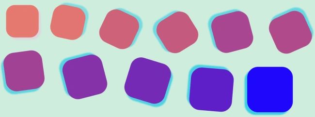
In this article, I will describe the movement of a Div or Element using HTML5 and CSS3. This movement is animation without using Flash. In this article, I will also describe Border Radius, Box Shadow and Opacity for making the output more attractive.
Step 1
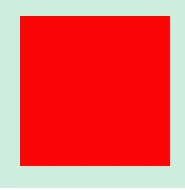
Design a div in HTML and provide its properties through CSS.
HTML
- <html>
- <head>
- <title>Div_Transposition</title>
- </head>
- <body>
- <div id="rotating_div">
- </div>
- </body>
- </html>
CSS
- /*CSS Document*/
- body {background-color:#ceeddc;
- }
- * {
- margin: 0 auto;
- }
- #rotating_div {
- margin:150px;
- width:150px;
- height:150px;
- background:fb0505;
- }
Output
Step 2
Provide a linking between HTML and CSS (in the HTML page):
Step 3
- <link href="StyleSheet1.css" rel="stylesheet" type="text/css" />
Border radius property
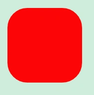
We can make the corners of the div, image, etc. rounded using this property. This CSS property is supported in Internet Explorer 9+, Firefox 4+, Chrome, Safari 5+, and Opera.
CSS
border-radius: 40px;
Output
Box Shadow property
This property is used for making a shadow of a div. Box-shadow is a combination of six different values; they are:
- Horizontal - shadow - This is a required property of a box-shadow for specifying a horizontal shadow of a box; negative values cannot be given for this.
- Vertical - shadow - This is a required property of a box-shadow for specifying a vertical shadow of a box; negative values cannot be given for this.
- Blur - This is used when we want to provide a hazy shadow and it's an optional property.
- Spread - Spread defines the size of the shadow. It's used when we want to provide a specific size to the shadow, it's also an optional property.
- Color - By using this we can define the color of the shadow. It's also an optional property.
- Inset - Inset is required when we want to set the shadow to be inside or outside.
This property is supported in browsers IE9+, Firefox 4, Chrome, Opera, and Safari 5.1.1
CSS
box-shadow: 10px 10px 5px 0 #eec2e2;
Output

Opacity property
If we use opacity it will work like a transparent layer on an image or on a div etc. The opacity value lies between 0.0-1.0 and for the browsers Internet Explorer 8 and earlier we use filter:alpha(opacity=x) and the value of X lies between 0-100. A higher value makes the transparent layer heavier and element became less visible
CSS
opacity: 0.50;
Output

Transform property
Using the transform property we can make 2D & 3D transformations to an element, animation without using Flash. With the use of this property, we can provide a value for rotate, scale, move, skew, angle, translate, etc. to an element.
For IE the prefix is -ms-, for Firefox the prefix is -moz-, for Safari and Chrome the prefix is -webkit- and for Opera, the prefix is -o-. If we want to provide a value for rotation of an element in a transform.
CSS
- -webkit-transform:rotate(2160deg);/*for Chrome and Safari */
- -ms-transform:rotate(2160deg);/*for IE9*/
- -moz-transform:rotate(2160deg);/*for Firefox*/
- -o-transform:rotate(2160deg);/*for Opera*/
Step 7
Transition property
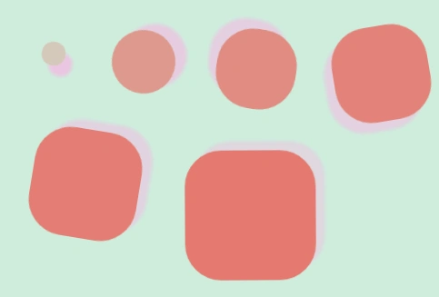
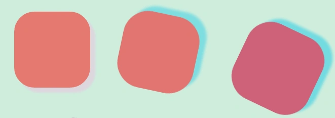
Using the transition property of CSS3 we can make boxes, images, etc. move in various styles without using any animation. This property is not yet supported by IE. For Firefox the prefix is-moz-, for Safari and Chrome the prefix is -webkit- and for Opera, it's -o-.
There are two main things required for a transition, which are a CSS property which needs to be changed and time duration for this changed effect; the property can be one or more than one but the duration specification is required.
Ismail Hakki SenPosted Sep 21, 2014, 5:10 AM
thanks.
Amit TripathiPosted Jul 12, 2014, 4:20 AM
Nice Article ......Good Job
Gopi ChandPosted Jun 2, 2014, 2:09 PM
Complete explaination about the topic..excellent.
srikanth ladiPosted May 7, 2013, 5:57 AM
Nice article, user can understand easily. Good job (preeti).
Preeti ZutshiPosted Apr 10, 2013, 2:57 AM
@ Aman Singhal Replace background: #fb0505; by giving path of your image for value of property background As: background:url(image-insert-main-body-for-text-on-image.jpg) and u can change your image on "hover" using same property....
vikash khannaPosted Jan 30, 2013, 2:26 AM
woa...........good...............thanxxxxx...
Aman SinghalPosted Jan 21, 2013, 4:45 AM
How, Preeti.
Preeti ZutshiPosted Jan 19, 2013, 4:28 AM
Ya Aman Singhal we can set div background an image instead of color........
Aman SinghalPosted Jan 9, 2013, 8:44 AM
Nice article, Can we set background image in div?
Vithal WadjePosted Jan 9, 2013, 5:40 AM
super,i have playing with 3D output
Dinesh BeniwalPosted Jan 9, 2013, 2:19 AM
Good start
Satyapriya NayakPosted Jan 9, 2013, 12:27 AM
Nice one
Deepak MiddhaPosted Jan 8, 2013, 10:29 PM
Nice explanation...keep it up..