Introduction:
Required Field Validator is being used from the initial version of ASP.NET and is a part of the standard validator controls in ASP.NET 2.0. When the validator is invalid, the required field is flagged with the literal in the "Text" property. The current article proposes an additional Image property that can be used to flag the required field.
Proposed Solution:
The control inherits the Required Field Validator, adds a new property ImageUrl and overrides the "Render" and "RegisterValidatorDeclarations" methods. The listing in Figure 1 shows the newly added property.
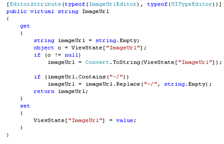
Figure 1: ImageUrl Propeperty
There is an EditorAttribute for the property, which describes the type of editor used in the Visual Studio design mode while modifying the value of ImageUrl property. EditorAttribute has four different overloads and in the current context, the article uses the "type" of the editor needed and the base type. The ImageUrlEditor type gives us the GUI interface needed to locate an image in the file system. The attribute is optional and is included because it is easier to choose the location of the image using a visual interface. Figure 2 shows the designer view with this attribute as opposed to a standard view seen on other properties (for example: Initialvalue).
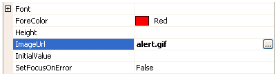
Figure 2: Designer support for the Image Url property
When the ellipses is clicked the interface for choosing the image is presented as shown in Figure 3. This interface is the standard one used for selecting images across multiple webcontrols.
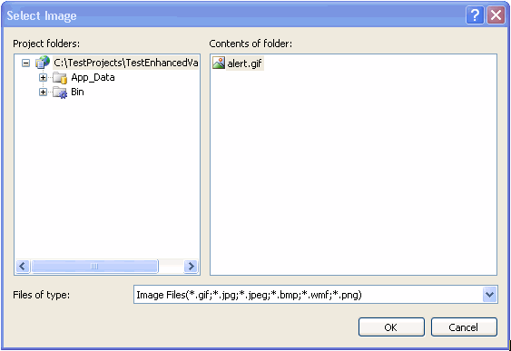
Figure 3: User Interface to select the Image
The ImageUrl value is used within the overridden Render block. The code is shown here in Figure 4. The overridden Render method defines the rendering of the control and also provides the client side script hook up needed for it to work with the JavaScript framework (formerly WebUIValidation.js) shipped with .NET 2.0.
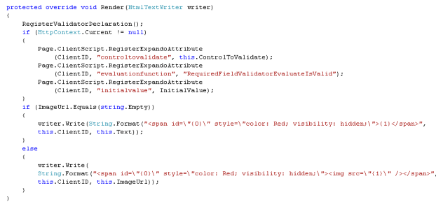
Figure 4: Overridden Render Block
The first call is to the RegisterValidatorDeclaration method listed in Figure 5.
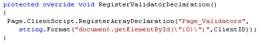
Figure 5: RegisterValidatorDeclaration
When a page is submitted using a Button in an aspx page, the JavaScript framework looks for all the validators available on the page and evaluates them. For the current control to participate in the Page Validation process, we need to register it in the global JS variable "Page_Validators", which is done in the above method. The next three lines shows the properties of a standard Required Field Validator added as Expando Attributes. There is an advantage of using Expando attributes as opposed to adding attributes in the overridden AddAttributesToRender. One of the main advantages is that the attributes needed for the Validation process are rendered as JS variables JavaScript DOM. That way the client side source code is XHTML compliant, cleaner, and easier to read. In this example the DOM is rendered as shown in Figure 6. As we can see, the rendering code (HTML) is well separated from the additional attributes.
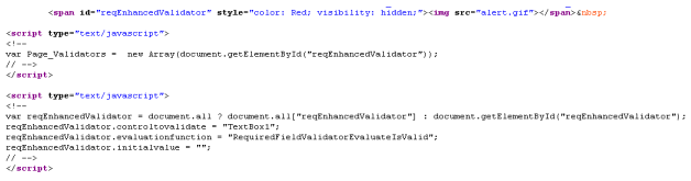
Figure 6: DOM rendering of the Expando Attributes
It is seen that these attributes are conditionally rendered depending on the value of HttpContext.Current. That expando attributes need to be rendered only at runtime and not in the design mode. The value is null when viewing the control on the VS editor design mode and the rendering is skipped during that time.
The next set of lines in Figure 4 show the actual rendering feature. If the user of the control does not set the ImageUrl, the default behavior is to show the Text property to flag the required field. If the ImageUrl is set, an <img> is embedded as part of the span tag to show an Image when the ControlToValidate does not have a value. Since an HTML img is used, the ImageUrl property checks for "~/" (which is introduced when using a ImageUrlEditor for selecting the Image file) and removes it.
Demo:
The attached example shows the validator In action. The example consists of a TextBox, a Button, and the the Enhanced Required Validator. When the button is clicked without entering any text, the error is flagged either though the Text or an Image depending on the case.
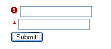
Figure 7: TextBox flagged either through Text or ImageUrl
Conclusion:
The control provides a flexible way to flag an error with either the default Text or an Image which is set through ImageUrl. As the saying goes "A picture is worth thousand words", if we can communicate the significance of a field to the user through an Image, then why not !