

Introduction
In my previous articles, you've learned the basic history of CSS, vendor prefixes, all about borders and backgrounds. If you didn't check yet, then you should go through these two articles before proceeding:
Today you'll learn all about text-effects that include text-shadow and word-wrap then you'll learn how to use other fonts in your project.
3. Text Effects
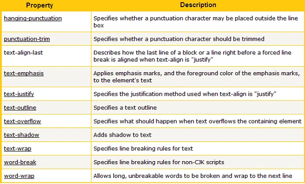
In CSS3 there are many new text features introduced. Here, you'll learn about these two text properties:
-
text-shadow
-
word-wrap
Browser Support
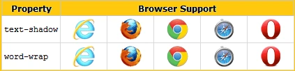
i) Text Shadow
In CSS3, text shadows are nearly the same as box shadows with a little exception that there is no support of inset text shadows and there is no vendor prefix required for it. Let's check the syntax we use for text-shadows
text-shadow: offset_x offset_y blur_radius color;
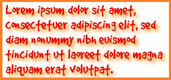
Here, for the first parameter you need to provide the "horizontal shadow," then in the second parameter specify "vertical shadow". In the third one provide the "blur distance" and in the last one provide the "color" for text-shadow. Now check this example that includes an invisible text with special effects
Example:
- #text-effect {
- width: 500px;
- font-size: 60px;
- color: #f00;
- text-shadow: 5px 5px 10px #f80;
- }
Output
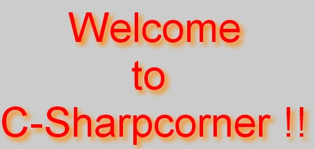
In my previous article, you've seen that we can apply multiple shadows to a box that is also possible in text shadows. You've to separate them by using commas. Now check this example with some flaming text effects that include multiple text-shadows.
Example:
- #text-flame {
- width: 500px;
- font-size: 60px;
- color: #fff;
- text-shadow: 0 0 5px #ccc,
- 0 -6px 5px #ff3,
- 3px -12px 7px #fd3,
- -3px -17px 12px #f80,
- 3px -19px 19px #f20;
- }

Join the conversation! Your thoughts help the community grow.