
Introduction
A Component Library in Power Apps is a centralized repository used to create and manage reusable components such as headers, footers, navigation menus, and custom controls. These components can be shared and used across multiple apps, ensuring consistency and efficiency in development.
What is a Component?
A component is a reusable building block in Power Apps that contains:
UI elements (labels, buttons, icons)
Custom properties (input/output)
Logic and formulas
Instead of creating the same design repeatedly, you can build it once and reuse it.
Why Use Component Library?
Using a Component Library provides several benefits:
Reusability: Create once and use in multiple apps
Consistency: Maintain uniform design across apps
Maintainability: Update in one place, reflect everywhere
Efficiency: Reduce development time and effort
When to Use What?
Use Component when:
The logic/design is needed only in one app
You want quick reuse within the same app
Use Component Library when:
You need consistency across multiple apps
You want centralized control and updates
You are building scalable or enterprise-level solutions
Common Use Cases
Some commonly used components include:
Application Header (Title, User Info)
Navigation Menu
Custom Buttons
Popup Dialogs
Loading Spinners
Getting Started: Creating a Component Library
Follow these steps to create a Component Library in Power Apps:
Step 1: Open Power Apps
Go to Power Apps
Navigate to Mores..
Select Discover all
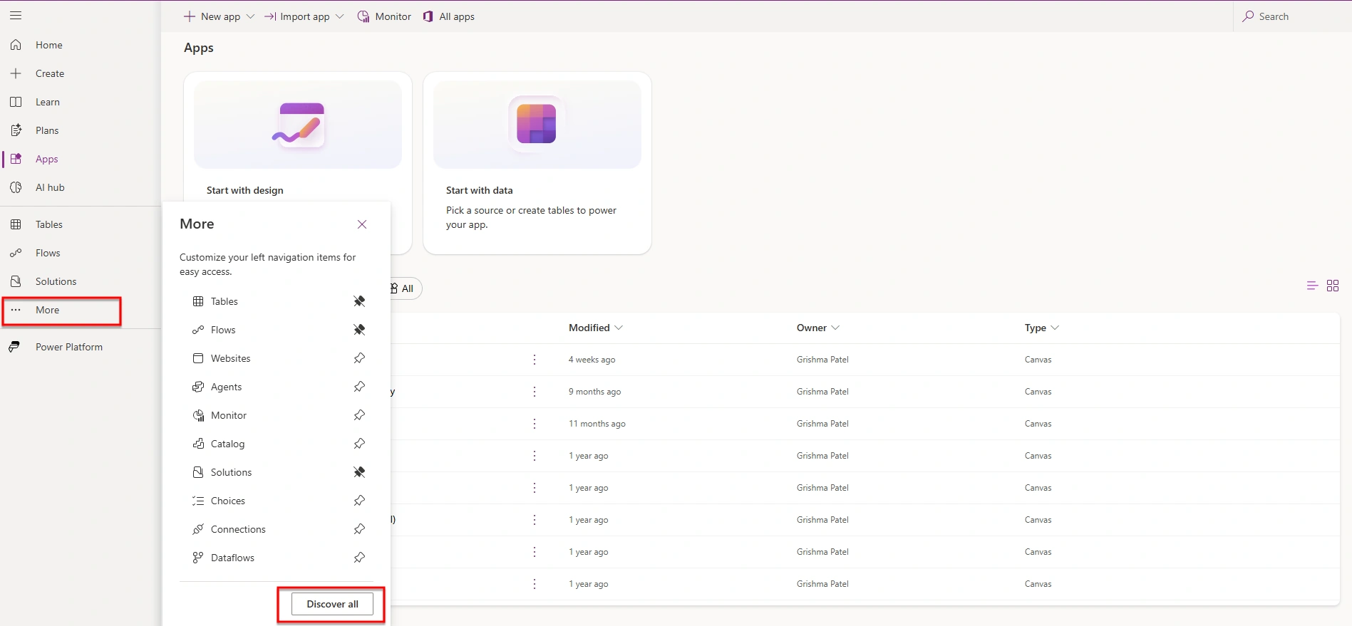
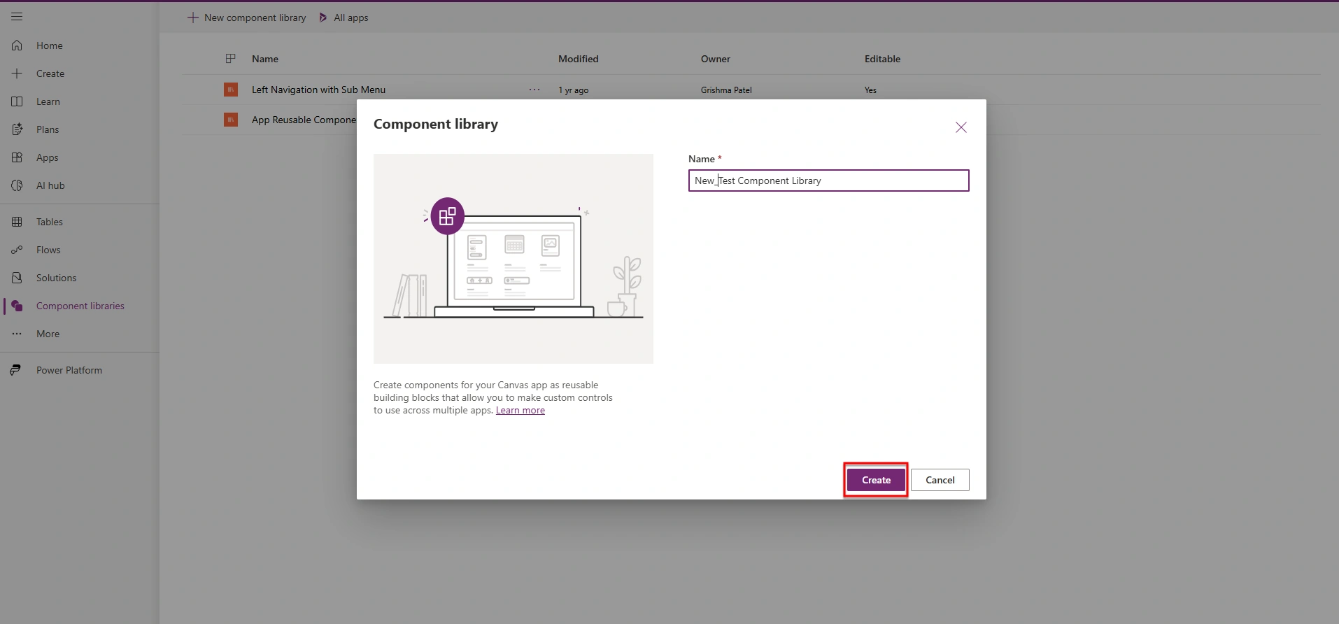
Step 2: Create a Component Library
As shown Click on Component library



Join the conversation! Your thoughts help the community grow.