
In this article, we will explore how to implement validations in the Edit Form control in Power Apps. Form validations help ensure that users provide accurate, complete, and meaningful data before submitting it to a data source. Implementing proper validations improves data quality, prevents incorrect or incomplete submissions, enhances the user experience, and reduces downstream processing errors.
Power Apps provides several ways to validate user input, including:
Built-in Form Validation:
Required Property
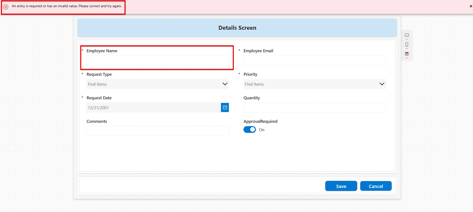
Any field marked as required in the data source automatically has its Required property set to true in Power Apps. This ensures that mandatory fields cannot be left blank. The form will not be submitted until a value is provided, and an error message is displayed automatically.
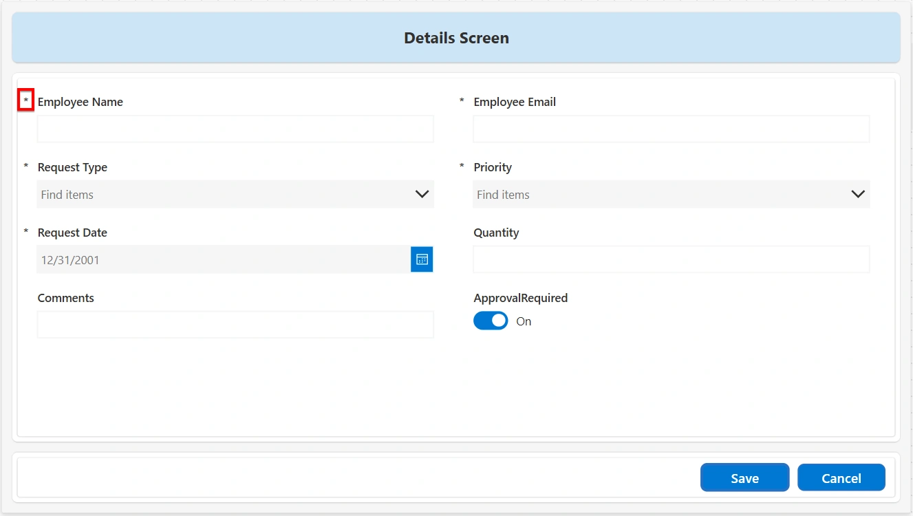
Required fields are also indicated by a star (*) icon at the top-left of the data card:
SubmitForm Function:
The SubmitForm function is used to save the data entered in a form. When SubmitForm(FormName) is executed, Power Apps automatically checks all validations on the form. If any field fails validation, the submission is stopped and the form is not saved. In such cases, the form’s Error property is populated, and appropriate error messages are shown to guide the user.
Form.Valid Property:
The Form.Valid property is a Boolean value that indicates whether all fields in the form meet their validation rules. It returns true only when every required field is filled and all validation checks pass. This property is commonly used to control the behavior of the Submit button, preventing the submission of incomplete or incorrect data.
To apply this validation, set the following expression on the DisplayMode property of the Submit button. With this configuration, the Submit button remains disabled until all validations in the form are satisfied:
If(FormName.Valid, DisplayMode.Edit, DisplayMode.Disabled)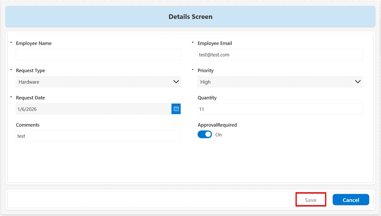
Alternatively, the following expression can be used on the OnSelect property of the Submit button to display an error message when validation fails. When the form is not valid, an error message is displayed to indicate that required information is missing or invalid.
If(FormName.Valid, SubmitForm(FormName), Notify("Please complete all required fields before submitting.", NotificationType.Error))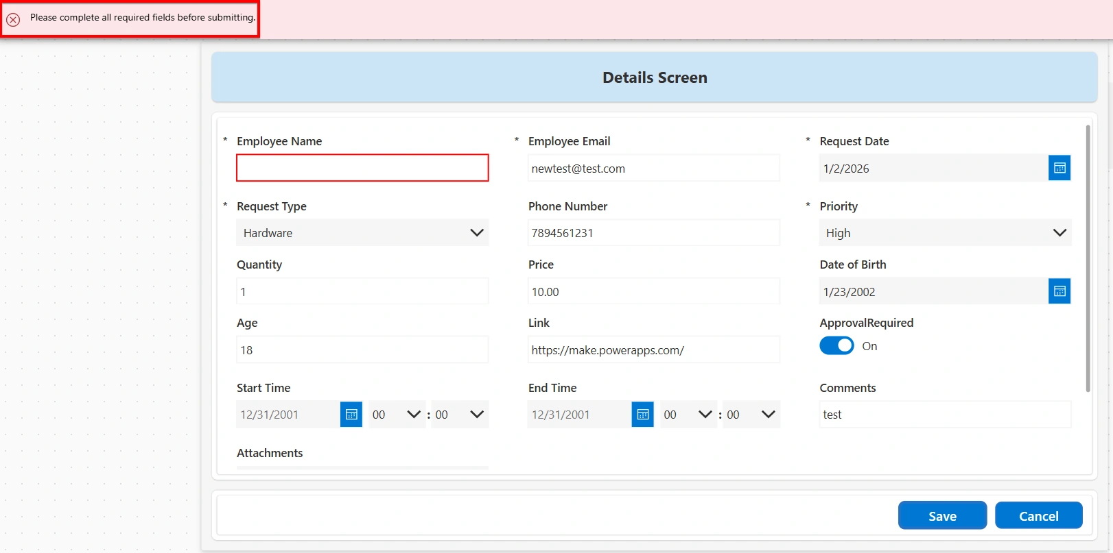
Visual Feedback and User Experience Enhancements:
Border Color Change:
Border color change is a visual validation technique used to indicate invalid input. When a validation rule fails, the border color of the input control changes, providing immediate visual feedback to help identify errors. This validation can be implemented using the following steps:
Add validation logic to the BorderColor property of the input control:
If(IsBlank(DataCardValue.Text), Color.Red, Parent.BorderColor)Custom Validation Logic using Power Fx:
Custom validation logic can be used to implement rules that are not defined at the data source level. These validations are created using Power Fx and can be applied either to individual controls or at the form level.
Pattern Matching (Regex):
Pattern matching is a type of validation that checks whether an input follows a specific format, such as containing the required letters, numbers, and symbols in the correct order.
Email Validation: Email validation checks whether an email address is entered in a valid format, including a username, the @ symbol, and a domain name. This validation can be implemented following below steps:
Add this expression on the ‘Visible’ property of the “ErrorMessage” Label of the Email DataCard in the form control:
!IsBlank(DataCardValue_Email.Text) && !IsMatch(DataCardValue_Email.Text, Match.Email)Set the ‘Text’ Property of the “ErrorMessage” Label as "Please enter a valid email address."
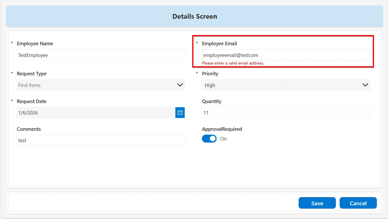
Phone Format: Phone number validation checks whether a phone number is entered in the correct format. This validation ensures that the input contains only numeric characters and meets the expected length. This validation can be implemented using the following steps:
Add the following expression to the Visible property of the ErrorMessage label of the Phone Number DataCard in the form control:
!IsBlank(DataCardValue_Phone.Text) && !IsMatch(DataCardValue_Phone.Text, "^\d{10}$")Set the Text property of the ErrorMessage label to "Please enter a valid 10-digit phone number."
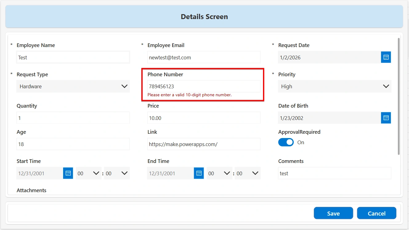
This ensures that the error message is displayed only when the phone number is entered but does not match the required format.
URL Validation: URL validation ensures that the entered value follows a valid web address format. This validation is commonly used for fields that capture website links, documentation URLs, or external references. This validation can be implemented using the following steps:
Add the following expression to the Visible property of an error message label:
!IsMatch(TextInput.Text,"^(https?:\/\/)?([\w.-]+)\.([a-z\.]{2,6})([\/\w .-]*)*\/?$")Set the Text property of the error message label to: "Please enter a valid URL."
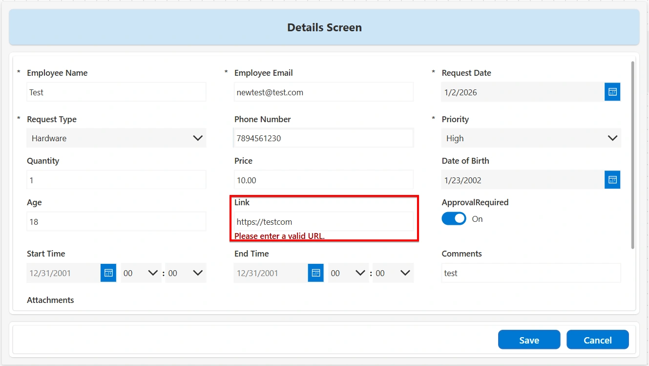
Logical Expressions:
Blank Field Validation: This validation ensures that a field is not left empty before the form is submitted. If the field does not contain a value, an error message is displayed, guiding the user to enter the required information. This validation can be implemented using the following steps:
Add the following expression on the Visible property of the ErrorMessage label inside the required DataCard.
IsBlank(DataCardValue_FieldName.Text)Set the Text property of the ErrorMessage label to: "This field cannot be left blank."
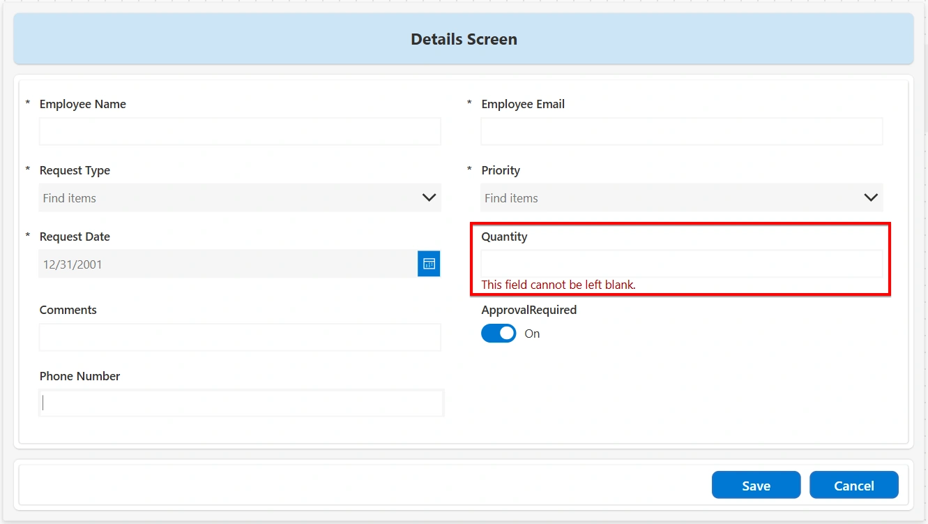
This ensures that the error message appears whenever the field is empty.
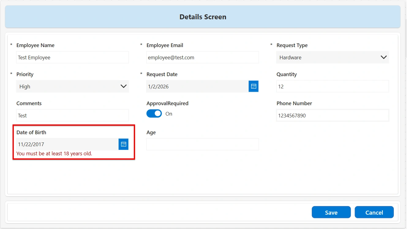
Age Validation: Age validation ensures that the entered age meets a minimum requirement. This validation is commonly used to confirm eligibility, such as allowing access only to users who are 18 years or older. This validation can be implemented using the following steps:
Use a Date Picker control to capture the user’s date of birth.
Add the following expression on the Visible property of an error message label of the form control:
DateDiff( DateValue(DateOfBirth.SelectedDate), Today(),TimeUnit.Years) <18Set the Text property of the error message label to "You must be at least 18 years old."
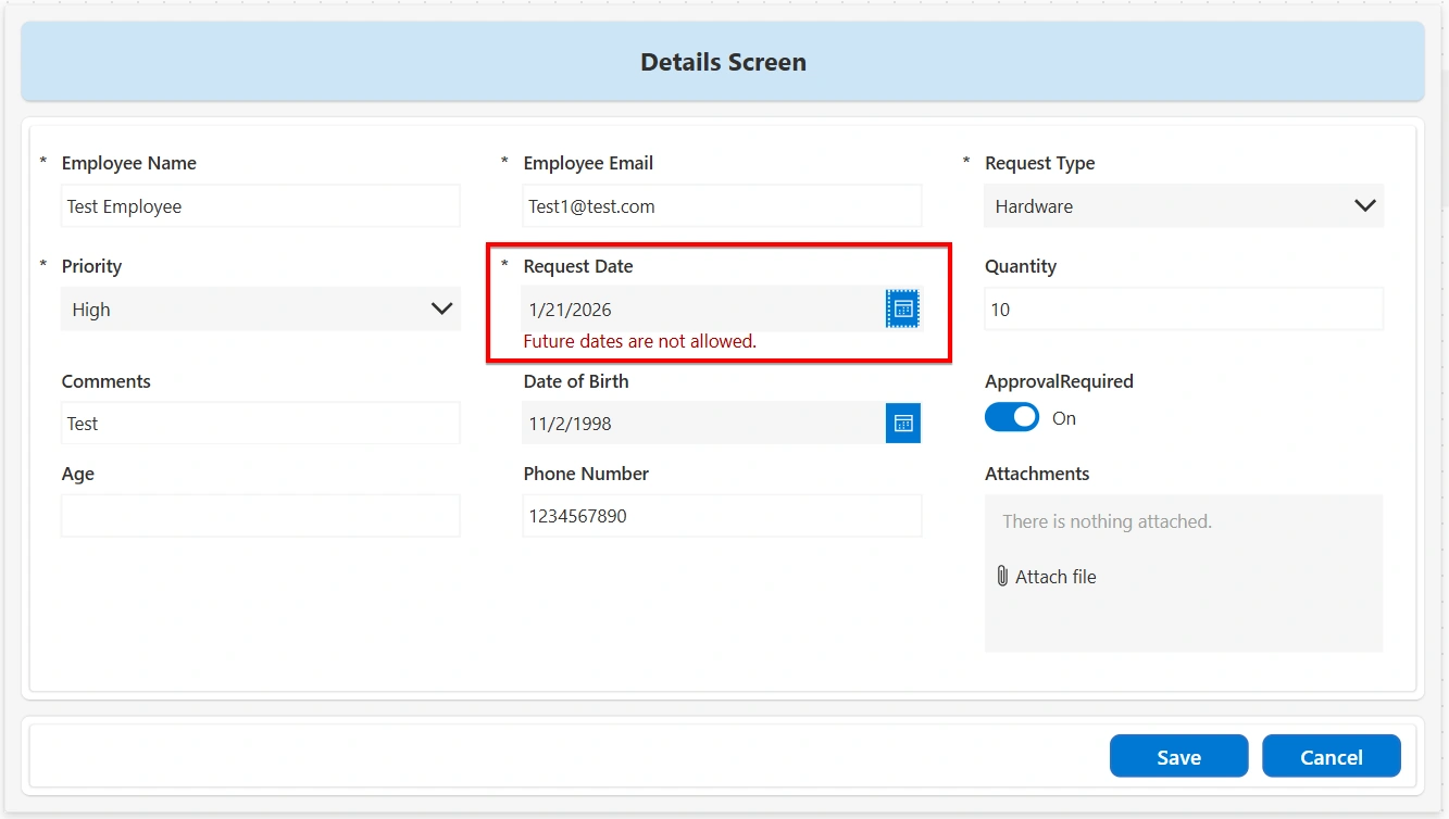
Prevent Future Date Selection: This validation ensures that a selected date does not fall after the current date. This validation is commonly used for fields such as date of birth, past events, or historical records where future dates are not allowed. This validation can be implemented using the following steps:
Add the following expression to the Visible property of the error message label:
DatePicker1.SelectedDate > Today()Set the Text property of the error message label to: "Future dates are not allowed."
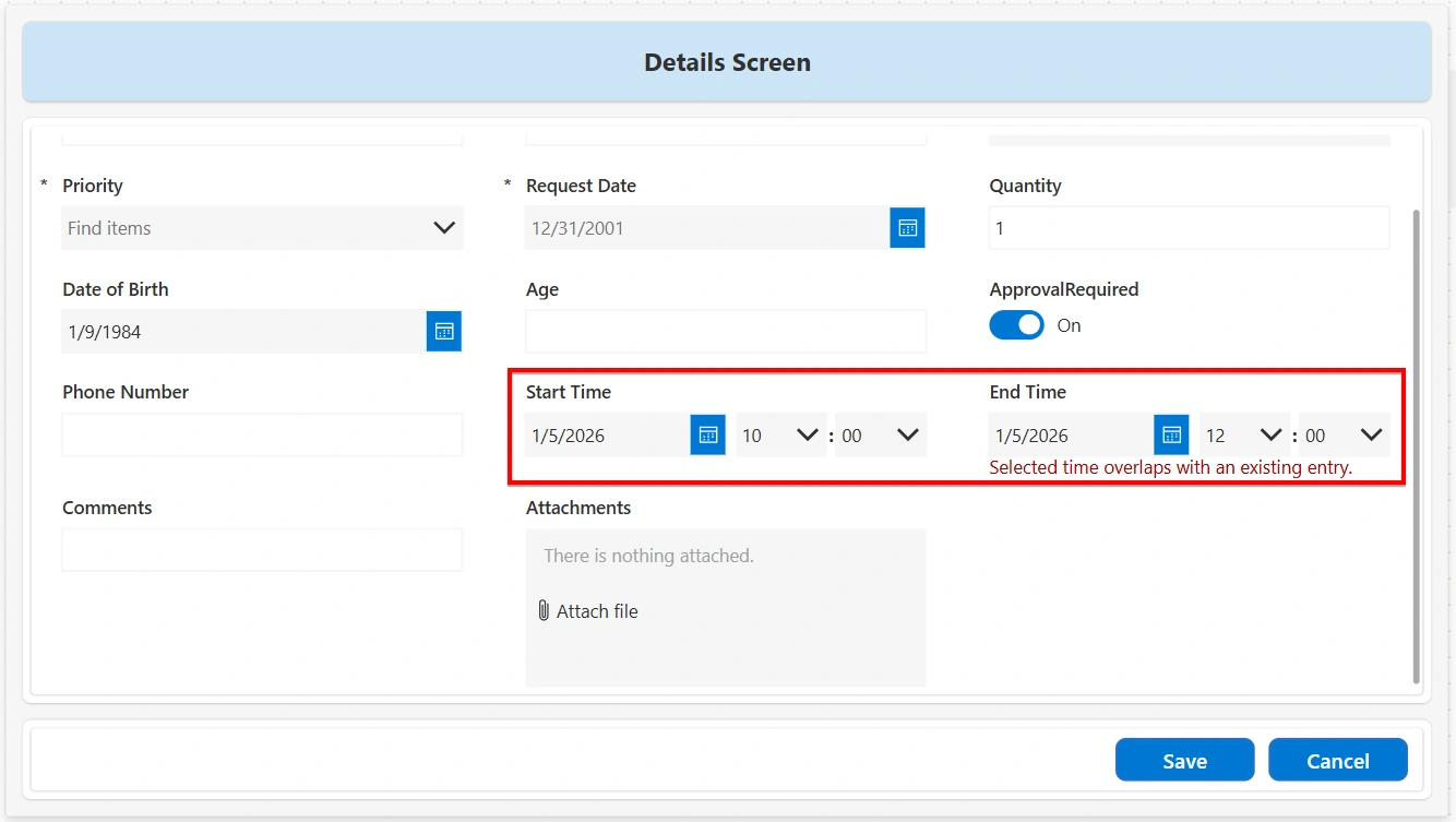
Time Overlap Prevention: This validation ensures that a new time entry does not conflict with existing time records. This validation is commonly used in scenarios such as bookings, reservations, shift scheduling, or time tracking, where overlapping time ranges are not allowed. This validation can be implemented using the following steps:
Identify the start time and end time fields for the current record (for example, StartTime and EndTime).
Add the following expression to the Visible property of an error message label or to the OnSelect property of the Submit button:
With(
    {
        NewStart:
            DateAdd(
                DateValue1.SelectedDate,
                Value(HourValue1.Selected.Value) * 60 +
                Value(MinuteValue1.Selected.Value),
                TimeUnit.Minutes
            ),
        NewEnd:
            DateAdd(
                DateValue2.SelectedDate,
                Value(HourValue2.Selected.Value) * 60 +
                Value(MinuteValue2.Selected.Value),
                TimeUnit.Minutes
            )
    },
    !IsBlank(
        LookUp(
            Articles,
            'Start Time' < NewEnd &&
            'End Time' > NewStart
        )
    )
)
Set the Text property of the error message label to: "Time entries overlap with an existing record."
Weekday-Only Date Validation: Weekday-Only Date Validation ensures that the selected date does not fall on a weekend. This validation is commonly used in scenarios such as business requests, bookings, or scheduling, where only working days are allowed. This validation can be implemented using the following steps:
Use a Date Picker control to capture the date value.
Add the following expression to the Visible property of an error message label:
Weekday(DatePicker.SelectedDate) in [1, 7]Set the ‘Text’ property of the error message label to: “Please select weekdays only.”
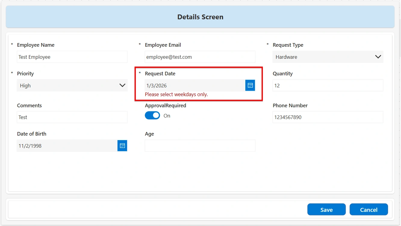
This ensures that users can select only weekday dates. If required, this validation can also be extended to include public holidays or combined with other date-based validations.
Validate Numeric Range: This validation ensures that a numeric value entered by the user falls within a defined acceptable range. This validation is commonly used for fields such as quantities, scores, ratings, or limits. This validation can be implemented using the following steps:
Add the following expression to the Visible property of an error message label:
Value(DataCardValueName.Text) < 1 || Value(DataCardValueName.Text) > 100Set the Text property of the error message label to: "Value must be between 1 and 100”.
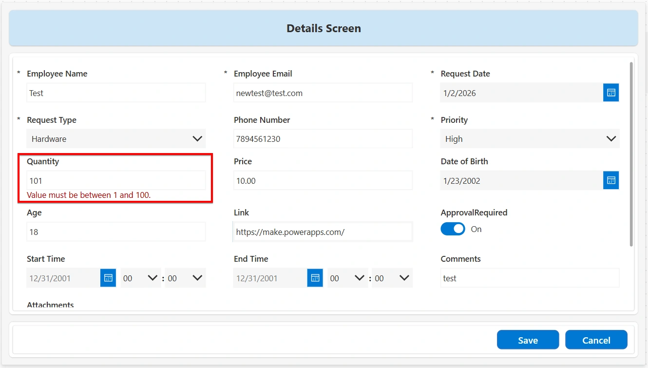
This ensures that only values within the specified range are accepted before the form is submitted. If required, this validation can be adjusted for different ranges or combined with other validation rules.
Duplicate entries elimination: Duplicate entry validation ensures that the same value is not entered more than once in the data source. This validation is commonly used for fields such as email addresses, employee IDs, request numbers, or any value that must remain unique. This validation can be implemented using the following steps:
Add the following expression to the Visible property of an error message label:
!IsBlank(LookUp( DataSourceName, FieldName = DataCardValue_FieldName.Text))Set the Text property of the error message label to “Duplicate entry detected. Please enter a unique value.”
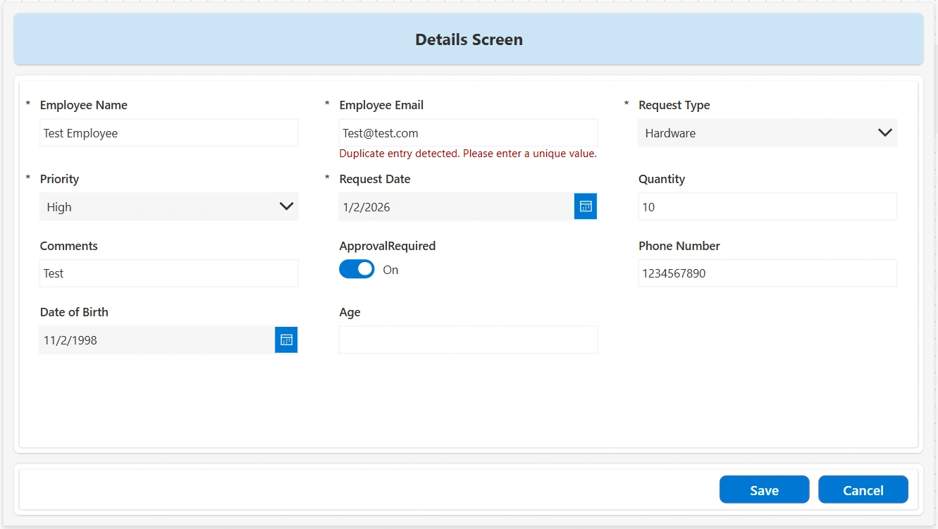
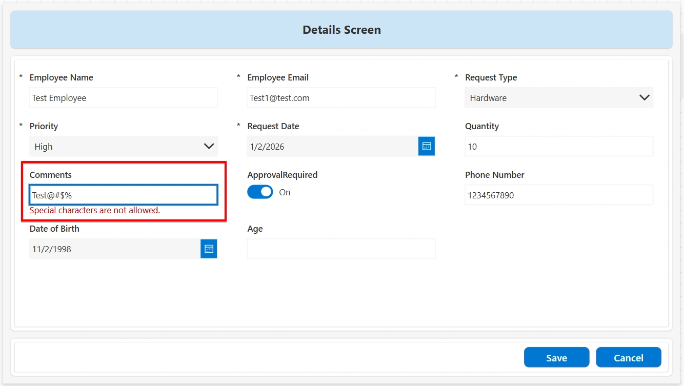
Special Character Validation: Special Character validation ensures that users do not enter unwanted or invalid special characters in a text field. This validation is commonly used for fields such as usernames, IDs, codes, or names where only letters and numbers are allowed. This validation can be implemented using the following steps:
Add the following expression to the Visible property of an error message label:
IsMatch(TextInput.Text, "[!@#$%^&*(),.?{}|<>]", MatchOptions.Contains)Set the Text property of the error message label to: "Special characters are not allowed."
Whitespace Validation: Whitespace validation prevents users from entering extra spaces at the beginning or end of a text value, which can cause data inconsistency and comparison issues. This validation can be implemented using the following steps:
Add the following expression to the Visible property of the error message label:
TextInput.Text <> Trim(TextInput.Text)Set the error message text to: "Leading or trailing spaces are not allowed."
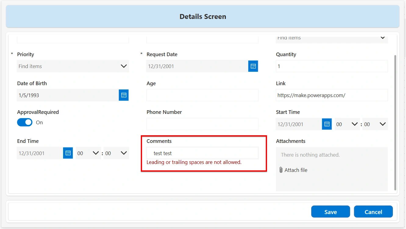
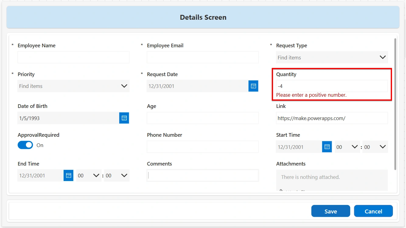
Allow Only Positive Numbers: This validation ensures that a numeric field contains a value greater than zero. This validation is commonly used for quantities, amounts, counts, or any input where negative numbers or zero are not allowed. This validation can be implemented using the following steps:
Add the following expression to the Visible property of the error message label:
Value(TextInput.Text) <= 0Set the error message text to: "Please enter a positive number."
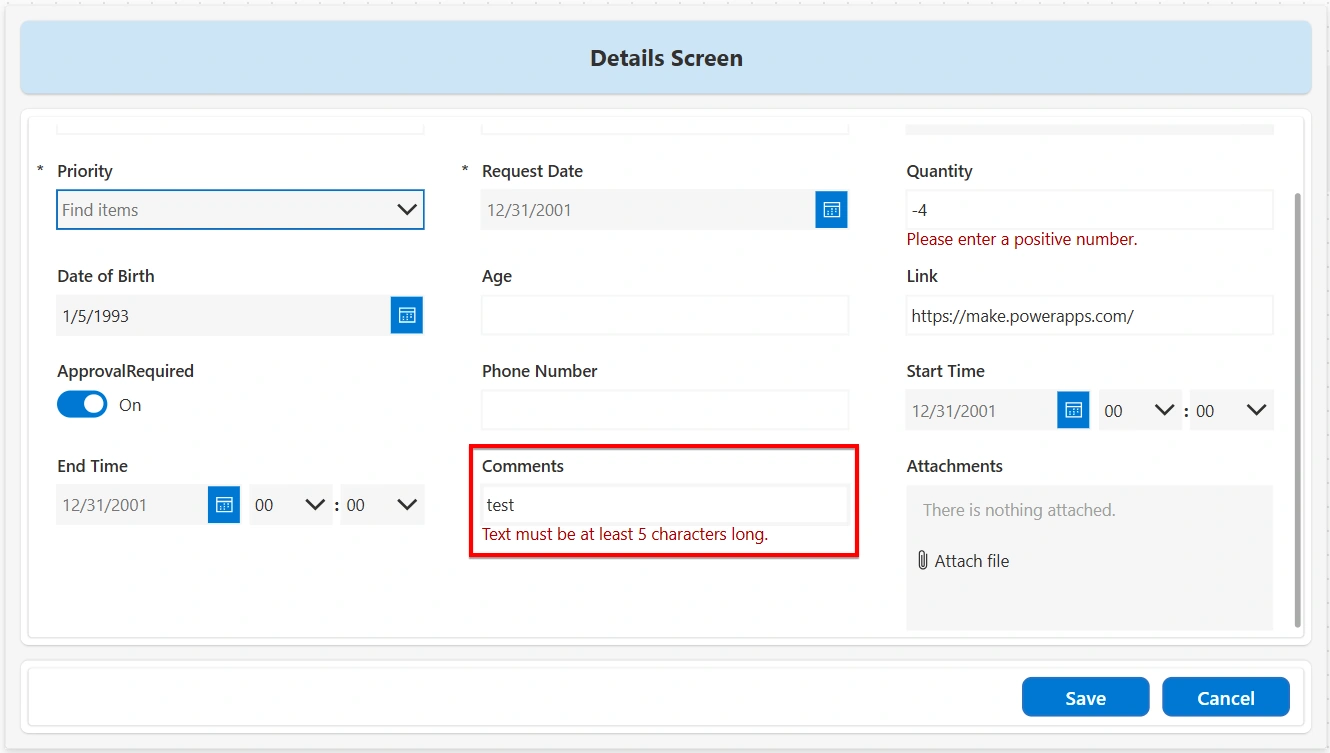
Require Minimum Characters: This validation ensures that a text field contains at least a specified number of characters. This validation is commonly used for fields such as names, comments, or descriptions where a minimum amount of information is required. This validation can be implemented using the following steps:
Add the following expression to the Visible property of the error message label:
Len(TextInput.Text) < 5Set the error message text to: "Text must be at least 5 characters long."
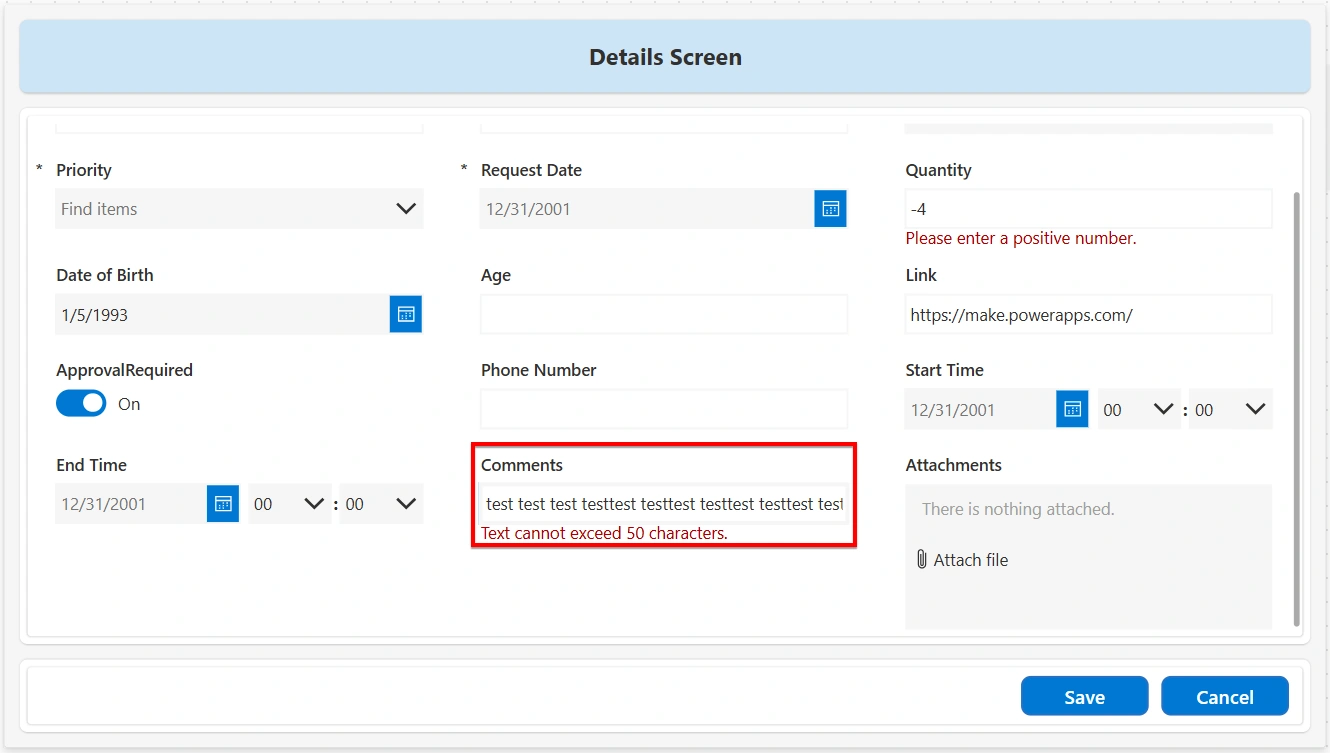
Require Maximum Characters: This validation ensures that a text field does not exceed a specified number of characters. This validation is commonly used to limit input size for fields such as titles, comments, or descriptions. This validation can be implemented using the following steps:
Add the following expression to the Visible property of the error message label:
Len(TextInput.Text) > 50Set the error message text to: "Text cannot exceed 50 characters.
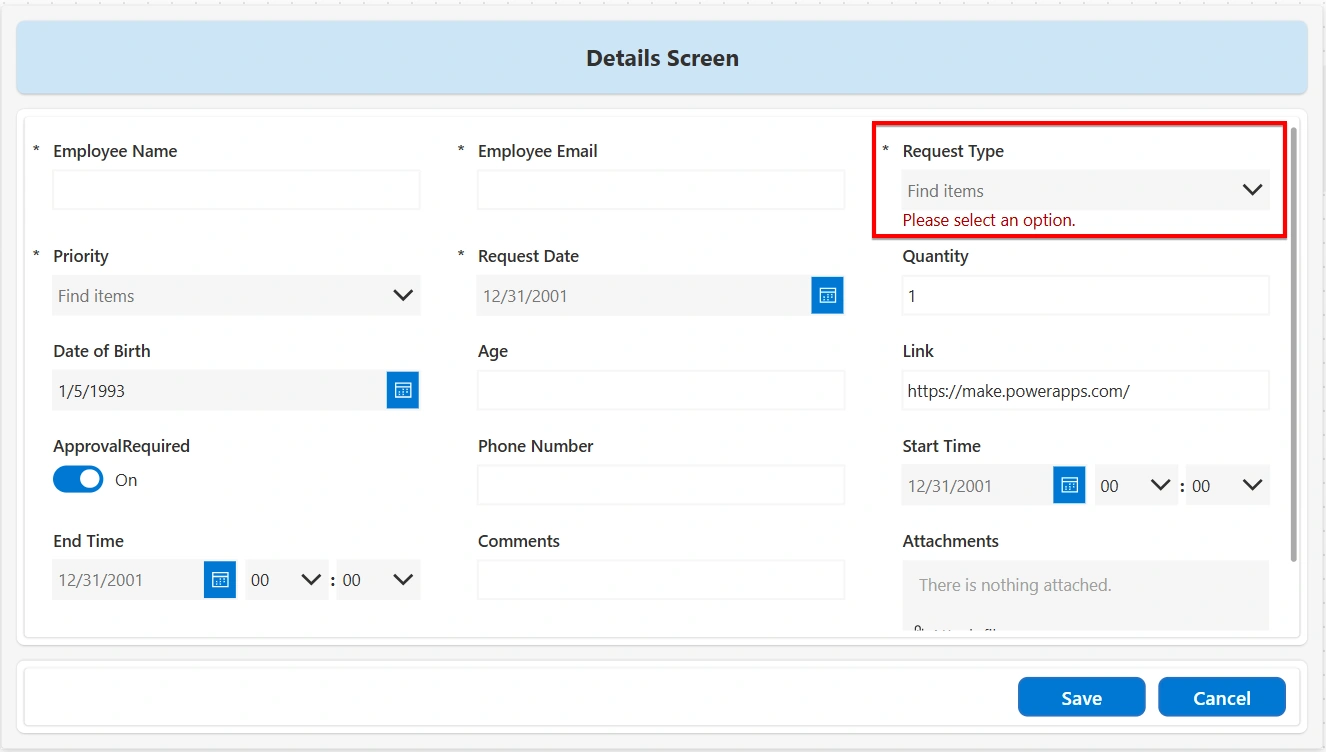
Require Dropdown Selection: This validation ensures that a user selects a valid option from a dropdown control and does not leave it unselected or at its default value. The implementation is as follows:
Add the following expression to the Visible property of the error message label:
IsBlank(Dropdown.Selected.Value)Set the error message text to: "Please select an option."
Condition-Based Field Validation: Condition-Based Field validation ensures that a field becomes mandatory only when a specific condition is met. This validation is commonly used when additional information is required based on a user’s selection or input in another field. The implementation is as follows:
Add the following expression to the Visible property of the error message label:
Dropdown.Selected.Value = "Other" && IsBlank(TextInput.Text)Set the error message text to: "Please provide details for the selected option in Comments."
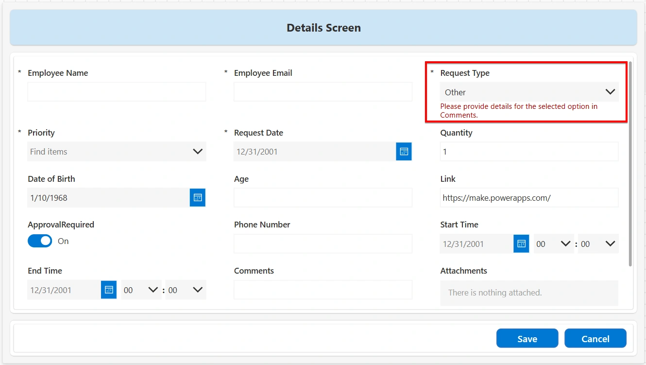
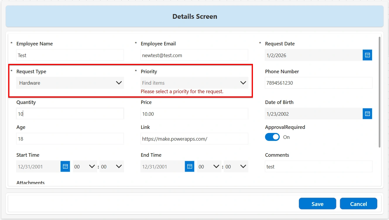
Interdependent Field Validation: Interdependent Field Validation ensures that the value of one field is validated based on the selection made in another field. This type of validation is useful when business rules require additional input or specific settings depending on a related field. In this scenario, the SharePoint list contains the following fields:
i. Request Type (Choice): Hardware, Software, Access, Other
ii. Priority (Choice): High, Medium, Low
The requirement is to ensure that a Priority is selected whenever a Request Type is chosen.
Add the following expression to the Visible property of the error message label for the Priority field:
!IsBlank(DataCardValue_RequestType.Selected.Value) && IsBlank(DataCardValue_Priority.Selected.Value)Set the Text property of the error message label to: "Please select a priority for the request."
Decimal validation: Decimal validation ensures that the entered value is a valid decimal number and follows the expected numeric format. This validation is commonly used for fields such as prices, measurements, or scores where decimal values are allowed. The implementation is as follows:
Add the following expression to the Visible property of the error message label:
!IsMatch(TextInput.Text, "^\d+(\.\d{1,2})?$")Set the error message text to: "Please enter a valid decimal number."
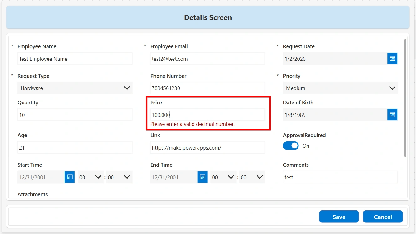
This validation allows whole numbers or decimal values with up to two decimal places and prevents invalid numeric input.
File Type Validation: File type validation ensures that only allowed file formats can be uploaded. This validation is commonly used to restrict uploads to specific document types and prevent unsupported or unsafe files from being submitted. This validation can be implemented using the following steps:
Use an Attachment control in the form to allow users to upload files.
Add the following expression on the Visible property of an error message label of the form control:
CountRows(DataCardValue12.Attachments) > 0 && !EndsWith(
    Lower(First(DataCardValue12.Attachments).Name),
    ".pdf"
) && !EndsWith(
    Lower(First(DataCardValue12.Attachments).Name),
    ".docx"
)
Set the Text property of the error message label to: "Only PDF or DOCX files are allowed."
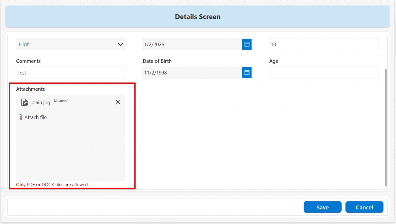
Form validations in Power Apps help ensure that only correct and complete data is submitted. By combining built-in validations with custom Power Fx rules, forms become more reliable, user-friendly, and aligned with business requirements.
Join the conversation! Your thoughts help the community grow.