

Introduction
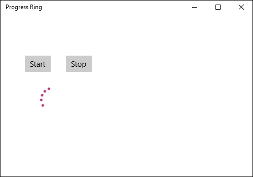
ProgressRing represents a control that indicates an operation is ongoing. The typical visual appearance is a ring-shaped "spinner" that cycles an animation as progress continues.
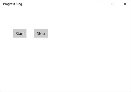
Open a blank app and add a ProgressRing control and two buttons named Start and Stop either from the toolbox or by copying the following XAML code into your grid.
IsActive defines animation
- <StackPanel>
- <StackPanel Orientation="Horizontal" Margin="50,80,0,0">
- <Button Name="start" Content="Start" Click="start_Click"></Button>
- <Button Name="stop" Content="Stop" Click="stop_Click" Margin="30,0,0,0"></Button>
- </StackPanel>
- <ProgressRing Name="myRing" IsActive="False" Height="50" Width="50" HorizontalAlignment="Left" Margin="80,30,0,0"></ProgressRing>
- </StackPanel>
Step 2
Set the value of IsActive to True for start button event handler and to false for the end button event handler respectively.
- private void start_Click(object sender, RoutedEventArgs e)
- {
- myRing.IsActive = true;
- }
- private void stop_Click(object sender, RoutedEventArgs e)
- {
- myRing.IsActive = false;
- }
Step 3
Run the application and click on the start button to start the ProgressRing.
Summary
In this article, we learned about progressRing control for Windows 10.
Kuppurasu NagarajPosted Feb 11, 2016, 12:36 PM
Nice Ramees..
Mohammed IbrahimPosted Dec 3, 2015, 7:40 PM
nice
Gowtham KPosted Nov 2, 2015, 11:25 AM
Good One
Sibeesh VenuPosted Nov 2, 2015, 4:43 AM
Nice Share
Abhishek AroraPosted Nov 2, 2015, 1:18 AM
Nice..
Mahesh ChandPosted Nov 2, 2015, 1:00 AM
Nice. I didn't realize this control was called ProgressRing.
Harshad PansuriyaPosted Nov 2, 2015, 12:53 AM
Nice one