

Introduction
The React-Select-Plus is a plugin written in React.js to initialize the React Dropdown component in React forms.
Open a command prompt. Create a directory for the SPFx solution.
md spfx-ReactDropDown
Navigate to the above-created directory.
cd spfx-ReactDropDown
Run the Yeoman SharePoint Generator to create the solution.
yo @microsoft/sharepoint
Solution Name
Hit Enter to have the default name (spfx-ReactDropDown this case) or type in any other name for your solution.
Selected choice - Hit Enter
Target for the component
Here, we can select the target environment where we are planning to deploy the client web part; i.e., SharePoint Online or SharePoint OnPremise (SharePoint 2016 onwards).
Selected choice - SharePoint Online only (latest).
Place of files
We may choose to use the same folder or create a subfolder for our solution.
Selected choice - same folder.
Deployment option
Selecting Y will allow the app to be deployed instantly to all sites and be accessible everywhere.
Selected choice - N (install on each site explicitly).
Permissions to access web APIs
Choose if the components in the solution require permission to access web APIs that are unique and not shared with other components in the tenant.
Selected choice - N (solution contains unique permissions).
Type of client-side component to create
We can choose to create a client-side web part or an extension. Choose the web part option.
Selected choice - WebPart
Web part name
Hit Enter to select the default name or type in any other name.
Selected choice - ReactSelectPlus
Web part description
Hit Enter to select the default description or type in any other value.
Framework to use
Select any JavaScript framework to develop the component. Available choices are - No JavaScript Framework, React, and Knockout.
Selected choice - React
The Yeoman generator will perform a scaffolding process to generate the solution. The scaffolding process will take a significant amount of time.
Once the scaffolding process is completed, lock down the version of project dependencies by running the below command,
npm shrinkwrap
In the command prompt, type the below command to open the solution in the code editor of your choice.
NPM Packages used,
- npm i react-select-plus
- import Select from 'react-select-plus';
- import 'react-select-plus/dist/react-select-plus.css';
- import * as React from 'react';
- import { IReactSelectPlusProps } from './IReactSelectPlusProps';
- import Select from 'react-select-plus';
- import 'react-select-plus/dist/react-select-plus.css';
- export interface ISelectState {
- selectedOption?:string;
- }
- export default class ReactSelectPlus extends React.Component<IReactSelectPlusProps, ISelectState> {
- constructor(props) {
- super(props);
- this.state = {
- selectedOption: ''
- };
- this.handleChange=this.handleChange.bind(this);
- }
- private handleChange = (selectedOption) => {
- this.setState({ selectedOption });
- console.log(`Selected: ${selectedOption.label}`);
- }
- public render(): React.ReactElement<IReactSelectPlusProps> {
- const { selectedOption } = this.state;
- const value = selectedOption ;
- return (
- <div >
- <Select
- name="form-field-name"
- multi //for Multi select
- autofocus
- value={value}
- onChange={this.handleChange}
- options={ops}
- />
- </div>
- );
- }
- }
Important Props
onChange - change function event
onClose - close button clicking event
multi - Select more than one options
value - it refers the deafult value
autofocus - intial focus
searchable - whether search option is needed
clearable - whether clear icon is needed
For more properties visit here.
Sample object array format for dropdown
- var ops =[
- { value: 'one', label: 'One' },
- { value: 'two', label: 'Two' },
- { value: 'three', label: 'three' },
- { value: 'four', label: 'four' },
- { value: 'five', label: 'five' },
- { value: 'six', label: 'six' },
- { value: 'seven', label: 'seven' },
- { value: 'eight', label: 'eight' , clearableValue: false},
- ];
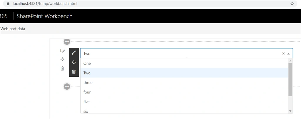
Expected result (Here I neglect the attribute multi):
Sample object array format for grouping dropdown option value:
- var ops = [{
- label: 'Black',
- value: 'black',
- }, {
- label: 'Primary Colors',
- options: [{
- label: 'Yellow',
- value: 'yellow'
- }, {
- label: 'Red',
- value: 'red'
- }, {
- label: 'Blue',
- value: 'blue'
- }]
- }, {
- label: 'Secondary Colors',
- options: [{
- label: 'Orange',
- value: 'orange'
- }, {
- label: 'Purple',
- options: [{
- label: 'Light Purple',
- value: 'light_purple'
- }, {
- label: 'Medium Purple',
- value: 'medium_purple'
- }, {
- label: 'Dark Purple',
- value: 'dark_purple'
- }]
- }, {
- label: 'Green',
- value: 'green'
- }]
- }, {
- label: 'White',
- value: 'white',
- }];
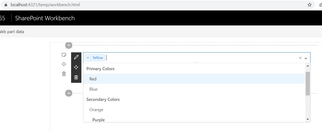
Expected result (here I am using multi attribute):
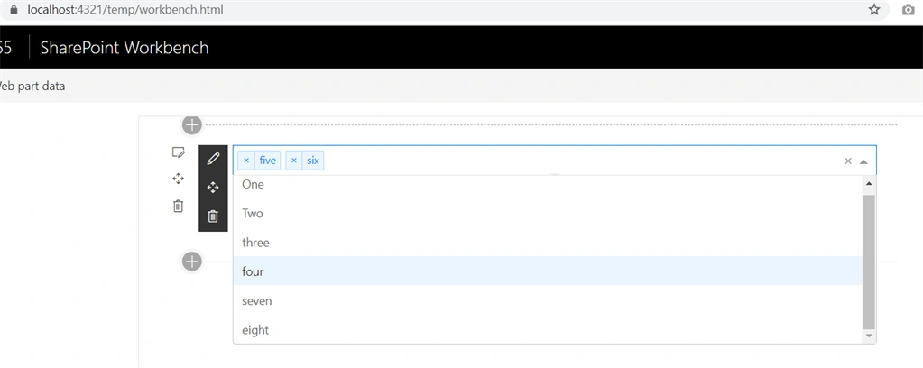
Output for using multitag without grouping:
Conclusion
We learned about initializing React Dropdown component in Spfx forms using react-select-plus plugin. I hope this helps someone. Happy coding :)
Join the conversation! Your thoughts help the community grow.