

Overview
SharePoint Framework (SPFx) offers a lightweight, responsive client-side web part development for classic as well as modern SharePoint. In this article, we will explore how we can integrate the Office UI Fabric into SharePoint Framework.
The UI Challenges
In the SharePoint journey so far, we have been developing custom web parts. Developing the visual interface for each of the custom web parts has involved significant efforr from SharePoint developers as well as UX designers and UI developers to make the web part look like an integral part of the SharePoint portal. A huge amount of effort was invested in designing the CSS classes and placing the required controls (like labels, textboxes, buttons, etc.) on the web part. This also had its own challenge to rewrite while re-branding the SharePoint portals.
The UI Challenges
In the SharePoint journey so far, we have been developing custom web parts. Developing the visual interface for each of the custom web parts has involved significant efforr from SharePoint developers as well as UX designers and UI developers to make the web part look like an integral part of the SharePoint portal. A huge amount of effort was invested in designing the CSS classes and placing the required controls (like labels, textboxes, buttons, etc.) on the web part. This also had its own challenge to rewrite while re-branding the SharePoint portals.
Office UI Fabric handles this challenge gracefully for SharePoint developers and designers so that they can build the client side web parts which can resemble their appearance to Office 365 and provide responsiveness.
Brief information about Office UI Fabric
Office UI Fabric is an official front-end framework to build experiences that fit seamlessly in Office 365. The Office UI Fabric components are built with React JS. Microsoft uses Fabric Core and Fabric React which offers numerous components and styles. Read more about Office UI Fabric here.
Brief information about Office UI Fabric
Office UI Fabric is an official front-end framework to build experiences that fit seamlessly in Office 365. The Office UI Fabric components are built with React JS. Microsoft uses Fabric Core and Fabric React which offers numerous components and styles. Read more about Office UI Fabric here.
Office UI Fabric for SharePoint Framework
SharePoint Framework Fabric Core npm package (@microsoft/sp-office-ui-fabric-core) is a subset of Fabric Core Styles that can be easily integrated with SharePoint Framework. Yeoman generator for SharePoint Framework (from version 1.3.4 onwards) supports Office UI Fabric by default.
To install the Fabric Core package in your existing project, use the below command.
npm install @microsoft/sp-office-ui-fabric-core –save
To use Fabric Core styles, use the below declaration
@import '~@microsoft/sp-office-ui-fabric-core/dist/sass/SPFabricCore.scss';
However, it is recommended to use "Office UI Fabric React" package with SharePoint Framework.
Create SPFx Solution
Open the command prompt. Create a directory for SPFx solution.
Create SPFx Solution
Open the command prompt. Create a directory for SPFx solution.
md spfx-officeuifabric
Navigate to the above-created directory.
Run Yeoman SharePoint Generator to create the solution.
yo @microsoft/sharepoint
Yeoman generator will present you with the wizard by asking questions about the solution to be created.
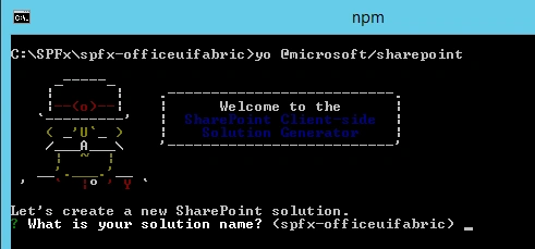
Solution Name
Hit enter to have a default name (spfx-officeuifabric in this case) or type in any other name for your solution.
Selected choice - Hit enter
Hit enter to have a default name (spfx-officeuifabric in this case) or type in any other name for your solution.
Selected choice - Hit enter
Target for component
Here, we can select the target environment where we are planning to deploy the client webpart; i.e., SharePoint Online or SharePoint OnPremise (SharePoint 2016 onwards).
Selected choice - SharePoint Online only (latest)
Here, we can select the target environment where we are planning to deploy the client webpart; i.e., SharePoint Online or SharePoint OnPremise (SharePoint 2016 onwards).
Selected choice - SharePoint Online only (latest)
Place of files
We may choose to use the same folder or create a subfolder for our solution.
Selected choice - Same folder
We may choose to use the same folder or create a subfolder for our solution.
Selected choice - Same folder
Deployment option
Selecting Y will allow the app to be deployed instantly to all sites and will be accessible everywhere.
Selected choice - N (install on each site explicitly)
Selecting Y will allow the app to be deployed instantly to all sites and will be accessible everywhere.
Selected choice - N (install on each site explicitly)
Type of client-side component to create
We can choose to create a client-side web part or an extension. Choose a web part option.
Selected choice - WebPart
We can choose to create a client-side web part or an extension. Choose a web part option.
Selected choice - WebPart
Web part name
Hit enter to select the default name or type in any other name.
Selected choice - OfficeUIFabricExamples
Hit enter to select the default name or type in any other name.
Selected choice - OfficeUIFabricExamples
Web part description
Hit enter to select the default description or type in any other value.
Selected choice - Office UI Fabric Integration with SPFx
Hit enter to select the default description or type in any other value.
Selected choice - Office UI Fabric Integration with SPFx
Framework to use
Select any JavaScript framework to develop the component. Available choices are (No JavaScript Framework, React, and Knockout)
Selected choice - React
Select any JavaScript framework to develop the component. Available choices are (No JavaScript Framework, React, and Knockout)
Selected choice - React
Yeoman generator will perform scaffolding process to generate the solution. The scaffolding process will take a significant amount of time.
Once the scaffolding process is completed, lock down the version of project dependencies by running the below command.
Once the scaffolding process is completed, lock down the version of project dependencies by running the below command.
In the command prompt type the below command to open the solution in the code editor of your choice.
code .
Office UI Fabric Components
Office UI Fabric has the below-categorized components,
Basic Inputs
Basic Inputs
- Button
- Checkbox
- ChoiceGroup
- ComboBox
- ContextualMenu
- Dropdown
- Label
- Link
- Rating
- Slider
- SpinButton
- TextField
- Toggle
Navigation
- Breadcrumb
- CommandBar
- Nav
- OverflowSet
- Pivot
- SearchBox
Content
- ActivityItem
- Calendar
- DetailsList
- Facepile
- GroupedList
- Icon
- Image
- List
- Persona
Pickers
- Pickers
- ColorPicker
- DatePicker
- PeoplePicker
- SwatchColorPicker
Progress & Validation
- MessageBar
- ProgressIndicator
- Shimmer
- Spinner
Surfaces
- Callout
- Dialog
- DocumentCard
- HoverCard
- Layer
- Modal
- Overlay
- Panel
- ScrollablePane
- TeachingBubble
- Tooltip
- Coachmark
Utilities
- FocusTrapZone
- FocusZone
- MarqueeSelection
- ResizeGroup
- Selection
- Themes
ow to use Office UI Fabric Components in SPFx WebPart
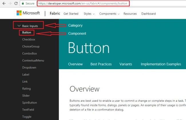
- Navigate to Office UI Fabric Components site here.
- Select and expand the Category of your component.
- Click the component node.
- Below is an example of selecting a button component.
- Alternatively, search your component from the search box.
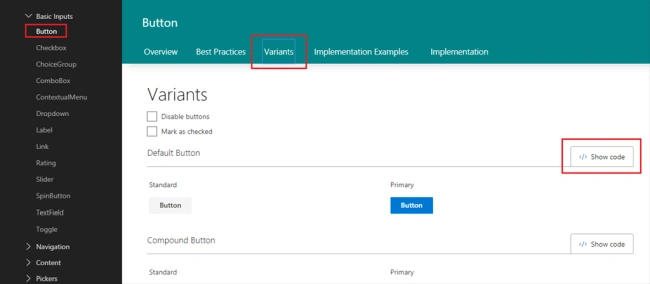
- Click Variants tab to see the variations for use of the component.
- Click “Show code” to get the code for the component.
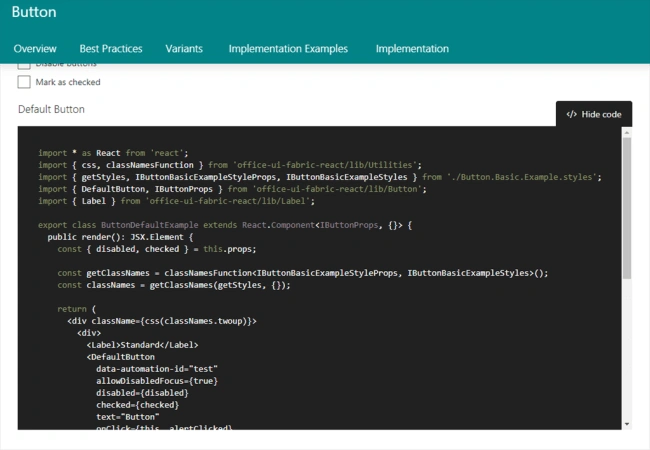
- Copy entire code or part of it to use in your SPFx solution.
Implement Greet Message WebPart using Office UI Fabric
Using the Office UI Fabric components, we will implement a simple web part, having the below components,
Using the Office UI Fabric components, we will implement a simple web part, having the below components,
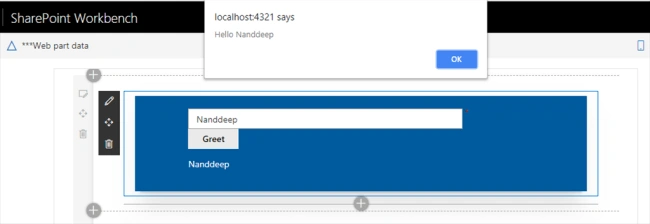
- Textbox – Accepts user name
- Button – with text as “Greet” on click of which will show an alert greeting the text typed in the textbox.
In the solution, add file IComponentState.ts, which will represent the state of entered username.
export interface IComponentState {
    userName: string;
}
Open OfficeUiFabricExamples.tsx under “\src\webparts\officeUiFabricExamples\components\” folder,
Import Textfield and button components,
// Import Textfield component
import { TextField } from 'office-ui-fabric-react/lib/TextField';

// Import Button component
import { IButtonProps, DefaultButton } from 'office-ui-fabric-react/lib/Button';
Add components to Render method
export default class OfficeUiFabricExamples extends React.Component<IOfficeUiFabricExamplesProps, IComponentState> {
  constructor(props: IOfficeUiFabricExamplesProps, state: IComponentState) {
    super(props);

    this.state = ({
      userName: ''
    });

    this._greetClicked = this._greetClicked.bind(this);
  }

  public render(): React.ReactElement<IOfficeUiFabricExamplesProps> {
    return (
      <div className={ styles.officeUiFabricExamples }>
        <div className={ styles.container }>
          <div className={ styles.row }>
            <div className={ styles.column }>
              <div className="docs-TextFieldExample">
                <TextField
                  required={true}
                  name="txtUserName"
                  placeholder="Your name please!"
                  value={this.state.userName}
                  onChanged={e => this.setState({ userName: e })}
                />

                <DefaultButton
                  data-automation-id="greet"
                  target="_blank"
                  title="Greet the user!"
                  onClick={this._greetClicked}
                  >
                  Greet
                </DefaultButton>

                <p>{this.state.userName}</p>
              </div>
            </div>
          </div>
        </div>
      </div>
    );
  }

  private _greetClicked(): void {
    alert('Hello ' + this.state.userName);
  }
}
Test the WebPart
- On the command prompt, type “gulp serve”
- SharePoint local workbench will open
- Add the web part to the page
- Enter text in TextBox component, click the Greet button. An alert should appear with the value entered in the textbox.
Summary
Office UI Fabric React components help to develop robust and consistent design across SharePoint modern experiences. Office UI Fabric is available out of the box for developers in SharePoint Framework.
Office UI Fabric React components help to develop robust and consistent design across SharePoint modern experiences. Office UI Fabric is available out of the box for developers in SharePoint Framework.
ajay kerePosted Aug 2, 2021, 7:12 AM
How can we make DetailsList as Responsive?
mohammed jaseefarPosted Jul 12, 2020, 11:51 PM
I have on function return command bar items. how can i render command bar in panel header.
Rayees KuniyilPosted Sep 11, 2018, 2:39 AM
Very Informative!!!!!!!!!!!!!!!!