

Scope
The purpose of this article is to show how to use the AutoCompleteBox for Universal Apps, from Telerik.
Introduction
Some time ago Telerik published the UI For Windows Universal as a Beta version, that can be downloaded from the Telerik WebSite.
For now only the following controls are available:
- AutoCompleteBox
- BusyIndicator
- Chart
- DataBoundListBox
- DatePicker
- Rating
- TimePicker
This article focuses on the AutoCompleteBox. Let's see how to use it!
Description
Before downloading and installing UI For Windows Universal, we should create a Blank Universal App, then we need to add the reference for it. The following image shows how to add it: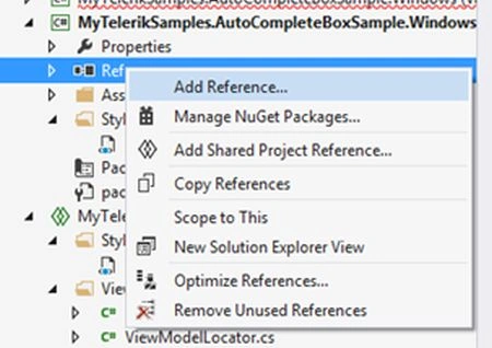
And then: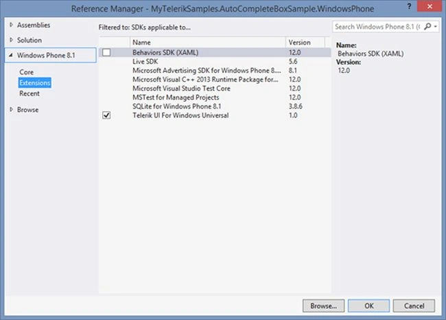
Now we can start using the Telerik controls, but before we can move MainWindow.xaml and App.xaml for the shared project to reuse the code.
Note: In this article we will use MVVMLight, see more about that here.
In MainWindow we can define the UI as in the following:
- <Page
- x:Class="MyTelerikSamples.AutoCompleteBoxSample.MainPage"
- xmlns="http://schemas.microsoft.com/winfx/2006/xaml/presentation"
- xmlns:x="http://schemas.microsoft.com/winfx/2006/xaml"
- xmlns:d="http://schemas.microsoft.com/expression/blend/2008"
- xmlns:mc="http://schemas.openxmlformats.org/markup-compatibility/2006"
- xmlns:input="using:Telerik.Universal.UI.Xaml.Controls.Input"
- mc:Ignorable="d"
- DataContext="{Binding Main, Source={StaticResource Locator}}"
- Background="{ThemeResource ApplicationPageBackgroundThemeBrush}">
- <Grid>
- <Grid.ColumnDefinitions>
- <ColumnDefinition Width="{StaticResource HeaderWidth}"/>
- <ColumnDefinition Width="*"/>
- </Grid.ColumnDefinitions>
- <Grid.RowDefinitions>
- <RowDefinition Height="{StaticResource HeaderHeigth}"/>
- <RowDefinition Height="*"/>
- </Grid.RowDefinitions>
- <TextBlock Grid.Row="0" Grid.Column="1" VerticalAlignment="Center" Style="{StaticResource HeaderTextBlockStyle}" Grid.ColumnSpan="2">RadAutoCompleteBox Sample</TextBlock>
- <StackPanel Margin="20,10,0,0" Orientation="Vertical" Grid.Row="1" Grid.Column="1">
- <TextBlock FontSize="20">Insert some text:</TextBlock>
- <input:RadAutoCompleteBox Margin="0,20,0,0"
- FilterMode="Contains" IsTextMatchHighlightEnabled="True"
- Text="{Binding Value, Mode=TwoWay}"
- FilterComparisonMode="CurrentCultureIgnoreCase"
- ItemsSource="{Binding Suggestions}" AutosuggestFirstItem="False"
- Width="200" HorizontalAlignment="Left">
- <input:RadAutoCompleteBox.ItemTemplate>
- <DataTemplate>
- <TextBlock Text="{Binding}"
- input:RadAutoCompleteBox.IsTextMatchHighlightEnabled="True">
- <input:RadAutoCompleteBox.TextMatchHighlightStyle>
- <input:HighlightStyle Foreground="DeepPink" FontSize="21"/>
- </input:RadAutoCompleteBox.TextMatchHighlightStyle>
- </TextBlock>
- </DataTemplate>
- </input:RadAutoCompleteBox.ItemTemplate>
- </input:RadAutoCompleteBox>
- </StackPanel>
- </Grid>
- </Page>
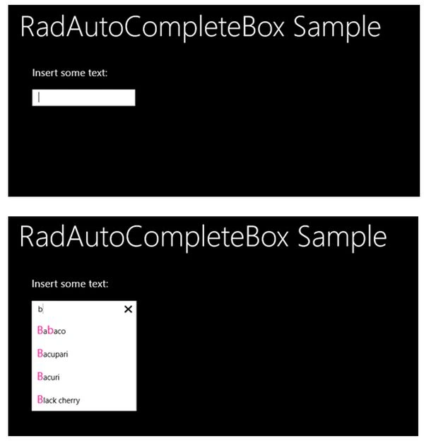
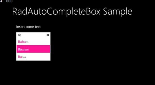
The DataTemplate was defined to allow to highlight the matched chars when we insert the text, in this case it will be highlighted by the Pink color.
The MainViewModel can be defined as in the following:
- public class MainViewModel : ViewModelBase
- {
- private string _value;
- /// <summary>
- /// Gets or sets the value.
- /// </summary>
- /// <value>
- /// The value.
- /// </value>
- public string Value
- {
- get { return _value; }
- set { Set(() => Value, ref _value, value); }
- }
- /// <summary>
- /// Gets the suggestions.
- /// </summary>
- /// <value>The suggestions.</value>
- public IEnumerable<string> Suggestions
- {
- get
- {
- return new List<string>
- {
- "Apple",
- "Babaco",
- "Bacupari",
- "Bacuri",
- "Black cherry",
- "Pineapples",
- "Orange",
- "Tomato",
- };
- }
- }
- }
- <SolidColorBrush x:Key="TelerikAutoCompleteBoxSelectorSelectedItemBackgroundBrush" Color="DeepPink"/>
- <SolidColorBrush x:Key="TelerikAutoCompleteBoxFocusedForegroundBrush" Color="White"/>
- <Application
- x:Class="MyTelerikSamples.AutoCompleteBoxSample.App"
- xmlns="http://schemas.microsoft.com/winfx/2006/xaml/presentation"
- xmlns:x="http://schemas.microsoft.com/winfx/2006/xaml"
- xmlns:viewModel="using:MyTelerikSamples.AutoCompleteBoxSample.ViewModel"
- xmlns:controls="using:Telerik.Universal.UI.Xaml.Controls">
- <Application.Resources>
- <ResourceDictionary>
- <viewModel:ViewModelLocator x:Key="Locator"/>
- <controls:UserThemeResources x:Key="ThemeResource"
- DarkResourcesPath="ms-appx:///Styles/TelerikResources.xaml"
- LightResourcesPath="ms-appx:///Styles/TelerikResources.xaml"/>
- <ResourceDictionary.ThemeDictionaries>
- <ResourceDictionary x:Key="Default">
- <ResourceDictionary.MergedDictionaries>
- <!-- your namespace is "Telerik.Universal.UI.Xaml.Input" -->
- <ResourceDictionary Source="ms-appx:///Telerik.Universal.UI.Xaml.Input/Themes/ThemeResourcesDark.xaml"/>
- <ResourceDictionary Source="{CustomResource DarkResourcesPath}"/>
- </ResourceDictionary.MergedDictionaries>
- </ResourceDictionary>
- <ResourceDictionary x:Key="Light">
- <ResourceDictionary.MergedDictionaries>
- <ResourceDictionary Source="ms-appx:///Telerik.Universal.UI.Xaml.Input/Themes/ThemeResourcesLight.xaml"/>
- <ResourceDictionary Source="{CustomResource LightResourcesPath}"/>
- </ResourceDictionary.MergedDictionaries>
- </ResourceDictionary>
- </ResourceDictionary.ThemeDictionaries>
- <ResourceDictionary.MergedDictionaries>
- <ResourceDictionary Source="/Style/Definition.xaml"/>
- </ResourceDictionary.MergedDictionaries>
- </ResourceDictionary>
- </Application.Resources>
- </Application>
When we run the app, we will get:
Source Code
The source code is available in github.
See Also
Telerik UI for Windows 8 XAML Documentation - Telerik Named Brushes.
Telerik UI for Windows 8 XAML Documentation - Resolving Telerik named resources.
Vithal WadjePosted Nov 13, 2014, 9:52 PM
nice explanation